Jumpstart your career with the Fabric Career Hub
Find everything you need to get certified on Fabric—skills challenges, live sessions, exam prep, role guidance, and a 50 percent discount on exams.
Get started- Power BI forums
- Updates
- News & Announcements
- Get Help with Power BI
- Desktop
- Service
- Report Server
- Power Query
- Mobile Apps
- Developer
- DAX Commands and Tips
- Custom Visuals Development Discussion
- Health and Life Sciences
- Power BI Spanish forums
- Translated Spanish Desktop
- Power Platform Integration - Better Together!
- Power Platform Integrations (Read-only)
- Power Platform and Dynamics 365 Integrations (Read-only)
- Training and Consulting
- Instructor Led Training
- Dashboard in a Day for Women, by Women
- Galleries
- Community Connections & How-To Videos
- COVID-19 Data Stories Gallery
- Themes Gallery
- Data Stories Gallery
- R Script Showcase
- Webinars and Video Gallery
- Quick Measures Gallery
- 2021 MSBizAppsSummit Gallery
- 2020 MSBizAppsSummit Gallery
- 2019 MSBizAppsSummit Gallery
- Events
- Ideas
- Custom Visuals Ideas
- Issues
- Issues
- Events
- Upcoming Events
- Community Blog
- Power BI Community Blog
- Custom Visuals Community Blog
- Community Support
- Community Accounts & Registration
- Using the Community
- Community Feedback
Earn a 50% discount on the DP-600 certification exam by completing the Fabric 30 Days to Learn It challenge.
- Power BI forums
- Forums
- Get Help with Power BI
- Desktop
- Re: Show all items in X axis
- Subscribe to RSS Feed
- Mark Topic as New
- Mark Topic as Read
- Float this Topic for Current User
- Bookmark
- Subscribe
- Printer Friendly Page
- Mark as New
- Bookmark
- Subscribe
- Mute
- Subscribe to RSS Feed
- Permalink
- Report Inappropriate Content
Show all items in X axis
Hi all,
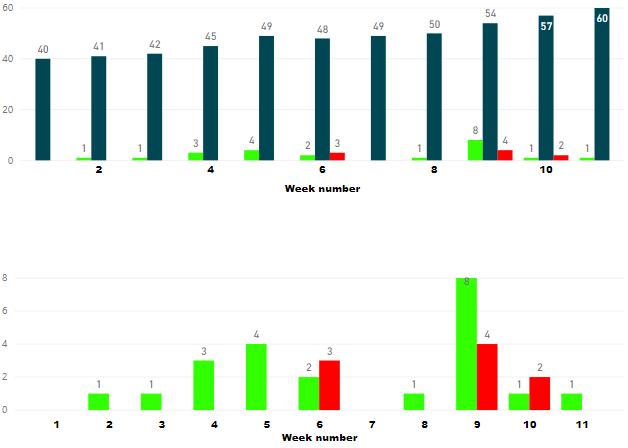
I have a line and clustered column chart with week number in the x axis. I've added new data in the last refresh and, although all the data is shown correctly, the x-axis is now showing only the even numbers. How can I force all of the week numbers to be shown? In the screen capture below, the top one is what is happening and the bottom one what I would want (consider only the x-axis, ignore the different data in both charts).
Many thanks

- Mark as New
- Bookmark
- Subscribe
- Mute
- Subscribe to RSS Feed
- Permalink
- Report Inappropriate Content
Hi! Haven't found any simple solution here so just came up with my own.
My goal was pretty like author of the thread's but with hours in a day instead of weeks. So I calculated amount of incidents by hours of a day. And it was critical to save hours with zero-values for saving 24h structure of X-axis for user convinience. But filtering particular category gave me zero-value on some hours. And when I chose categorical X-axis it didn't show these hours with zeroes on viz so the 24h structure changed which made user feel acute pain.
SOLUTION I've found:
1) create mesuare in original table:
IncidentID_DistinctCount = DISTINCTCOUNT('TableOriginal'[IncidentID])
2) create new table:
Table1 = SUMMARIZECOLUMNS('TableOriginal'[Hour of incident])
It creates new Table1 with single column [Hour of incident], which contains all distinct values in the same column of original table. And since the creation it doesn't react on any filter context for original table.
3) create link between these two tables by columns [Hour of incident]
4) take column 'Table1'[Hour of incident] as X-axis
5) take measure IncidentID_DistinctCount from original table as values
Profit!
- Mark as New
- Bookmark
- Subscribe
- Mute
- Subscribe to RSS Feed
- Permalink
- Report Inappropriate Content
Why is everything in Power Bi so counterintuitive or hard to get done? The most simple features need a work around in order to make them possible.
- Mark as New
- Bookmark
- Subscribe
- Mute
- Subscribe to RSS Feed
- Permalink
- Report Inappropriate Content
Because it's Microsoft. The reason eveyone is still working with their apps is Excel (and maybe Word). All the rest is terrible, but we have no choice
- Mark as New
- Bookmark
- Subscribe
- Mute
- Subscribe to RSS Feed
- Permalink
- Report Inappropriate Content
Hi @AlB ,
Could you please tell me if your problem has been solved? If it is, could you please mark the helpful replies as Answered to close this topic?
Regards,
Daniel He
If this post helps, then please consider Accept it as the solution to help the other members find it more quickly.
- Mark as New
- Bookmark
- Subscribe
- Mute
- Subscribe to RSS Feed
- Permalink
- Report Inappropriate Content
Not yet. I will have a loom at @Nolock's suggestion with Json file
Thanks @Nolock and @Greg_Deckler for the tips
- Mark as New
- Bookmark
- Subscribe
- Mute
- Subscribe to RSS Feed
- Permalink
- Report Inappropriate Content
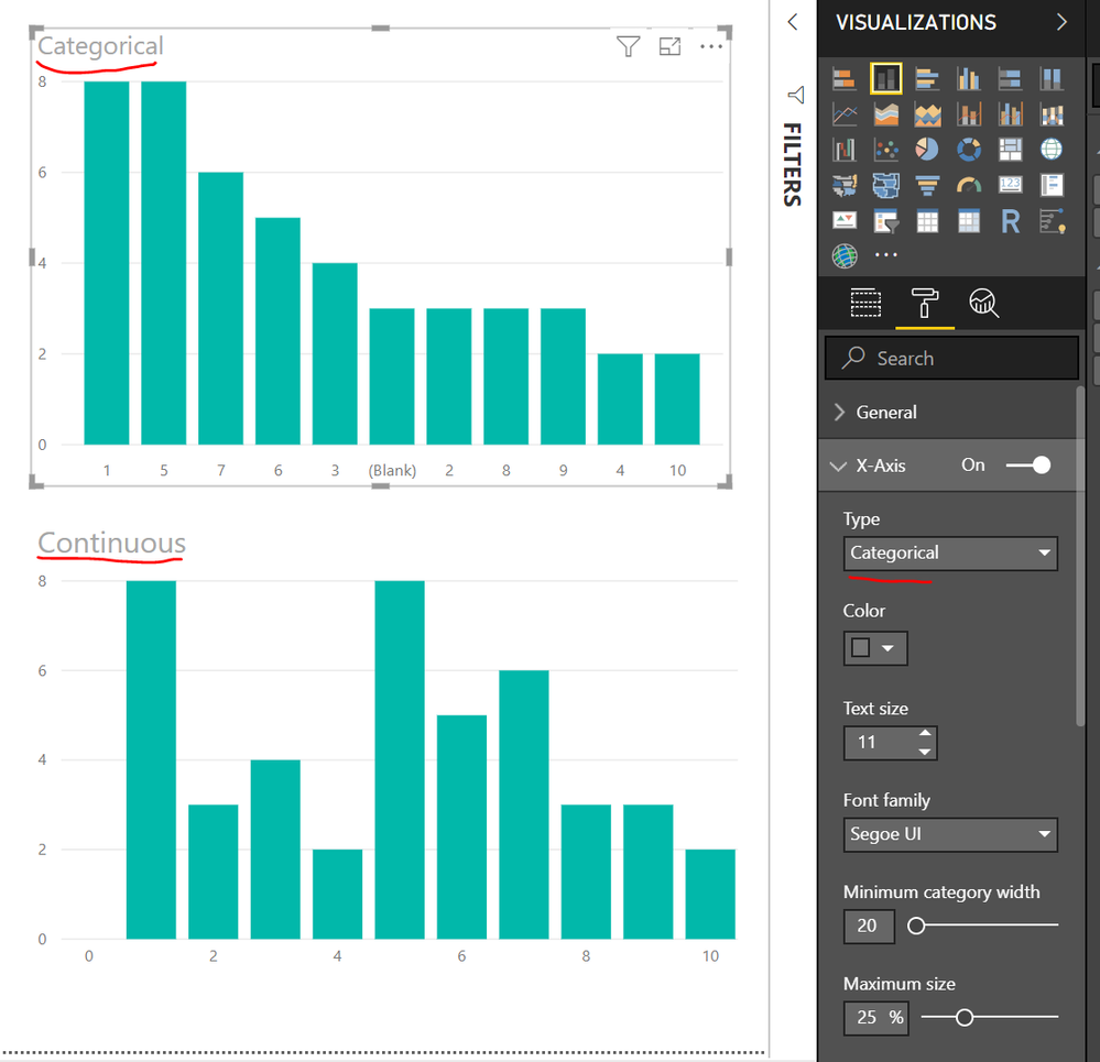
Are you using Continuous or Categorical for you X-Axis?
Follow on LinkedIn
@ me in replies or I'll lose your thread!!!
Instead of a Kudo, please vote for this idea
Become an expert!: Enterprise DNA
External Tools: MSHGQM
YouTube Channel!: Microsoft Hates Greg
Latest book!: The Definitive Guide to Power Query (M)
DAX is easy, CALCULATE makes DAX hard...
- Mark as New
- Bookmark
- Subscribe
- Mute
- Subscribe to RSS Feed
- Permalink
- Report Inappropriate Content
- Mark as New
- Bookmark
- Subscribe
- Mute
- Subscribe to RSS Feed
- Permalink
- Report Inappropriate Content
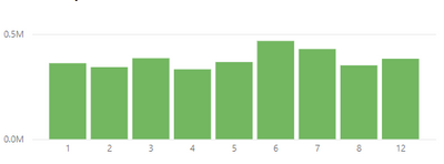
This works...except when you have weeks or months where there is no data. I have no data for September, October, November so my chart skips from month 8 to month 12 which the user might miss unless they look closely. Not help if you're looking for trends at a glance.
- Mark as New
- Bookmark
- Subscribe
- Mute
- Subscribe to RSS Feed
- Permalink
- Report Inappropriate Content
Found this as had similar issue, thanks for posting and its a Yes from me. Turned a head banging into a thumbs up!!
- Mark as New
- Bookmark
- Subscribe
- Mute
- Subscribe to RSS Feed
- Permalink
- Report Inappropriate Content
Thanks guys. Going for categorical solves the issue but I have quite a lot of charts like that in the file. It'd be quite time-consuming to go chart by chart changing from continuous to categorical. Any idea on how to do that in a faster, more convenient way?
Many thanks
- Mark as New
- Bookmark
- Subscribe
- Mute
- Subscribe to RSS Feed
- Permalink
- Report Inappropriate Content
- Mark as New
- Bookmark
- Subscribe
- Mute
- Subscribe to RSS Feed
- Permalink
- Report Inappropriate Content
Hi @AlB ,
I am afraid it may could not support all visuals, you could vote below links for your visuals or could submit an idea:
https://ideas.powerbi.com/forums/265200-power-bi-ideas?query=categorical%20x-axis
If your problem could be solved, don't forget to close this topic.
Regards,
Daniel He
If this post helps, then please consider Accept it as the solution to help the other members find it more quickly.
- Mark as New
- Bookmark
- Subscribe
- Mute
- Subscribe to RSS Feed
- Permalink
- Report Inappropriate Content
Hi @AlB and @Greg_Deckler,
WARNING: the following doesn't work, but it should be mentioned.
All Microsofts modern file formats are zipped files and folders. I've tried to unzip the pbix file and opened the file Report/Layout which is a JSON file. I changed a property (categorial/continuous) of a chart, zipped everything again and voila an error message that the file is corrupted. Then I tried the same once again only with changing a title of a chart. Also didn't work. It means there is probably a fingerprint somewhere in the binaries.
If it worked you could script it with ease. Unfortunately it doesn't 😞
- Mark as New
- Bookmark
- Subscribe
- Mute
- Subscribe to RSS Feed
- Permalink
- Report Inappropriate Content
Hi @AlB and @Greg_Deckler,
my next try, maybe you will find a bug in my solution and will be more successful than I was.
My next idea is to use Report Themes - create a new JSON file with a report theme and apply it to every report. According https://docs.microsoft.com/en-us/power-bi/desktop-report-themes it is possible to set all column charts to categorical or continuous (check the JSON file at the end of the MS doc page). I've tried to set many different properties, they worked but setting axisType for categoryAxis didn't.
Do you have any idea why the following JSON theme doesn't work?
{
    "name": "My Theme",
    "visualStyles": {
        "columnChart": {
            "*": {
                "categoryAxis": [
                    {
                        "axisType": "Categorical",
                        "fontSize": 14
                    }
                ]
            }
        }
    }
}
- Mark as New
- Bookmark
- Subscribe
- Mute
- Subscribe to RSS Feed
- Permalink
- Report Inappropriate Content
@Nolock - Have you looked at powerbi.tips to generate your theme code? @Mike_Carlo might have some insight into this.
Follow on LinkedIn
@ me in replies or I'll lose your thread!!!
Instead of a Kudo, please vote for this idea
Become an expert!: Enterprise DNA
External Tools: MSHGQM
YouTube Channel!: Microsoft Hates Greg
Latest book!: The Definitive Guide to Power Query (M)
DAX is easy, CALCULATE makes DAX hard...
- Mark as New
- Bookmark
- Subscribe
- Mute
- Subscribe to RSS Feed
- Permalink
- Report Inappropriate Content
Hi @AlB,
I think it is the standard behavior of all charts I've seen in many products. If there are to many values on an axis, only some of them will be displayed to stay well-arranged.
How to enforce it? Increase the width of your chart, which works for now. But it won't work, wenn you get a new data.
Helpful resources
| User | Count |
|---|---|
| 95 | |
| 86 | |
| 78 | |
| 72 | |
| 66 |
| User | Count |
|---|---|
| 113 | |
| 105 | |
| 84 | |
| 65 | |
| 64 |


