- Power BI forums
- Updates
- News & Announcements
- Get Help with Power BI
- Desktop
- Service
- Report Server
- Power Query
- Mobile Apps
- Developer
- DAX Commands and Tips
- Custom Visuals Development Discussion
- Health and Life Sciences
- Power BI Spanish forums
- Translated Spanish Desktop
- Power Platform Integration - Better Together!
- Power Platform Integrations (Read-only)
- Power Platform and Dynamics 365 Integrations (Read-only)
- Training and Consulting
- Instructor Led Training
- Dashboard in a Day for Women, by Women
- Galleries
- Community Connections & How-To Videos
- COVID-19 Data Stories Gallery
- Themes Gallery
- Data Stories Gallery
- R Script Showcase
- Webinars and Video Gallery
- Quick Measures Gallery
- 2021 MSBizAppsSummit Gallery
- 2020 MSBizAppsSummit Gallery
- 2019 MSBizAppsSummit Gallery
- Events
- Ideas
- Custom Visuals Ideas
- Issues
- Issues
- Events
- Upcoming Events
- Community Blog
- Power BI Community Blog
- Custom Visuals Community Blog
- Community Support
- Community Accounts & Registration
- Using the Community
- Community Feedback
Register now to learn Fabric in free live sessions led by the best Microsoft experts. From Apr 16 to May 9, in English and Spanish.
- Power BI forums
- Forums
- Get Help with Power BI
- Desktop
- Invisible bar chart ?
- Subscribe to RSS Feed
- Mark Topic as New
- Mark Topic as Read
- Float this Topic for Current User
- Bookmark
- Subscribe
- Printer Friendly Page
- Mark as New
- Bookmark
- Subscribe
- Mute
- Subscribe to RSS Feed
- Permalink
- Report Inappropriate Content
Invisible bar chart ?
Hello everyone,
I have a column with a lot of modality (approximatively 100) and I want to use them as a legend in my stacked chart. The result is the following :
They don't have as much color as modality, consequently we see invisible bar chart. Only 84 modality have a color and I really need to see all of them. Can we change the color allocation limit ?
Solved! Go to Solution.
- Mark as New
- Bookmark
- Subscribe
- Mute
- Subscribe to RSS Feed
- Permalink
- Report Inappropriate Content
Hi @Irache ,
By default, Power BI uses a color palette with a limited number of colors, which can result in some categories not being assigned a unique color.
Please have a try.
- Custom Color Palette:
You can create a custom color palette by defining specific colors for each category. - Grouping or Aggregating Data:
Consider grouping similar modalities together. For instance, if you have multiple subcategories within a broader category, aggregate them.This reduces the number of distinct colors needed and simplifies the visualization. - Alternate Visualization Types:
If the stacked chart becomes too cluttered, explore other visualization types like a treemap, bar chart, or table.
Tips and tricks for formatting in reports - Power BI | Microsoft Learn
Define colors on a Power BI paginated report chart using a palette - Power BI | Microsoft Learn
Best Regards
Community Support Team _ Rongtie
If this post helps, then please consider Accept it as the solution to help the other members find it more quickly.
- Mark as New
- Bookmark
- Subscribe
- Mute
- Subscribe to RSS Feed
- Permalink
- Report Inappropriate Content
Hello,
Thanks for your advice I have already thought about these means but this is a mandatory information that I really need to show. I have found an alternative solution for my issue.
- Mark as New
- Bookmark
- Subscribe
- Mute
- Subscribe to RSS Feed
- Permalink
- Report Inappropriate Content
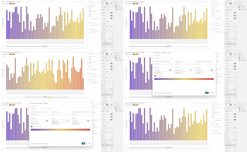
hi @Irache do you have a id on you rrecord, if such you can use that in the column conditional formatting section.
Consider having 100 categories, the id is from 1 - 100 thus the gradient scale will provide you what you need, e.g.:
- Mark as New
- Bookmark
- Subscribe
- Mute
- Subscribe to RSS Feed
- Permalink
- Report Inappropriate Content
It will doesn't work it's a categorial column.
Helpful resources

Microsoft Fabric Learn Together
Covering the world! 9:00-10:30 AM Sydney, 4:00-5:30 PM CET (Paris/Berlin), 7:00-8:30 PM Mexico City

Power BI Monthly Update - April 2024
Check out the April 2024 Power BI update to learn about new features.

| User | Count |
|---|---|
| 106 | |
| 104 | |
| 79 | |
| 68 | |
| 61 |
| User | Count |
|---|---|
| 144 | |
| 104 | |
| 103 | |
| 82 | |
| 70 |


