Jumpstart your career with the Fabric Career Hub
Find everything you need to get certified on Fabric—skills challenges, live sessions, exam prep, role guidance, and a 50 percent discount on exams.
Get started- Power BI forums
- Updates
- News & Announcements
- Get Help with Power BI
- Desktop
- Service
- Report Server
- Power Query
- Mobile Apps
- Developer
- DAX Commands and Tips
- Custom Visuals Development Discussion
- Health and Life Sciences
- Power BI Spanish forums
- Translated Spanish Desktop
- Power Platform Integration - Better Together!
- Power Platform Integrations (Read-only)
- Power Platform and Dynamics 365 Integrations (Read-only)
- Training and Consulting
- Instructor Led Training
- Dashboard in a Day for Women, by Women
- Galleries
- Community Connections & How-To Videos
- COVID-19 Data Stories Gallery
- Themes Gallery
- Data Stories Gallery
- R Script Showcase
- Webinars and Video Gallery
- Quick Measures Gallery
- 2021 MSBizAppsSummit Gallery
- 2020 MSBizAppsSummit Gallery
- 2019 MSBizAppsSummit Gallery
- Events
- Ideas
- Custom Visuals Ideas
- Issues
- Issues
- Events
- Upcoming Events
- Community Blog
- Power BI Community Blog
- Custom Visuals Community Blog
- Community Support
- Community Accounts & Registration
- Using the Community
- Community Feedback
Earn a 50% discount on the DP-600 certification exam by completing the Fabric 30 Days to Learn It challenge.
- Power BI forums
- Forums
- Get Help with Power BI
- Desktop
- Dynamically Change the aggregate on a line chart b...
- Subscribe to RSS Feed
- Mark Topic as New
- Mark Topic as Read
- Float this Topic for Current User
- Bookmark
- Subscribe
- Printer Friendly Page
- Mark as New
- Bookmark
- Subscribe
- Mute
- Subscribe to RSS Feed
- Permalink
- Report Inappropriate Content
Dynamically Change the aggregate on a line chart by days or months
Hi all,
So I've got a problem. I have a dataset that contains values which I aggregate and display on a line chart by date. I want to however have the line chart's date axis dynamically change from aggregating in Days to aggregating in months depending on how I select the date slicer. So for example:
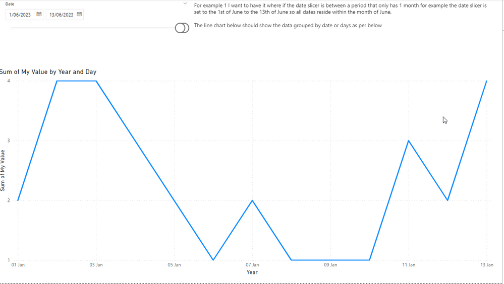
When I then change the date slicer to include more than 1 month for example the below. I want the line chart to dynamically change so that it's now displaying and aggregating by months.
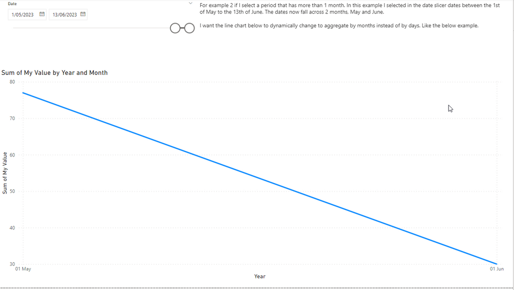
Is there a way of doing this?
Here's the dropbox link to the PBIX file I used to generate the screenshot. Any help would be greatly appreciated.
https://www.dropbox.com/s/kdrayilm4f7pp6u/Help%20Example.pbix?dl=0
Solved! Go to Solution.
- Mark as New
- Bookmark
- Subscribe
- Mute
- Subscribe to RSS Feed
- Permalink
- Report Inappropriate Content
Hi @Mike282
I
While I don't believe it is possible to do it completely automatically, I do believe it is possible to use
Field parametrs
In order to select the granularity level desired
Please follow these steps to modify this option:
1. Add to your date table column for month - year
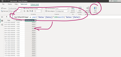
2. Add another column to have the option to sort your month and year in the correct order:
3. Modify sort order of month and year:
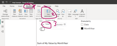
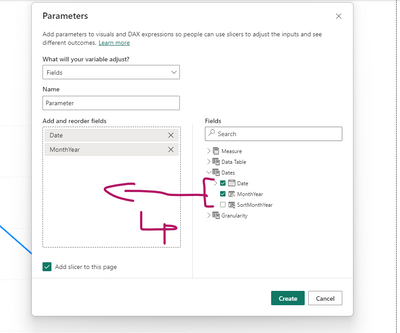
4. Add field parameters:
5. Put the field parameter as a X axis to your chart:
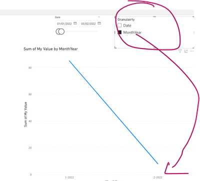
Now you can change desired granularity from the slicer of the parameter:
If this post helps, then please consider Accepting it as the solution to help the other members find it more quickly
- Mark as New
- Bookmark
- Subscribe
- Mute
- Subscribe to RSS Feed
- Permalink
- Report Inappropriate Content
I was just look at this too and saw @Ritaf1983 's post just before I posted.
My only addition to the discussion is that the field parameter selection can be automated.
- Create a measure Date Field Flag that returns 1 if the current field parameter value corresponds to the date selection.
- Ensure there is an explicit "Start of Month" or MonthYear column in the Dates table.
- Add a Top N filter to the line chart visual as shown below.
See attached PBIX.
Date Field Flag measure:
Date Field Flag =
VAR NumMonths =
    DISTINCTCOUNT ( Dates[Start of Month] )
VAR CurrentDateField =
    MIN ( 'Date Field'[Date Field] )
RETURN
    INT (
        OR (
            AND ( NumMonths = 1, CurrentDateField = "Date" ),
            AND ( NumMonths > 1, CurrentDateField = "Start of Month" )
        )
    )
Visual-level filter on line chart:
- Mark as New
- Bookmark
- Subscribe
- Mute
- Subscribe to RSS Feed
- Permalink
- Report Inappropriate Content
Hi @Mike282
I
While I don't believe it is possible to do it completely automatically, I do believe it is possible to use
Field parametrs
In order to select the granularity level desired
Please follow these steps to modify this option:
1. Add to your date table column for month - year
2. Add another column to have the option to sort your month and year in the correct order:
3. Modify sort order of month and year:
4. Add field parameters:
5. Put the field parameter as a X axis to your chart:
Now you can change desired granularity from the slicer of the parameter:
If this post helps, then please consider Accepting it as the solution to help the other members find it more quickly

