- Power BI forums
- Updates
- News & Announcements
- Get Help with Power BI
- Desktop
- Service
- Report Server
- Power Query
- Mobile Apps
- Developer
- DAX Commands and Tips
- Custom Visuals Development Discussion
- Health and Life Sciences
- Power BI Spanish forums
- Translated Spanish Desktop
- Power Platform Integration - Better Together!
- Power Platform Integrations (Read-only)
- Power Platform and Dynamics 365 Integrations (Read-only)
- Training and Consulting
- Instructor Led Training
- Dashboard in a Day for Women, by Women
- Galleries
- Community Connections & How-To Videos
- COVID-19 Data Stories Gallery
- Themes Gallery
- Data Stories Gallery
- R Script Showcase
- Webinars and Video Gallery
- Quick Measures Gallery
- 2021 MSBizAppsSummit Gallery
- 2020 MSBizAppsSummit Gallery
- 2019 MSBizAppsSummit Gallery
- Events
- Ideas
- Custom Visuals Ideas
- Issues
- Issues
- Events
- Upcoming Events
- Community Blog
- Power BI Community Blog
- Custom Visuals Community Blog
- Community Support
- Community Accounts & Registration
- Using the Community
- Community Feedback
Register now to learn Fabric in free live sessions led by the best Microsoft experts. From Apr 16 to May 9, in English and Spanish.
- Power BI forums
- Forums
- Get Help with Power BI
- Desktop
- Dynamic Linear Gauge
- Subscribe to RSS Feed
- Mark Topic as New
- Mark Topic as Read
- Float this Topic for Current User
- Bookmark
- Subscribe
- Printer Friendly Page
- Mark as New
- Bookmark
- Subscribe
- Mute
- Subscribe to RSS Feed
- Permalink
- Report Inappropriate Content
Dynamic Linear Gauge
Hello guys,
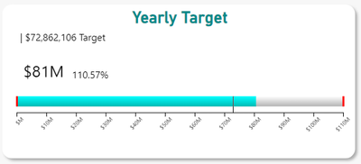
Currently, I've been using Linear Gauge by MAC software it's great but I want to add something to it and couldn't know how.
this visual shows the sales data compared to the target by month, can I make it to stack month that is before the selected month?
Example:
Selected Month [Apr]: view visual for [Jan,Feb,Mar,Apr]
if other visuals achieve my goal please feel free to suggest them to me.
Thanks
- Mark as New
- Bookmark
- Subscribe
- Mute
- Subscribe to RSS Feed
- Permalink
- Report Inappropriate Content
To achieve the desired functionality of stacking the months that are before the selected month in your Linear Gauge visual, you can utilize the following approach:
1. **Data Preparation**:
- Ensure your dataset contains a column for the month and another column for the sales data.
- Create a calculated column that assigns a value of 1 to the selected month and a value of 0 to all other months. This column will be used to filter the data.
2. **Visual Configuration**:
- Configure your Linear Gauge visual to use the calculated column created in the previous step as a filter.
- Set up the target value for the gauge to represent the target sales for the selected month.
- Adjust the settings of the Linear Gauge visual to display the sales data for all months before the selected month. You may need to adjust the formatting or aggregation settings to achieve the desired result.
3. **Interaction**:
- Enable interactions between the Linear Gauge visual and other visuals in your report. This will allow users to select a specific month from another visual (e.g., a slicer or dropdown) and dynamically update the Linear Gauge visual to display the corresponding sales data.
By following these steps, you should be able to create a Linear Gauge visual that stacks the sales data for months before the selected month and compares it to the target. Additionally, you can explore other visuals such as line charts or stacked bar charts that offer similar functionality and may better suit your requirements.
Did I answer your question? Mark my post as a solution! Appreciate your Kudos !!
Helpful resources

Microsoft Fabric Learn Together
Covering the world! 9:00-10:30 AM Sydney, 4:00-5:30 PM CET (Paris/Berlin), 7:00-8:30 PM Mexico City

Power BI Monthly Update - April 2024
Check out the April 2024 Power BI update to learn about new features.

| User | Count |
|---|---|
| 97 | |
| 97 | |
| 82 | |
| 74 | |
| 66 |
| User | Count |
|---|---|
| 120 | |
| 105 | |
| 99 | |
| 81 | |
| 72 |

