Jumpstart your career with the Fabric Career Hub
Find everything you need to get certified on Fabric—skills challenges, live sessions, exam prep, role guidance, and more.
Get started- Power BI forums
- Updates
- News & Announcements
- Get Help with Power BI
- Desktop
- Service
- Report Server
- Power Query
- Mobile Apps
- Developer
- DAX Commands and Tips
- Custom Visuals Development Discussion
- Health and Life Sciences
- Power BI Spanish forums
- Translated Spanish Desktop
- Power Platform Integration - Better Together!
- Power Platform Integrations (Read-only)
- Power Platform and Dynamics 365 Integrations (Read-only)
- Training and Consulting
- Instructor Led Training
- Dashboard in a Day for Women, by Women
- Galleries
- Community Connections & How-To Videos
- COVID-19 Data Stories Gallery
- Themes Gallery
- Data Stories Gallery
- R Script Showcase
- Webinars and Video Gallery
- Quick Measures Gallery
- 2021 MSBizAppsSummit Gallery
- 2020 MSBizAppsSummit Gallery
- 2019 MSBizAppsSummit Gallery
- Events
- Ideas
- Custom Visuals Ideas
- Issues
- Issues
- Events
- Upcoming Events
- Community Blog
- Power BI Community Blog
- Custom Visuals Community Blog
- Community Support
- Community Accounts & Registration
- Using the Community
- Community Feedback
Grow your Fabric skills and prepare for the DP-600 certification exam by completing the latest Microsoft Fabric challenge.
- Power BI forums
- Forums
- Get Help with Power BI
- Desktop
- Re: Display my percent data
- Subscribe to RSS Feed
- Mark Topic as New
- Mark Topic as Read
- Float this Topic for Current User
- Bookmark
- Subscribe
- Printer Friendly Page
- Mark as New
- Bookmark
- Subscribe
- Mute
- Subscribe to RSS Feed
- Permalink
- Report Inappropriate Content
Display my percent data
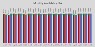
I'm sure for a non-newbie that this is a simple issue, but I can't find the answer and all the YouTube clips that I have watched, all relate to some calculation to create a percentage. I have a table that has a month column, then 4 columns for different incident priorities. And those columns are populated with percentages. I just want PBI to show a chart with the months along the bottom and bars showing the percentage values with labels - like the simple Excel chart I have for last year. I am guessing that I have to change the source data where the percentages are, and then change the format in PBI but can't work it out.
Solved! Go to Solution.
- Mark as New
- Bookmark
- Subscribe
- Mute
- Subscribe to RSS Feed
- Permalink
- Report Inappropriate Content
Hi @botty1963 ,
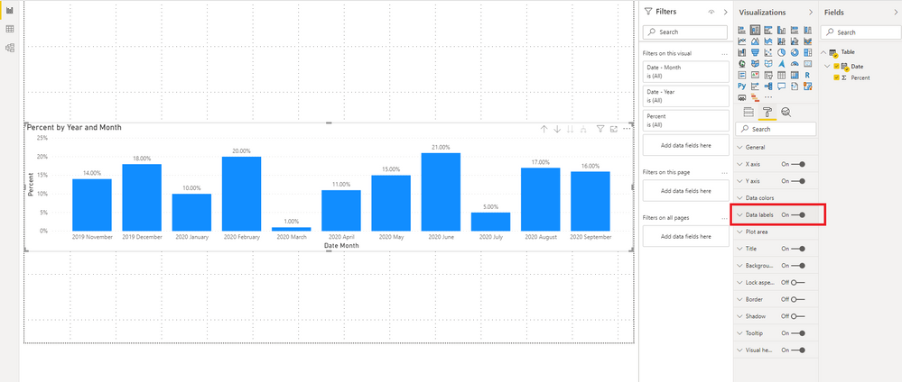
You may try to create a Stacked column chart, then put your date column to Axis and percent column to Valus. The date hierarchy retains the year and month, and expand all down one level in the hierarchy. To show the percentage values with labels, mark sure the Data labels is on.
You can check more details from here.
Reference: Introduction To Power BI Visuals - Part Two (Stacked Column Chart)
Drill mode in a visual in Power BI
How to use Date vs Date Hierarchy in Power BI
Best Regards,
Stephen Tao
If this post helps, then please consider Accept it as the solution to help the other members find it more quickly.
- Mark as New
- Bookmark
- Subscribe
- Mute
- Subscribe to RSS Feed
- Permalink
- Report Inappropriate Content
Based on your dataset already including the relevant month field and 4 percentages you could try the following:
Create a clustered column chart visual, pull the month field into axis then pull the 4 relevant percentage fields into values. This should create a bar chart showing the 4 percentages for each month.
Turn on data labels by going into format.
Helpful resources

Europe’s largest Microsoft Fabric Community Conference
Join the community in Stockholm for expert Microsoft Fabric learning including a very exciting keynote from Arun Ulag, Corporate Vice President, Azure Data.

| User | Count |
|---|---|
| 86 | |
| 85 | |
| 68 | |
| 67 | |
| 63 |
| User | Count |
|---|---|
| 210 | |
| 118 | |
| 116 | |
| 81 | |
| 74 |


