Jumpstart your career with the Fabric Career Hub
Find everything you need to get certified on Fabric—skills challenges, live sessions, exam prep, role guidance, and more.
Get started- Power BI forums
- Updates
- News & Announcements
- Get Help with Power BI
- Desktop
- Service
- Report Server
- Power Query
- Mobile Apps
- Developer
- DAX Commands and Tips
- Custom Visuals Development Discussion
- Health and Life Sciences
- Power BI Spanish forums
- Translated Spanish Desktop
- Power Platform Integration - Better Together!
- Power Platform Integrations (Read-only)
- Power Platform and Dynamics 365 Integrations (Read-only)
- Training and Consulting
- Instructor Led Training
- Dashboard in a Day for Women, by Women
- Galleries
- Community Connections & How-To Videos
- COVID-19 Data Stories Gallery
- Themes Gallery
- Data Stories Gallery
- R Script Showcase
- Webinars and Video Gallery
- Quick Measures Gallery
- 2021 MSBizAppsSummit Gallery
- 2020 MSBizAppsSummit Gallery
- 2019 MSBizAppsSummit Gallery
- Events
- Ideas
- Custom Visuals Ideas
- Issues
- Issues
- Events
- Upcoming Events
- Community Blog
- Power BI Community Blog
- Custom Visuals Community Blog
- Community Support
- Community Accounts & Registration
- Using the Community
- Community Feedback
Grow your Fabric skills and prepare for the DP-600 certification exam by completing the latest Microsoft Fabric challenge.
- Power BI forums
- Forums
- Get Help with Power BI
- Desktop
- Re: Conditionally format bar chart column colour b...
- Subscribe to RSS Feed
- Mark Topic as New
- Mark Topic as Read
- Float this Topic for Current User
- Bookmark
- Subscribe
- Printer Friendly Page
- Mark as New
- Bookmark
- Subscribe
- Mute
- Subscribe to RSS Feed
- Permalink
- Report Inappropriate Content
Conditionally format bar chart column colour based on slicer value
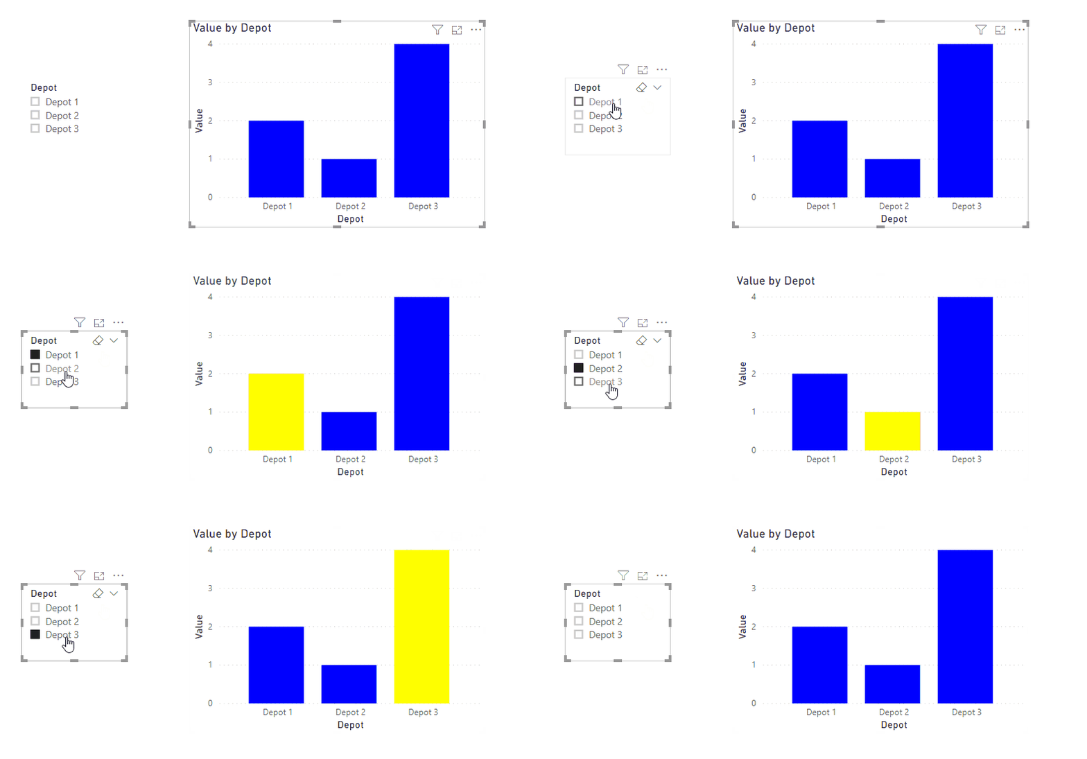
I have the following visuals:
I am looking to change the colour of each bar based on the selection of the Depot slicer.
If depot slicer is Depot 1, the Depot 1 bar is highlighted
If depot slicer is Depot 2, the Depot 2 bar is highlighted
Can anyone advise if this is possible with a measure and conditional formatting?
Any assistance appreciated.
Solved! Go to Solution.
- Mark as New
- Bookmark
- Subscribe
- Mute
- Subscribe to RSS Feed
- Permalink
- Report Inappropriate Content
Hi @msommerf ,
Try this:
1. Create a separate Depot table.
Depot = VALUES ( 'Table'[Depot] )
2. Create a Measure like so:
Highlight = IF ( MAX ( 'Table'[Depot] ) = SELECTEDVALUE ( Depot[Depot] ), "Yellow", "Blue" )
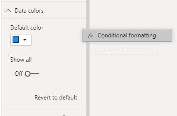
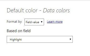
3. Set conditional formatting of Data color in Clustered column chart.
4. Test.
For more details, please check the attached PBIX file.
Best Regards,
Icey
If this post helps, then please consider Accept it as the solution to help the other members find it more quickly.
- Mark as New
- Bookmark
- Subscribe
- Mute
- Subscribe to RSS Feed
- Permalink
- Report Inappropriate Content
Hi
That's fantastic. Is there any way to change the format the axis labels using the slicer in the same way? I want to be able to only show the label of the selected column by changing the font colour of the other labels to white. I tried it in your example file by changing the conditional formatting of the X axis value settings but the only effect was that all three labels changed to yellow when I select Depot 3, they all remained blue when selecting Depot 1 or Depot 2. I guess this is something to do with the Max function in the Highlight measure. It's odd that the conditional formatting behaves differently for different elements in the same chart.
Many thanks
Nigel
- Mark as New
- Bookmark
- Subscribe
- Mute
- Subscribe to RSS Feed
- Permalink
- Report Inappropriate Content
Hey Icey, I've implemented your solution and it works great! Thank you for that. I do however have a question. Is it possible to use the slicer as a filter for other visuals? In my model I get a circular reference error when trying to make the relationship.
Thank you!
ZL
- Mark as New
- Bookmark
- Subscribe
- Mute
- Subscribe to RSS Feed
- Permalink
- Report Inappropriate Content
Create a measure like this
Color Measure = if(Max(Table[Depot] in allselected(Table[Depot])) <today(),"Yellow","Blue")
And use field options and measure in conditional formatting
https://docs.microsoft.com/en-us/power-bi/desktop-conditional-table-formatting#color-by-color-values
Microsoft Power BI Learning Resources, 2023 !!
Learn Power BI - Full Course with Dec-2022, with Window, Index, Offset, 100+ Topics !!
Did I answer your question? Mark my post as a solution! Appreciate your Kudos !! Proud to be a Super User! !!
Helpful resources

Europe’s largest Microsoft Fabric Community Conference
Join the community in Stockholm for expert Microsoft Fabric learning including a very exciting keynote from Arun Ulag, Corporate Vice President, Azure Data.

New forum boards available in Real-Time Intelligence.
Ask questions in Eventhouse and KQL, Eventstream, and Reflex.

| User | Count |
|---|---|
| 84 | |
| 84 | |
| 65 | |
| 62 | |
| 55 |
| User | Count |
|---|---|
| 172 | |
| 108 | |
| 105 | |
| 71 | |
| 70 |


