- Power BI forums
- Updates
- News & Announcements
- Get Help with Power BI
- Desktop
- Service
- Report Server
- Power Query
- Mobile Apps
- Developer
- DAX Commands and Tips
- Custom Visuals Development Discussion
- Health and Life Sciences
- Power BI Spanish forums
- Translated Spanish Desktop
- Power Platform Integration - Better Together!
- Power Platform Integrations (Read-only)
- Power Platform and Dynamics 365 Integrations (Read-only)
- Training and Consulting
- Instructor Led Training
- Dashboard in a Day for Women, by Women
- Galleries
- Community Connections & How-To Videos
- COVID-19 Data Stories Gallery
- Themes Gallery
- Data Stories Gallery
- R Script Showcase
- Webinars and Video Gallery
- Quick Measures Gallery
- 2021 MSBizAppsSummit Gallery
- 2020 MSBizAppsSummit Gallery
- 2019 MSBizAppsSummit Gallery
- Events
- Ideas
- Custom Visuals Ideas
- Issues
- Issues
- Events
- Upcoming Events
- Community Blog
- Power BI Community Blog
- Custom Visuals Community Blog
- Community Support
- Community Accounts & Registration
- Using the Community
- Community Feedback
Earn a 50% discount on the DP-600 certification exam by completing the Fabric 30 Days to Learn It challenge.
- Power BI forums
- Forums
- Get Help with Power BI
- Desktop
- Re: Change column to subtract based on geographic ...
- Subscribe to RSS Feed
- Mark Topic as New
- Mark Topic as Read
- Float this Topic for Current User
- Bookmark
- Subscribe
- Printer Friendly Page
- Mark as New
- Bookmark
- Subscribe
- Mute
- Subscribe to RSS Feed
- Permalink
- Report Inappropriate Content
Change column to subtract based on geographic heirarchy
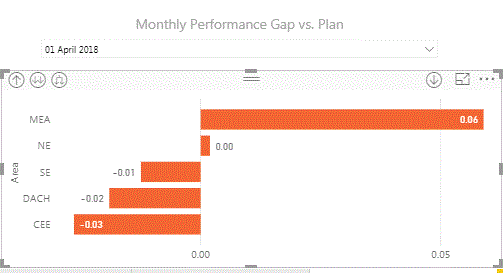
I am trying to create a visual which will show my "Gap to target value" at three layers in the visual. Region>Area>Country.
Here is my first attempt, the idea is to be able to drill though each layer and see the gap:
The visual gives the correct information at country level where Gap = Actual - Target, but at the area and regional level the visual is showing Gap = average of actual - average of target. I don't have the option to stop it summarizing. Okay so more background info:
This is a small snippit of the data. And here is what I need my visualisation to do:
- Actual performance (at country level) = Quantity delivered/Quantity ordered. Then, Gap (country) = Actual performance - Market target.
- Actual performance (at area level) = sum of Quantity delivered/sum of Quantity ordered. (i.e. sum both columns by area such as DACH) Then, Gap (area) = Actual performance - Area target.
- Actual performance (at region level) = sum of Quantity delivered/sum of Quantity ordered. (i.e. sum both columns by region such as EMEA) Then, Gap (region) = Actual performance - region target.
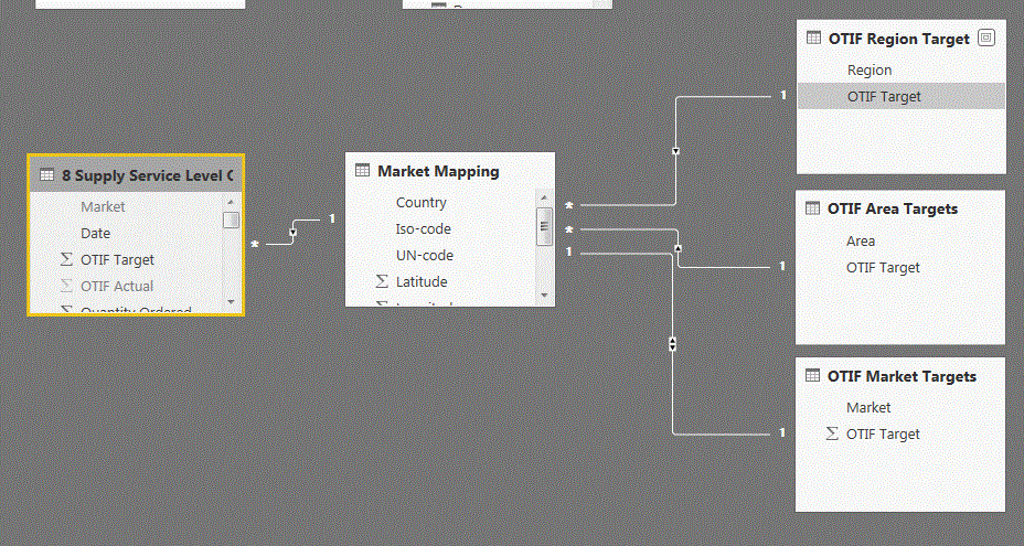
Here is my PwBI relationships so far:
I have created seperate tables to store market, area, and regional targets, a table for the actual performance data, and a central market mapping table to relate the market, area, and regional names to some standardised names.
Is it possible to write 1 set of measures to show this in 1 visual (1 visual is key), right now i can do it but as 3 visuals.
- Mark as New
- Bookmark
- Subscribe
- Mute
- Subscribe to RSS Feed
- Permalink
- Report Inappropriate Content
Hi HassanI,
Here is a workaround, please check if it can work. You can create a new column which contains value "Country level", "Region level" and "area level" in the Target table. Then you can drag the new column into legend field of chart.
Regards,
Jimmy Tao
- Mark as New
- Bookmark
- Subscribe
- Mute
- Subscribe to RSS Feed
- Permalink
- Report Inappropriate Content
Hi Jimmy,
Are you suggesting instead of drill down through the geographic layers, we show each as a layer as a seperate bar colourised with legend?
This would mean I would be trying to show 37 bars on a chart at once? (32 countires, 5 areas, 1 region)
Hassan
- Mark as New
- Bookmark
- Subscribe
- Mute
- Subscribe to RSS Feed
- Permalink
- Report Inappropriate Content
Hi,
Just realised you asked me to make it in the target table of which there are 3, not 1.
Helpful resources

Microsoft Fabric Learn Together
Covering the world! 9:00-10:30 AM Sydney, 4:00-5:30 PM CET (Paris/Berlin), 7:00-8:30 PM Mexico City

Power BI Monthly Update - April 2024
Check out the April 2024 Power BI update to learn about new features.

| User | Count |
|---|---|
| 109 | |
| 102 | |
| 84 | |
| 79 | |
| 70 |
| User | Count |
|---|---|
| 120 | |
| 110 | |
| 95 | |
| 82 | |
| 77 |


