- Power BI forums
- Updates
- News & Announcements
- Get Help with Power BI
- Desktop
- Service
- Report Server
- Power Query
- Mobile Apps
- Developer
- DAX Commands and Tips
- Custom Visuals Development Discussion
- Health and Life Sciences
- Power BI Spanish forums
- Translated Spanish Desktop
- Power Platform Integration - Better Together!
- Power Platform Integrations (Read-only)
- Power Platform and Dynamics 365 Integrations (Read-only)
- Training and Consulting
- Instructor Led Training
- Dashboard in a Day for Women, by Women
- Galleries
- Community Connections & How-To Videos
- COVID-19 Data Stories Gallery
- Themes Gallery
- Data Stories Gallery
- R Script Showcase
- Webinars and Video Gallery
- Quick Measures Gallery
- 2021 MSBizAppsSummit Gallery
- 2020 MSBizAppsSummit Gallery
- 2019 MSBizAppsSummit Gallery
- Events
- Ideas
- Custom Visuals Ideas
- Issues
- Issues
- Events
- Upcoming Events
- Community Blog
- Power BI Community Blog
- Custom Visuals Community Blog
- Community Support
- Community Accounts & Registration
- Using the Community
- Community Feedback
Register now to learn Fabric in free live sessions led by the best Microsoft experts. From Apr 16 to May 9, in English and Spanish.
- Power BI forums
- Forums
- Get Help with Power BI
- Desktop
- Bar Chart Legend Dependent on Filter
- Subscribe to RSS Feed
- Mark Topic as New
- Mark Topic as Read
- Float this Topic for Current User
- Bookmark
- Subscribe
- Printer Friendly Page
- Mark as New
- Bookmark
- Subscribe
- Mute
- Subscribe to RSS Feed
- Permalink
- Report Inappropriate Content
Bar Chart Legend Dependent on Filter
Hi all! Need some help with a visual:
I have a Power BI report that shows connections between companies. Each row of data features a Company column and Company partner column. I have filters for both Company and Partner Company on this page. When I filter to Company, I want the bar chart - which shows the partnering company count - to have a legend of Partner Company. When I filter to Partner Company, I want the bar chart to have a legend of Company. Goal is to show who these companies are partnering with. Due to another visual, I require both Company and Partner Company filters and aniticipate both to be used by the end user.
How can I make this visual work? I've taught about overlaying two bar charts, each with a different legend but do not know how I owuld hide a visual based on whether a filter is one.
Solved! Go to Solution.
- Mark as New
- Bookmark
- Subscribe
- Mute
- Subscribe to RSS Feed
- Permalink
- Report Inappropriate Content
Hi @cake28424
The proposed solution is to overlay two bar charts and dynamically display them based on the applied filter, which is a feasible approach.
To achieve this effect, you can utilize bookmarks and the selection pane.
First, create two separate bar charts. One chart will have 'Company' as the legend (to be displayed when 'Partner Company' is filtered), and the other will have 'Partner Company' as the legend (to be displayed when 'Company' is filtered).
Use bookmarks to capture the state of your report page for each filter scenario.
You'll need to create two bookmarks:
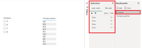
Bookmark 1: Hide the 'Company' legend chart and show the 'Partner Company' legend chart.
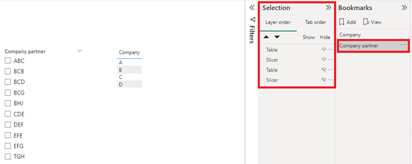
Bookmark 2: Hide the 'Partner Company' legend chart and show the 'Company' legend chart.
Use the Selection Pane: The Selection Pane allows you to control the visibility of visuals on your report page. Use it in conjunction with bookmarks to show/hide the appropriate chart based on the filter applied.
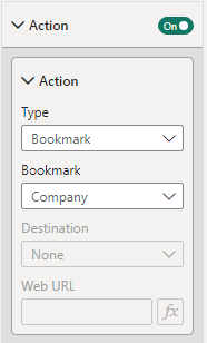
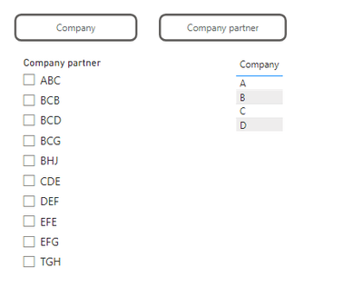
Create buttons. When clicked, the corresponding bookmark will be activated.
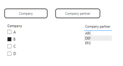
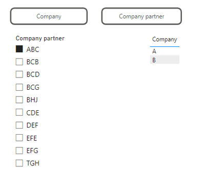
Here is the result.
Regards,
Nono Chen
If this post helps, then please consider Accept it as the solution to help the other members find it more quickly.
- Mark as New
- Bookmark
- Subscribe
- Mute
- Subscribe to RSS Feed
- Permalink
- Report Inappropriate Content
Thank you!
- Mark as New
- Bookmark
- Subscribe
- Mute
- Subscribe to RSS Feed
- Permalink
- Report Inappropriate Content
Hi @cake28424
The proposed solution is to overlay two bar charts and dynamically display them based on the applied filter, which is a feasible approach.
To achieve this effect, you can utilize bookmarks and the selection pane.
First, create two separate bar charts. One chart will have 'Company' as the legend (to be displayed when 'Partner Company' is filtered), and the other will have 'Partner Company' as the legend (to be displayed when 'Company' is filtered).
Use bookmarks to capture the state of your report page for each filter scenario.
You'll need to create two bookmarks:
Bookmark 1: Hide the 'Company' legend chart and show the 'Partner Company' legend chart.
Bookmark 2: Hide the 'Partner Company' legend chart and show the 'Company' legend chart.
Use the Selection Pane: The Selection Pane allows you to control the visibility of visuals on your report page. Use it in conjunction with bookmarks to show/hide the appropriate chart based on the filter applied.
Create buttons. When clicked, the corresponding bookmark will be activated.
Here is the result.
Regards,
Nono Chen
If this post helps, then please consider Accept it as the solution to help the other members find it more quickly.
Helpful resources

Microsoft Fabric Learn Together
Covering the world! 9:00-10:30 AM Sydney, 4:00-5:30 PM CET (Paris/Berlin), 7:00-8:30 PM Mexico City

Power BI Monthly Update - April 2024
Check out the April 2024 Power BI update to learn about new features.

| User | Count |
|---|---|
| 105 | |
| 94 | |
| 75 | |
| 63 | |
| 62 |
| User | Count |
|---|---|
| 137 | |
| 105 | |
| 104 | |
| 80 | |
| 63 |
