- Power BI forums
- Updates
- News & Announcements
- Get Help with Power BI
- Desktop
- Service
- Report Server
- Power Query
- Mobile Apps
- Developer
- DAX Commands and Tips
- Custom Visuals Development Discussion
- Health and Life Sciences
- Power BI Spanish forums
- Translated Spanish Desktop
- Power Platform Integration - Better Together!
- Power Platform Integrations (Read-only)
- Power Platform and Dynamics 365 Integrations (Read-only)
- Training and Consulting
- Instructor Led Training
- Dashboard in a Day for Women, by Women
- Galleries
- Community Connections & How-To Videos
- COVID-19 Data Stories Gallery
- Themes Gallery
- Data Stories Gallery
- R Script Showcase
- Webinars and Video Gallery
- Quick Measures Gallery
- 2021 MSBizAppsSummit Gallery
- 2020 MSBizAppsSummit Gallery
- 2019 MSBizAppsSummit Gallery
- Events
- Ideas
- Custom Visuals Ideas
- Issues
- Issues
- Events
- Upcoming Events
- Community Blog
- Power BI Community Blog
- Custom Visuals Community Blog
- Community Support
- Community Accounts & Registration
- Using the Community
- Community Feedback
Register now to learn Fabric in free live sessions led by the best Microsoft experts. From Apr 16 to May 9, in English and Spanish.
- Power BI forums
- Forums
- Get Help with Power BI
- Desktop
- Additional lines in chatter chart
- Subscribe to RSS Feed
- Mark Topic as New
- Mark Topic as Read
- Float this Topic for Current User
- Bookmark
- Subscribe
- Printer Friendly Page
- Mark as New
- Bookmark
- Subscribe
- Mute
- Subscribe to RSS Feed
- Permalink
- Report Inappropriate Content
Additional lines in chatter chart
Hi,
I have a chatter charts that I want to add 4 additional lines to (a specific value in 4 different columns)
I work in a hospital. My current Power BI request looks like this:
- each drug (15 different) is testet against a bug (disease - fx influenza)(21 different) every day.
- The result is a zone measured in Millimeters (MM)
- In my report, the users start out by selecting a drug (drug slicer) and a bug (bug slicer).
- the chatter chart now shows the dates on the x axis and the zones in millimeters on the y-axis. The measurement of each day is not related to the measurement of the previous day. So it needs to be a chatter chart.
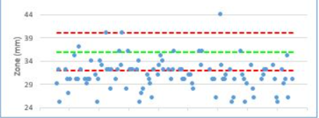
However. For each drug + bug combination, there is a 'Target low' (green line Excel in picture), 'target high' (green line in Excel picture - often the same value as target low), 'tollerance low' (lower red line in Excel picture), 'tollerence high' (upper red line in Excel picture).
All of these four values are fixed but only for a specific bug + drug combination.
I see a posibility in the analytics pane to add additional lines but not based on columns.
Is it in any way possible to add these 4 columns as lines in the chatter chart (like they are in the Excel picture above)?
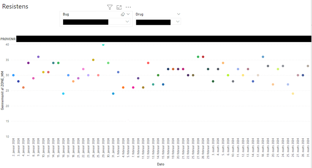
My solution rigtht now, looks like this:
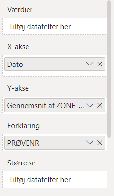
(Preferably I would have liked the Y-axis not to make an average of Zone_mm for each day, but as I see it, the only possibility in a chatter chart is to make a calculation on the y-axis. And I only have one measurement per day per bug + drug combination)
I really hope, that someone can help me.
I am using Power BI RS until we are allowed to use M365 later this year.
Solved! Go to Solution.
- Mark as New
- Bookmark
- Subscribe
- Mute
- Subscribe to RSS Feed
- Permalink
- Report Inappropriate Content
Hi @LNIEL
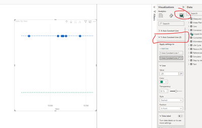
You can use Constant lines to achieve this goal ( I think that it work at report server as well, because it is old feature and not in preview).
The value can be hardcoded or you can create a measure and pill it into the constant
If this post helps, then please consider Accepting it as the solution to help the other members find it more quickly
Helpful resources

Microsoft Fabric Learn Together
Covering the world! 9:00-10:30 AM Sydney, 4:00-5:30 PM CET (Paris/Berlin), 7:00-8:30 PM Mexico City

Power BI Monthly Update - April 2024
Check out the April 2024 Power BI update to learn about new features.

| User | Count |
|---|---|
| 114 | |
| 105 | |
| 78 | |
| 68 | |
| 63 |
| User | Count |
|---|---|
| 148 | |
| 107 | |
| 106 | |
| 84 | |
| 70 |


