Jumpstart your career with the Fabric Career Hub
Find everything you need to get certified on Fabric—skills challenges, live sessions, exam prep, role guidance, and more.
Get started- Power BI forums
- Updates
- News & Announcements
- Get Help with Power BI
- Desktop
- Service
- Report Server
- Power Query
- Mobile Apps
- Developer
- DAX Commands and Tips
- Custom Visuals Development Discussion
- Health and Life Sciences
- Power BI Spanish forums
- Translated Spanish Desktop
- Power Platform Integration - Better Together!
- Power Platform Integrations (Read-only)
- Power Platform and Dynamics 365 Integrations (Read-only)
- Training and Consulting
- Instructor Led Training
- Dashboard in a Day for Women, by Women
- Galleries
- Community Connections & How-To Videos
- COVID-19 Data Stories Gallery
- Themes Gallery
- Data Stories Gallery
- R Script Showcase
- Webinars and Video Gallery
- Quick Measures Gallery
- 2021 MSBizAppsSummit Gallery
- 2020 MSBizAppsSummit Gallery
- 2019 MSBizAppsSummit Gallery
- Events
- Ideas
- Custom Visuals Ideas
- Issues
- Issues
- Events
- Upcoming Events
- Community Blog
- Power BI Community Blog
- Custom Visuals Community Blog
- Community Support
- Community Accounts & Registration
- Using the Community
- Community Feedback
Grow your Fabric skills and prepare for the DP-600 certification exam by completing the latest Microsoft Fabric challenge.
- Power BI forums
- Forums
- Get Help with Power BI
- Desktop
- 100% Stacked Column Chart Percentage
- Subscribe to RSS Feed
- Mark Topic as New
- Mark Topic as Read
- Float this Topic for Current User
- Bookmark
- Subscribe
- Printer Friendly Page
- Mark as New
- Bookmark
- Subscribe
- Mute
- Subscribe to RSS Feed
- Permalink
- Report Inappropriate Content
100% Stacked Column Chart Percentage
Hello Community,
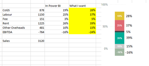
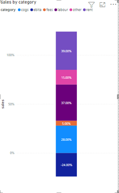
Under 100% stacked column chart, can I have the chart considering negative value and show the % (yellow cells) as below?
It looks like the chart will convert negative numbers to positive as the base of the total amount.
Thanks all.
Solved! Go to Solution.
- Mark as New
- Bookmark
- Subscribe
- Mute
- Subscribe to RSS Feed
- Permalink
- Report Inappropriate Content
Hi @nctvhk ,
Sorry for my late reply.
Here's my solution.
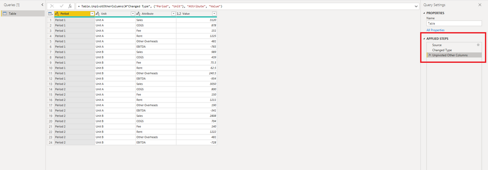
1.Unpivot the table in Power Query
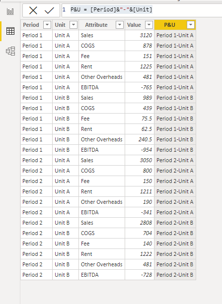
2.Because there can only be one field in the axis, we have to merge the two columns to create the following calculated column.
P&U = [Period]&"-"&[Unit]
3.Create the following measure
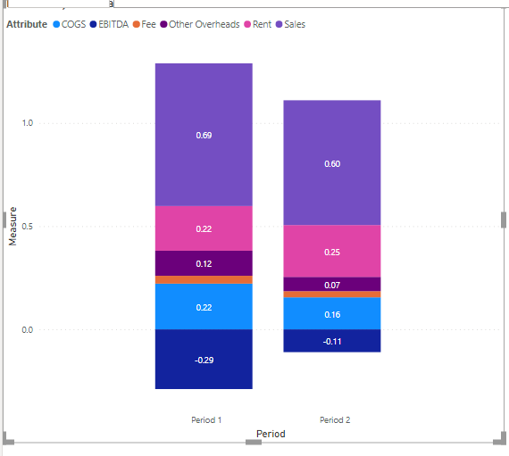
Measure = DIVIDE(SUM('Table'[Value]),CALCULATE(SUM('Table'[Value]),FILTER(ALLEXCEPT('Table','Table'[P&U]),[Attribute]="Sales")))
4.The result circled in the red box is the result you want, you can check it.
More details in the attachment.
Best Regards,
Stephen Tao
If this post helps, then please consider Accept it as the solution to help the other members find it more quickly.
- Mark as New
- Bookmark
- Subscribe
- Mute
- Subscribe to RSS Feed
- Permalink
- Report Inappropriate Content
Hi @nctvhk
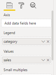
You can use stacked column chart and put your category column which consist value like EBITA etc under legend and put your percentage column under Values
It will show your negative value as it is.
Thanks,
Samarth
Best Regards,
Samarth
If this post helps, please consider accepting it as the solution to help the other members find it more quickly.
Appreciate your Kudos!!
Connect on Linkedin
- Mark as New
- Bookmark
- Subscribe
- Mute
- Subscribe to RSS Feed
- Permalink
- Report Inappropriate Content
Thanks @Samarth_18 ,
My dataset is like this:
In this case if I use the stack column solution you provided and take the hard coded percentage column as value, when I select filter/slicer (e.g. Period 1, Unit A+B), it seems the result will just average/sum the hard-coded percentage instead of showing the correct %.
Thanks.
- Mark as New
- Bookmark
- Subscribe
- Mute
- Subscribe to RSS Feed
- Permalink
- Report Inappropriate Content
you need to unpivot the table and create a measure
Measure = sum('Table'[Value])/CALCULATE(sum('Table'[Value]),ALLEXCEPT('Table','Table'[Period]))and use stacked column
pls see the attachment below
Did I answer your question? Mark my post as a solution!
Proud to be a Super User!
Helpful resources
| User | Count |
|---|---|
| 84 | |
| 80 | |
| 72 | |
| 71 | |
| 55 |
| User | Count |
|---|---|
| 108 | |
| 106 | |
| 93 | |
| 84 | |
| 66 |
