Jumpstart your career with the Fabric Career Hub
Find everything you need to get certified on Fabric—skills challenges, live sessions, exam prep, role guidance, and more.
Get started- Power BI forums
- Updates
- News & Announcements
- Get Help with Power BI
- Desktop
- Service
- Report Server
- Power Query
- Mobile Apps
- Developer
- DAX Commands and Tips
- Custom Visuals Development Discussion
- Health and Life Sciences
- Power BI Spanish forums
- Translated Spanish Desktop
- Training and Consulting
- Instructor Led Training
- Dashboard in a Day for Women, by Women
- Galleries
- Community Connections & How-To Videos
- COVID-19 Data Stories Gallery
- Themes Gallery
- Data Stories Gallery
- R Script Showcase
- Webinars and Video Gallery
- Quick Measures Gallery
- 2021 MSBizAppsSummit Gallery
- 2020 MSBizAppsSummit Gallery
- 2019 MSBizAppsSummit Gallery
- Events
- Ideas
- Custom Visuals Ideas
- Issues
- Issues
- Events
- Upcoming Events
- Community Blog
- Power BI Community Blog
- Custom Visuals Community Blog
- Community Support
- Community Accounts & Registration
- Using the Community
- Community Feedback
Grow your Fabric skills and prepare for the DP-600 certification exam by completing the latest Microsoft Fabric challenge.
- Power BI forums
- Forums
- Get Help with Power BI
- DAX Commands and Tips
- Scatter chart change color
- Subscribe to RSS Feed
- Mark Topic as New
- Mark Topic as Read
- Float this Topic for Current User
- Bookmark
- Subscribe
- Printer Friendly Page
- Mark as New
- Bookmark
- Subscribe
- Mute
- Subscribe to RSS Feed
- Permalink
- Report Inappropriate Content
Scatter chart change color
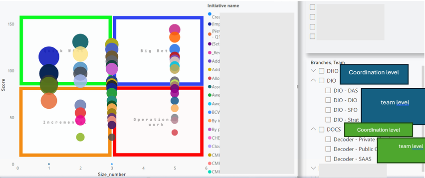
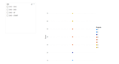
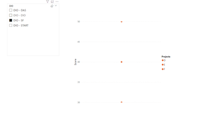
I have created a scatter chart where I plot the result from the calculation 'Score/size_number.' The markers are colorized by 'Initiative name' (projects). However, I need to colorize them by 'coordination level.' As a consequence, when someone selects 'coordination level' from the slice, the initiatives will be shown in accordance with each team under the 'coordination level.'
For example: when someone selects DIO (coordination level), the chart will show the initiatives in four different colors (DIO -DAS, DIO -DIO, DIO -SF, DIO - STRAT).
I appreciate any help
Thanks!
Solved! Go to Solution.
- Mark as New
- Bookmark
- Subscribe
- Mute
- Subscribe to RSS Feed
- Permalink
- Report Inappropriate Content
Hi @enavesca ,
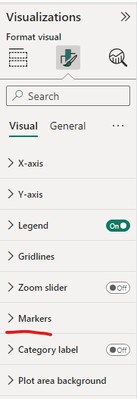
Regarding your question, you can modify this in the visualization settings of the scatterplot.
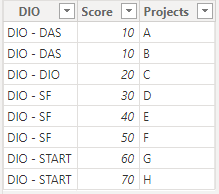
The Table data is shown below:
Please follow these steps:
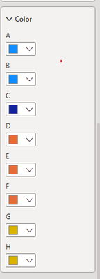
Setting items in the same category to the same color.
Final output:
Best Regards,
Wenbin Zhou
If this post helps, then please consider Accept it as the solution to help the other members find it more quickly.
- Mark as New
- Bookmark
- Subscribe
- Mute
- Subscribe to RSS Feed
- Permalink
- Report Inappropriate Content
Amazing!
Thank you very much 🙌
I have just one concern. There are more than 100 projects, I wonder if there is a way to do it with less effort.
- Mark as New
- Bookmark
- Subscribe
- Mute
- Subscribe to RSS Feed
- Permalink
- Report Inappropriate Content
Hi @enavesca ,
Regarding your question, you can modify this in the visualization settings of the scatterplot.
The Table data is shown below:
Please follow these steps:
Setting items in the same category to the same color.
Final output:
Best Regards,
Wenbin Zhou
If this post helps, then please consider Accept it as the solution to help the other members find it more quickly.
- Mark as New
- Bookmark
- Subscribe
- Mute
- Subscribe to RSS Feed
- Permalink
- Report Inappropriate Content
Amazing!
Thank you very much 🙌
I have just one concern. There are more than 100 projects, I wonder if there is a way to do it with less effort.
Helpful resources

Europe’s largest Microsoft Fabric Community Conference
Join the community in Stockholm for expert Microsoft Fabric learning including a very exciting keynote from Arun Ulag, Corporate Vice President, Azure Data.

Power BI Monthly Update - June 2024
Check out the June 2024 Power BI update to learn about new features.

| User | Count |
|---|---|
| 69 | |
| 35 | |
| 21 | |
| 18 | |
| 15 |
| User | Count |
|---|---|
| 126 | |
| 32 | |
| 28 | |
| 24 | |
| 24 |
