- Power BI forums
- Updates
- News & Announcements
- Get Help with Power BI
- Desktop
- Service
- Report Server
- Power Query
- Mobile Apps
- Developer
- DAX Commands and Tips
- Custom Visuals Development Discussion
- Health and Life Sciences
- Power BI Spanish forums
- Translated Spanish Desktop
- Power Platform Integration - Better Together!
- Power Platform Integrations (Read-only)
- Power Platform and Dynamics 365 Integrations (Read-only)
- Training and Consulting
- Instructor Led Training
- Dashboard in a Day for Women, by Women
- Galleries
- Community Connections & How-To Videos
- COVID-19 Data Stories Gallery
- Themes Gallery
- Data Stories Gallery
- R Script Showcase
- Webinars and Video Gallery
- Quick Measures Gallery
- 2021 MSBizAppsSummit Gallery
- 2020 MSBizAppsSummit Gallery
- 2019 MSBizAppsSummit Gallery
- Events
- Ideas
- Custom Visuals Ideas
- Issues
- Issues
- Events
- Upcoming Events
- Community Blog
- Power BI Community Blog
- Custom Visuals Community Blog
- Community Support
- Community Accounts & Registration
- Using the Community
- Community Feedback
Register now to learn Fabric in free live sessions led by the best Microsoft experts. From Apr 16 to May 9, in English and Spanish.
- Power BI forums
- Forums
- Get Help with Power BI
- Desktop
- Use Measure as Legend in Pie Chart or Column in Ma...
- Subscribe to RSS Feed
- Mark Topic as New
- Mark Topic as Read
- Float this Topic for Current User
- Bookmark
- Subscribe
- Printer Friendly Page
- Mark as New
- Bookmark
- Subscribe
- Mute
- Subscribe to RSS Feed
- Permalink
- Report Inappropriate Content
Use Measure as Legend in Pie Chart or Column in Matrix
Hi All,
I am working with the below table that contains data from three offices:
I am trying to create a total risk score for each office by adding up all three criteria (Geographic Score, Customer Count, Employee Count), but also apply a parameter weight between 0 and 5 to each to give users the flexibility to adjust the weight of each criteria to dynamically calculate the final risk score
Geographic:
Customer Count:
Employee Count:
Here's my measure calculation for the Total Score:
I then tried to create a Risk Level (Column) that categorizes the offices based the total risk score into High (> 200), Medium (< 200 and > 150), or Low (< 150) as follows:
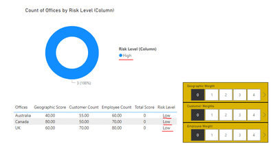
However, once I have completed the above steps, I wanted to create a pie chart to show the number of offices in each Risk Level, but I noticed that the risk levels are not dynamic, as the pie chart will not update as I adjusted the weights:
I then tried to replicate the Risk Level but in a measure format as follows:
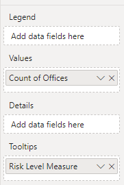
However, it seems like the Risk Level Measure cannot be added to the Legend field, as it could only be added to the Tooltips:
Is there a way to resolve this issue and add a dynmaic risk level measure to the pie chart as legend?
Thanks in advance
- Mark as New
- Bookmark
- Subscribe
- Mute
- Subscribe to RSS Feed
- Permalink
- Report Inappropriate Content
Hi @lcs211 ,
Sorry, add a dynmaic risk level measure to the pie chart as legend doesn't seem to be available on Power BI at the moment.Or you can try to calculate the columns, then change the weights and then refresh all the visuals.
Best Regards,
Xianda Tang
If this post helps, then please consider Accept it as the solution to help the other members find it more quickly.
Helpful resources

Microsoft Fabric Learn Together
Covering the world! 9:00-10:30 AM Sydney, 4:00-5:30 PM CET (Paris/Berlin), 7:00-8:30 PM Mexico City

Power BI Monthly Update - April 2024
Check out the April 2024 Power BI update to learn about new features.

| User | Count |
|---|---|
| 99 | |
| 99 | |
| 76 | |
| 66 | |
| 59 |
| User | Count |
|---|---|
| 142 | |
| 106 | |
| 103 | |
| 85 | |
| 70 |


