Jumpstart your career with the Fabric Career Hub
Find everything you need to get certified on Fabric—skills challenges, live sessions, exam prep, role guidance, and more.
Get started- Power BI forums
- Updates
- News & Announcements
- Get Help with Power BI
- Desktop
- Service
- Report Server
- Power Query
- Mobile Apps
- Developer
- DAX Commands and Tips
- Custom Visuals Development Discussion
- Health and Life Sciences
- Power BI Spanish forums
- Translated Spanish Desktop
- Power Platform Integration - Better Together!
- Power Platform Integrations (Read-only)
- Power Platform and Dynamics 365 Integrations (Read-only)
- Training and Consulting
- Instructor Led Training
- Dashboard in a Day for Women, by Women
- Galleries
- Community Connections & How-To Videos
- COVID-19 Data Stories Gallery
- Themes Gallery
- Data Stories Gallery
- R Script Showcase
- Webinars and Video Gallery
- Quick Measures Gallery
- 2021 MSBizAppsSummit Gallery
- 2020 MSBizAppsSummit Gallery
- 2019 MSBizAppsSummit Gallery
- Events
- Ideas
- Custom Visuals Ideas
- Issues
- Issues
- Events
- Upcoming Events
- Community Blog
- Power BI Community Blog
- Custom Visuals Community Blog
- Community Support
- Community Accounts & Registration
- Using the Community
- Community Feedback
Grow your Fabric skills and prepare for the DP-600 certification exam by completing the latest Microsoft Fabric challenge.
- Power BI forums
- Forums
- Get Help with Power BI
- Desktop
- Sales Trend which is normalized
- Subscribe to RSS Feed
- Mark Topic as New
- Mark Topic as Read
- Float this Topic for Current User
- Bookmark
- Subscribe
- Printer Friendly Page
- Mark as New
- Bookmark
- Subscribe
- Mute
- Subscribe to RSS Feed
- Permalink
- Report Inappropriate Content
Sales Trend which is normalized
Hi guys,
For example, Staten Island opened in Week 8 of 2021, we would compare sales of that store from Week 9 2021 onwards with Hyannis that opened in Week 17 of 2022.
I will defenitley appreciate can anyone give solution for this.
Thanks,
Srikanth
Solved! Go to Solution.
- Mark as New
- Bookmark
- Subscribe
- Mute
- Subscribe to RSS Feed
- Permalink
- Report Inappropriate Content
Hi,
Please check the attached file and the below.
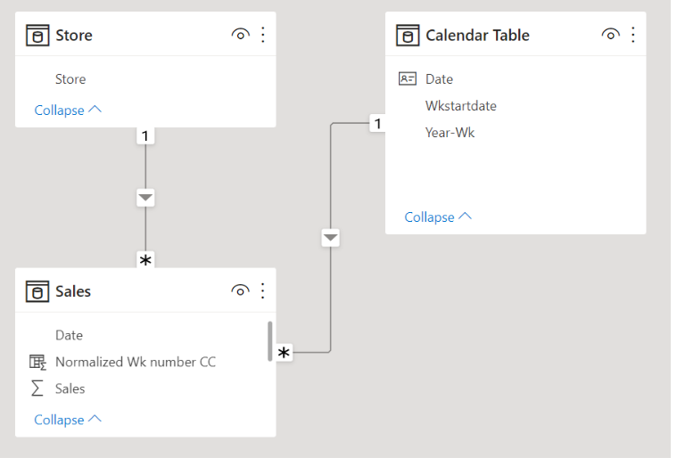
1. create a dim-calendar table
2. create a relationship between the sales table and dim-calendar table
3. create two calculated columns in the sales table
main point is to create a calculated column = Normalized Wk number CC
Normalized Wk number CC =
RANKX (
    SUMMARIZE (
        FILTER ( Sales, Sales[Store] = EARLIER ( Sales[Store] ) ),
        Sales[Startdate of Wk CC]
    ),
    Sales[Startdate of Wk CC],
    ,
    ASC
)
4. create a measure that shows sales total and put it into the visualization that uses one of the newly created calculated columns as the X-axis
If this post helps, then please consider accepting it as the solution to help other members find it faster, and give a big thumbs up.
- Mark as New
- Bookmark
- Subscribe
- Mute
- Subscribe to RSS Feed
- Permalink
- Report Inappropriate Content
Thank you.
it was helpful
Helpful resources
| User | Count |
|---|---|
| 84 | |
| 80 | |
| 72 | |
| 71 | |
| 55 |
| User | Count |
|---|---|
| 108 | |
| 106 | |
| 93 | |
| 84 | |
| 66 |


