- Power BI forums
- Updates
- News & Announcements
- Get Help with Power BI
- Desktop
- Service
- Report Server
- Power Query
- Mobile Apps
- Developer
- DAX Commands and Tips
- Custom Visuals Development Discussion
- Health and Life Sciences
- Power BI Spanish forums
- Translated Spanish Desktop
- Power Platform Integration - Better Together!
- Power Platform Integrations (Read-only)
- Power Platform and Dynamics 365 Integrations (Read-only)
- Training and Consulting
- Instructor Led Training
- Dashboard in a Day for Women, by Women
- Galleries
- Community Connections & How-To Videos
- COVID-19 Data Stories Gallery
- Themes Gallery
- Data Stories Gallery
- R Script Showcase
- Webinars and Video Gallery
- Quick Measures Gallery
- 2021 MSBizAppsSummit Gallery
- 2020 MSBizAppsSummit Gallery
- 2019 MSBizAppsSummit Gallery
- Events
- Ideas
- Custom Visuals Ideas
- Issues
- Issues
- Events
- Upcoming Events
- Community Blog
- Power BI Community Blog
- Custom Visuals Community Blog
- Community Support
- Community Accounts & Registration
- Using the Community
- Community Feedback
Register now to learn Fabric in free live sessions led by the best Microsoft experts. From Apr 16 to May 9, in English and Spanish.
- Power BI forums
- Forums
- Get Help with Power BI
- Desktop
- Matrix Results and Bar Chart not Calculating the S...
- Subscribe to RSS Feed
- Mark Topic as New
- Mark Topic as Read
- Float this Topic for Current User
- Bookmark
- Subscribe
- Printer Friendly Page
- Mark as New
- Bookmark
- Subscribe
- Mute
- Subscribe to RSS Feed
- Permalink
- Report Inappropriate Content
Matrix Results and Bar Chart not Calculating the Same
Hello,
I am running into an issue where a measure that I have is behaving correctly within a Matrix. However, when in a barchart, the behaviour is not correct.
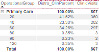
This is the measure I am using for the "Distro_ClinPercent" column:
DIVIDE([ClinicVisits],CALCULATE(SUMX('TABLE',[ClinicVisits]),ALL('Table'[ApptLength])))It gives me the following result:
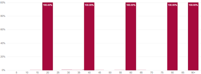
However, in a bar chart, it looks like the clinic visits row just divides by itself, rather than the SUMX value. this results in a 100% result for each apptlength category.
How do I correct this behavior?
Solved! Go to Solution.
- Mark as New
- Bookmark
- Subscribe
- Mute
- Subscribe to RSS Feed
- Permalink
- Report Inappropriate Content
thanks everyone for the input. I managed to figure it out, and it was really my mistake... I figured out that the x-axis was not properly connected to the model. Once I did that it all worked.
- Mark as New
- Bookmark
- Subscribe
- Mute
- Subscribe to RSS Feed
- Permalink
- Report Inappropriate Content
Hi @ExcelMonke
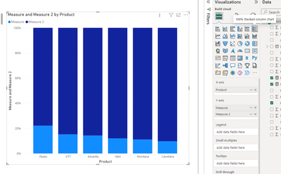
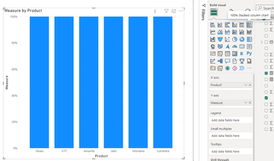
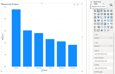
Do you use the visualization shown below? As you can see below, I put in two measures, and the visualization calculates the ratio of each of the two measures to the whole bar, and then displays them in different colors. A 100% stacked column chart is designed to illustrate the relative percentage of multiple data series in stacked columns. In this chart, the cumulative of the stacked columns always equals 100%. If you put in a measure, it will just show 100%.
You can use the stacked column chart to display the results you want.
If you are not using this chart, then could you provide a sample of the raw data so that we can better assist you?
How to provide sample data in the Power BI Forum - Microsoft Fabric Community . Or show it as a screenshot or pbix. Please remove any sensitive data in advance. If uploading pbix files please do not log into your account.
Best Regards,
Yulia Xu
If this post helps, then please consider Accept it as the solution to help the other members find it more quickly.
- Mark as New
- Bookmark
- Subscribe
- Mute
- Subscribe to RSS Feed
- Permalink
- Report Inappropriate Content
@ExcelMonke , Try one of the two
DIVIDE([ClinicVisits],CALCULATE(SUMX('TABLE',[ClinicVisits]),ALL()))
DIVIDE([ClinicVisits],CALCULATE(SUMX('TABLE',[ClinicVisits]),removefilters('Table'[Operation Group])))
Microsoft Power BI Learning Resources, 2023 !!
Learn Power BI - Full Course with Dec-2022, with Window, Index, Offset, 100+ Topics !!
Did I answer your question? Mark my post as a solution! Appreciate your Kudos !! Proud to be a Super User! !!
- Mark as New
- Bookmark
- Subscribe
- Mute
- Subscribe to RSS Feed
- Permalink
- Report Inappropriate Content
Unfortunately neither of those worked. for context, the Operation Group is on a seperate table. The apptlength is from the fact table.
Helpful resources

Microsoft Fabric Learn Together
Covering the world! 9:00-10:30 AM Sydney, 4:00-5:30 PM CET (Paris/Berlin), 7:00-8:30 PM Mexico City

Power BI Monthly Update - April 2024
Check out the April 2024 Power BI update to learn about new features.

| User | Count |
|---|---|
| 104 | |
| 96 | |
| 80 | |
| 67 | |
| 62 |
| User | Count |
|---|---|
| 137 | |
| 106 | |
| 104 | |
| 81 | |
| 63 |
