- Power BI forums
- Updates
- News & Announcements
- Get Help with Power BI
- Desktop
- Service
- Report Server
- Power Query
- Mobile Apps
- Developer
- DAX Commands and Tips
- Custom Visuals Development Discussion
- Health and Life Sciences
- Power BI Spanish forums
- Translated Spanish Desktop
- Power Platform Integration - Better Together!
- Power Platform Integrations (Read-only)
- Power Platform and Dynamics 365 Integrations (Read-only)
- Training and Consulting
- Instructor Led Training
- Dashboard in a Day for Women, by Women
- Galleries
- Community Connections & How-To Videos
- COVID-19 Data Stories Gallery
- Themes Gallery
- Data Stories Gallery
- R Script Showcase
- Webinars and Video Gallery
- Quick Measures Gallery
- 2021 MSBizAppsSummit Gallery
- 2020 MSBizAppsSummit Gallery
- 2019 MSBizAppsSummit Gallery
- Events
- Ideas
- Custom Visuals Ideas
- Issues
- Issues
- Events
- Upcoming Events
- Community Blog
- Power BI Community Blog
- Custom Visuals Community Blog
- Community Support
- Community Accounts & Registration
- Using the Community
- Community Feedback
Register now to learn Fabric in free live sessions led by the best Microsoft experts. From Apr 16 to May 9, in English and Spanish.
- Power BI forums
- Forums
- Get Help with Power BI
- Desktop
- Line chart for time series visualization
- Subscribe to RSS Feed
- Mark Topic as New
- Mark Topic as Read
- Float this Topic for Current User
- Bookmark
- Subscribe
- Printer Friendly Page
- Mark as New
- Bookmark
- Subscribe
- Mute
- Subscribe to RSS Feed
- Permalink
- Report Inappropriate Content
Line chart for time series visualization
Hello,
I am pretty new to powerBI, and I encountered a problem with plotting using the line chart. I have a dataset of time and another numeric variables. The time variable is on hourly basis and data looks like 2006-11-01 1:00:00 AM, 2006-11-01 2:00:00 AM, and so on for several years. After importing the data set, the time variable is recognized as Date/Time. My other numeric variable is in Decimal format.
However, when it goes for plotting using line chart, I cannot figure it out how to plot the numeric variable over years and in hourly basis. I am looking to have a chart like the attachment.
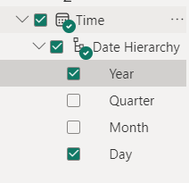
The problems I have: 1. The Time vatibale is not broken down into hours in date hierarchy
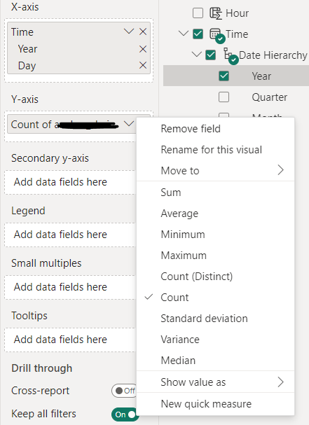
2. it only counts, sum, average, etc. but not the numeric value of the parameter on the plot.
and, I already read a lot of topics on the forum and tries many of them but none of them worked for me. I have changed the numeric variable to "Don't summarized", and the data type for that is "decimal number".
- Mark as New
- Bookmark
- Subscribe
- Mute
- Subscribe to RSS Feed
- Permalink
- Report Inappropriate Content
how to plot the numeric variable over years and in hourly basis.what would be the business benefit of doing this on a single axis? It might make more sense to use a heatmap visual instead.
- Mark as New
- Bookmark
- Subscribe
- Mute
- Subscribe to RSS Feed
- Permalink
- Report Inappropriate Content
This is an example that I presented to figure out the problem. My real data set includes some other parameters and I want to see the trend of each over time and compare them all in one chart.
- Mark as New
- Bookmark
- Subscribe
- Mute
- Subscribe to RSS Feed
- Permalink
- Report Inappropriate Content
That sounds like you are trying to do too much. Create some mock-ups to see how much data you can meaningfully show.
- Mark as New
- Bookmark
- Subscribe
- Mute
- Subscribe to RSS Feed
- Permalink
- Report Inappropriate Content
- Mark as New
- Bookmark
- Subscribe
- Mute
- Subscribe to RSS Feed
- Permalink
- Report Inappropriate Content
Have you considered using other tools like Tableau or QlikSense?
Helpful resources

Microsoft Fabric Learn Together
Covering the world! 9:00-10:30 AM Sydney, 4:00-5:30 PM CET (Paris/Berlin), 7:00-8:30 PM Mexico City

Power BI Monthly Update - April 2024
Check out the April 2024 Power BI update to learn about new features.

| User | Count |
|---|---|
| 100 | |
| 97 | |
| 85 | |
| 70 | |
| 67 |
| User | Count |
|---|---|
| 116 | |
| 109 | |
| 94 | |
| 79 | |
| 72 |


