- Power BI forums
- Updates
- News & Announcements
- Get Help with Power BI
- Desktop
- Service
- Report Server
- Power Query
- Mobile Apps
- Developer
- DAX Commands and Tips
- Custom Visuals Development Discussion
- Health and Life Sciences
- Power BI Spanish forums
- Translated Spanish Desktop
- Power Platform Integration - Better Together!
- Power Platform Integrations (Read-only)
- Power Platform and Dynamics 365 Integrations (Read-only)
- Training and Consulting
- Instructor Led Training
- Dashboard in a Day for Women, by Women
- Galleries
- Community Connections & How-To Videos
- COVID-19 Data Stories Gallery
- Themes Gallery
- Data Stories Gallery
- R Script Showcase
- Webinars and Video Gallery
- Quick Measures Gallery
- 2021 MSBizAppsSummit Gallery
- 2020 MSBizAppsSummit Gallery
- 2019 MSBizAppsSummit Gallery
- Events
- Ideas
- Custom Visuals Ideas
- Issues
- Issues
- Events
- Upcoming Events
- Community Blog
- Power BI Community Blog
- Custom Visuals Community Blog
- Community Support
- Community Accounts & Registration
- Using the Community
- Community Feedback
Register now to learn Fabric in free live sessions led by the best Microsoft experts. From Apr 16 to May 9, in English and Spanish.
- Power BI forums
- Forums
- Get Help with Power BI
- Desktop
- How to show 2 tables in 1 chart?
- Subscribe to RSS Feed
- Mark Topic as New
- Mark Topic as Read
- Float this Topic for Current User
- Bookmark
- Subscribe
- Printer Friendly Page
- Mark as New
- Bookmark
- Subscribe
- Mute
- Subscribe to RSS Feed
- Permalink
- Report Inappropriate Content
How to show 2 tables in 1 chart?
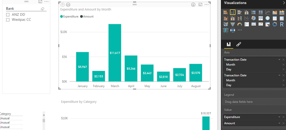
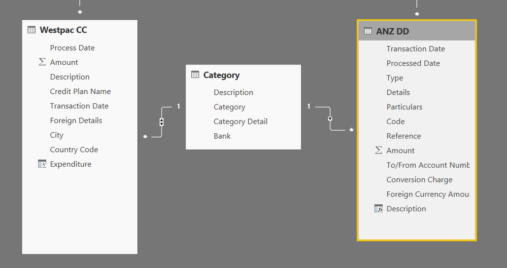
How to show 2 tables value in 1 chart? i've got expenditures from 2 banks, would like to show the expenditure in 1 chart. I've created a master category sheet and linked those 2 tables together.
I've added both "transaction Date" into the Axis and both "amount" into the Value, but it's working with the 1st table but not 2 together.
Ideallly i want the chart to get me 2 colors bar Green at the bottom and black at the top with 1 bar shows the total amount from both bank.
Solved! Go to Solution.
- Mark as New
- Bookmark
- Subscribe
- Mute
- Subscribe to RSS Feed
- Permalink
- Report Inappropriate Content
@Anonymous - It appears as though you do not have a seperate date table, this will assist in allowing the two banking tables to show the data with a single date.
Check out a previous post I did on date tables - http://community.powerbi.com/t5/Desktop/Noob-Date-question/m-p/38881#M14456
Once this table is created you can then connect the transaction dates in the banking columns to the date column in your new date table. The date column is then used on your X-axis.
In then depends how the data is held in your banking tables as to how you can display it. However if you put in a cluster bar graph with the date column on the x-axis and the expenditure and amount in the values you should be able to see them side by side.
Any questions please let me know.
Giles
- Mark as New
- Bookmark
- Subscribe
- Mute
- Subscribe to RSS Feed
- Permalink
- Report Inappropriate Content
Hi Giles,
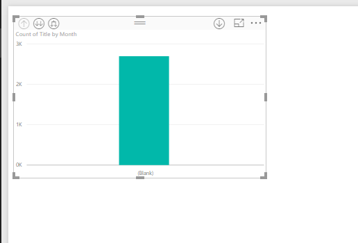
I am working on the same requirement, i did the same, what you have suggested in the post, but in the axis i am getting the blank date. Can you please help me on this.Thanks
- Mark as New
- Bookmark
- Subscribe
- Mute
- Subscribe to RSS Feed
- Permalink
- Report Inappropriate Content
@Anonymous - are you able to show a picture of the relationships so I can see your table structures?
Giles
- Mark as New
- Bookmark
- Subscribe
- Mute
- Subscribe to RSS Feed
- Permalink
- Report Inappropriate Content
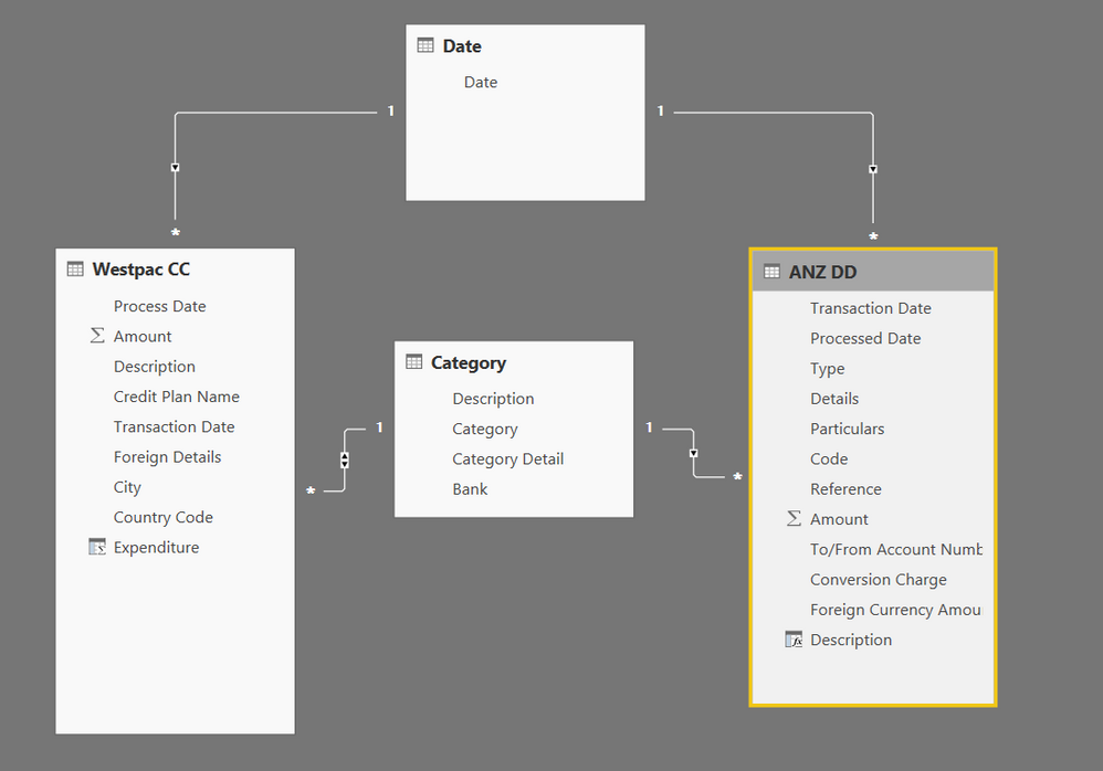
HI Giles,
Below is the relationship image, i have taken the date range of DateKey table as (2012,01,01) to (2018,12,31) that is future end date, but i have dates in my date columns upto current date only is that the problem? and i have blank values in my date column. is that the issue? Thanks
- Mark as New
- Bookmark
- Subscribe
- Mute
- Subscribe to RSS Feed
- Permalink
- Report Inappropriate Content
@GilesWalkeri do have a date table, when i bring "date" under the date table into the Axis. it works!! i think i just used the wrong date in the chart. thanks!!
- Mark as New
- Bookmark
- Subscribe
- Mute
- Subscribe to RSS Feed
- Permalink
- Report Inappropriate Content
@Anonymous excellent. Please mark this off as complete.
Giles
Helpful resources

Microsoft Fabric Learn Together
Covering the world! 9:00-10:30 AM Sydney, 4:00-5:30 PM CET (Paris/Berlin), 7:00-8:30 PM Mexico City

Power BI Monthly Update - April 2024
Check out the April 2024 Power BI update to learn about new features.

| User | Count |
|---|---|
| 105 | |
| 96 | |
| 75 | |
| 63 | |
| 62 |
| User | Count |
|---|---|
| 135 | |
| 105 | |
| 104 | |
| 80 | |
| 65 |


