- Power BI forums
- Updates
- News & Announcements
- Get Help with Power BI
- Desktop
- Service
- Report Server
- Power Query
- Mobile Apps
- Developer
- DAX Commands and Tips
- Custom Visuals Development Discussion
- Health and Life Sciences
- Power BI Spanish forums
- Translated Spanish Desktop
- Power Platform Integration - Better Together!
- Power Platform Integrations (Read-only)
- Power Platform and Dynamics 365 Integrations (Read-only)
- Training and Consulting
- Instructor Led Training
- Dashboard in a Day for Women, by Women
- Galleries
- Community Connections & How-To Videos
- COVID-19 Data Stories Gallery
- Themes Gallery
- Data Stories Gallery
- R Script Showcase
- Webinars and Video Gallery
- Quick Measures Gallery
- 2021 MSBizAppsSummit Gallery
- 2020 MSBizAppsSummit Gallery
- 2019 MSBizAppsSummit Gallery
- Events
- Ideas
- Custom Visuals Ideas
- Issues
- Issues
- Events
- Upcoming Events
- Community Blog
- Power BI Community Blog
- Custom Visuals Community Blog
- Community Support
- Community Accounts & Registration
- Using the Community
- Community Feedback
Register now to learn Fabric in free live sessions led by the best Microsoft experts. From Apr 16 to May 9, in English and Spanish.
- Power BI forums
- Forums
- Get Help with Power BI
- Desktop
- How to add an max /line to column chart?
- Subscribe to RSS Feed
- Mark Topic as New
- Mark Topic as Read
- Float this Topic for Current User
- Bookmark
- Subscribe
- Printer Friendly Page
- Mark as New
- Bookmark
- Subscribe
- Mute
- Subscribe to RSS Feed
- Permalink
- Report Inappropriate Content
How to add an max /line to column chart?
Hello guys,
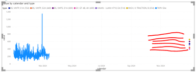
I have a simple lince chart and need to add a max on the chart or line chart.
This seems simple but yet again I'm having trouble.
The red lines in this chart are drawn with a screenshot app. But in data the red line have not the calendar data.
How can I make them using PowerBI?
Raw Data :
| no | model | calendar | value | type |
| 777D | 544 | BS, VMTP, E1A (554) | ||
| 777D | 440 | BS, VMTP, E2A (440) | ||
| 777D | 600 | BS, VMTS, E1A (600) | ||
| 777D | 400 | GY, GT-4B, 4H (400) | ||
| 777D | 654 | MICH, X-TRACTION, B (654) | ||
| 777D | 514 | HAIAN - LUAN H710, E4 (514) | ||
| 16xxx1 | 777D | 12/12/2023 | 400 | tkph site |
| 16xxx1 | 777D | 1/1/2024 | 200 | tkph site |
| 16xxx1 | 777D | 18/11/2023 | 256 | tkph site |
| 16xxx1 | 777D | 25/09/2023 | 396 | tkph site |
Thanks!
- Mark as New
- Bookmark
- Subscribe
- Mute
- Subscribe to RSS Feed
- Permalink
- Report Inappropriate Content
Hi @vividarinda
Create a Measure for Maximum Value: First, you need to create a measure that calculates the maximum value of your data. You can do this by going to the "Modeling" tab in Power BI Desktop, and then selecting "New Measure". Here's an example DAX formula you could use:
MaxValue = MAX('YourTableName'[value])
Add the Measure to Your Chart: Once you have your measure,you can use the Combo chart visual. This allows you to display columns for your primary values and a line for the maximum value measure you just created.
Best Regards,
Jayleny
If this post helps, then please consider Accept it as the solution to help the other members find it more quickly.
- Mark as New
- Bookmark
- Subscribe
- Mute
- Subscribe to RSS Feed
- Permalink
- Report Inappropriate Content
Hi @v-jialongy-msft ,
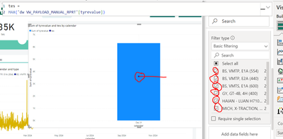
I'll try your suggest but in visual show like this. I want to show 6 line based on type.
- Mark as New
- Bookmark
- Subscribe
- Mute
- Subscribe to RSS Feed
- Permalink
- Report Inappropriate Content
Helpful resources

Microsoft Fabric Learn Together
Covering the world! 9:00-10:30 AM Sydney, 4:00-5:30 PM CET (Paris/Berlin), 7:00-8:30 PM Mexico City

Power BI Monthly Update - April 2024
Check out the April 2024 Power BI update to learn about new features.

| User | Count |
|---|---|
| 97 | |
| 96 | |
| 81 | |
| 74 | |
| 66 |
| User | Count |
|---|---|
| 126 | |
| 106 | |
| 105 | |
| 86 | |
| 72 |


