- Power BI forums
- Updates
- News & Announcements
- Get Help with Power BI
- Desktop
- Service
- Report Server
- Power Query
- Mobile Apps
- Developer
- DAX Commands and Tips
- Custom Visuals Development Discussion
- Health and Life Sciences
- Power BI Spanish forums
- Translated Spanish Desktop
- Power Platform Integration - Better Together!
- Power Platform Integrations (Read-only)
- Power Platform and Dynamics 365 Integrations (Read-only)
- Training and Consulting
- Instructor Led Training
- Dashboard in a Day for Women, by Women
- Galleries
- Community Connections & How-To Videos
- COVID-19 Data Stories Gallery
- Themes Gallery
- Data Stories Gallery
- R Script Showcase
- Webinars and Video Gallery
- Quick Measures Gallery
- 2021 MSBizAppsSummit Gallery
- 2020 MSBizAppsSummit Gallery
- 2019 MSBizAppsSummit Gallery
- Events
- Ideas
- Custom Visuals Ideas
- Issues
- Issues
- Events
- Upcoming Events
- Community Blog
- Power BI Community Blog
- Custom Visuals Community Blog
- Community Support
- Community Accounts & Registration
- Using the Community
- Community Feedback
Earn a 50% discount on the DP-600 certification exam by completing the Fabric 30 Days to Learn It challenge.
- Power BI forums
- Forums
- Get Help with Power BI
- Desktop
- How do I get a bar graph with two lines?
- Subscribe to RSS Feed
- Mark Topic as New
- Mark Topic as Read
- Float this Topic for Current User
- Bookmark
- Subscribe
- Printer Friendly Page
- Mark as New
- Bookmark
- Subscribe
- Mute
- Subscribe to RSS Feed
- Permalink
- Report Inappropriate Content
How do I get a bar graph with two lines?
Hi,
I have a few questions:
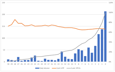
First, is there no bar graph that can have two lines plotted on it? Also, I was able to sort the x value descending on other visuals, but not for the line and clustered column chart. I'm trying to plot ticket prices/sales by days out from the game, and this is what I want to replicate from Excel:
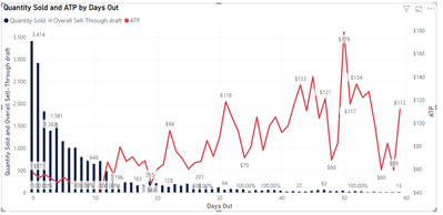
Daily volume being quantity of tickets sold, cumulative ATP (avg ticket price), and then sell-through being the quantity sold/total ticket quantity. It should be straightforward, but why does it seem like Power Bi makes things more complicated? This is what I have on Power Bi:
(not filtered for individual team)
Here are my columns/measures:
- Mark as New
- Bookmark
- Subscribe
- Mute
- Subscribe to RSS Feed
- Permalink
- Report Inappropriate Content
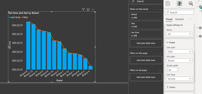
@deannag , I power bi the lines can not use both axes. This means both lines would be there on Y-axis or secondary y-axis.
For smooth line, there is an option in the latest release
Microsoft Power BI Learning Resources, 2023 !!
Learn Power BI - Full Course with Dec-2022, with Window, Index, Offset, 100+ Topics !!
Did I answer your question? Mark my post as a solution! Appreciate your Kudos !! Proud to be a Super User! !!
- Mark as New
- Bookmark
- Subscribe
- Mute
- Subscribe to RSS Feed
- Permalink
- Report Inappropriate Content
How could I sort my days out descending? Normally it's the ... in the top right of the visual, but not with this combo chart for some reason
Helpful resources
| User | Count |
|---|---|
| 98 | |
| 90 | |
| 77 | |
| 71 | |
| 64 |
| User | Count |
|---|---|
| 115 | |
| 102 | |
| 98 | |
| 71 | |
| 67 |


