Jumpstart your career with the Fabric Career Hub
Find everything you need to get certified on Fabric—skills challenges, live sessions, exam prep, role guidance, and more.
Get started- Power BI forums
- Updates
- News & Announcements
- Get Help with Power BI
- Desktop
- Service
- Report Server
- Power Query
- Mobile Apps
- Developer
- DAX Commands and Tips
- Custom Visuals Development Discussion
- Health and Life Sciences
- Power BI Spanish forums
- Translated Spanish Desktop
- Power Platform Integration - Better Together!
- Power Platform Integrations (Read-only)
- Power Platform and Dynamics 365 Integrations (Read-only)
- Training and Consulting
- Instructor Led Training
- Dashboard in a Day for Women, by Women
- Galleries
- Community Connections & How-To Videos
- COVID-19 Data Stories Gallery
- Themes Gallery
- Data Stories Gallery
- R Script Showcase
- Webinars and Video Gallery
- Quick Measures Gallery
- 2021 MSBizAppsSummit Gallery
- 2020 MSBizAppsSummit Gallery
- 2019 MSBizAppsSummit Gallery
- Events
- Ideas
- Custom Visuals Ideas
- Issues
- Issues
- Events
- Upcoming Events
- Community Blog
- Power BI Community Blog
- Custom Visuals Community Blog
- Community Support
- Community Accounts & Registration
- Using the Community
- Community Feedback
Grow your Fabric skills and prepare for the DP-600 certification exam by completing the latest Microsoft Fabric challenge.
- Power BI forums
- Forums
- Get Help with Power BI
- Desktop
- Format two different data labels in column chart
- Subscribe to RSS Feed
- Mark Topic as New
- Mark Topic as Read
- Float this Topic for Current User
- Bookmark
- Subscribe
- Printer Friendly Page
- Mark as New
- Bookmark
- Subscribe
- Mute
- Subscribe to RSS Feed
- Permalink
- Report Inappropriate Content
Format two different data labels in column chart
Dear all,
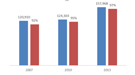
I am working to make my chart like this. The one column shows the total number and the another shows the Percentage. One column is related to another. For eg. In first column there is the total number and in another column you can see the 92% which is related to first column. How can I make this in Powr BI?
Sincerely,
Aakesh.
- Mark as New
- Bookmark
- Subscribe
- Mute
- Subscribe to RSS Feed
- Permalink
- Report Inappropriate Content
Hi @Aakex,
I'll suggest you use a "line and stacked / clustered column chart" instead. I've been where you are before and adding the same value to both column and line (displaying one of them as "Percent of grand total" or creating a measure) worked for me. You'll need to play a bit with the data labels to don't get it messy.
I hope it helps.
- Mark as New
- Bookmark
- Subscribe
- Mute
- Subscribe to RSS Feed
- Permalink
- Report Inappropriate Content
Thank You! 🙂
- Mark as New
- Bookmark
- Subscribe
- Mute
- Subscribe to RSS Feed
- Permalink
- Report Inappropriate Content
Hi Aakesh,
If my answer was satisfactory, could you mark it as it? Thank you!
Helpful resources

Europe’s largest Microsoft Fabric Community Conference
Join the community in Stockholm for expert Microsoft Fabric learning including a very exciting keynote from Arun Ulag, Corporate Vice President, Azure Data.

New forum boards available in Real-Time Intelligence.
Ask questions in Eventhouse and KQL, Eventstream, and Reflex.

| User | Count |
|---|---|
| 86 | |
| 82 | |
| 65 | |
| 63 | |
| 56 |
| User | Count |
|---|---|
| 171 | |
| 111 | |
| 109 | |
| 72 | |
| 71 |

