- Power BI forums
- Updates
- News & Announcements
- Get Help with Power BI
- Desktop
- Service
- Report Server
- Power Query
- Mobile Apps
- Developer
- DAX Commands and Tips
- Custom Visuals Development Discussion
- Health and Life Sciences
- Power BI Spanish forums
- Translated Spanish Desktop
- Power Platform Integration - Better Together!
- Power Platform Integrations (Read-only)
- Power Platform and Dynamics 365 Integrations (Read-only)
- Training and Consulting
- Instructor Led Training
- Dashboard in a Day for Women, by Women
- Galleries
- Community Connections & How-To Videos
- COVID-19 Data Stories Gallery
- Themes Gallery
- Data Stories Gallery
- R Script Showcase
- Webinars and Video Gallery
- Quick Measures Gallery
- 2021 MSBizAppsSummit Gallery
- 2020 MSBizAppsSummit Gallery
- 2019 MSBizAppsSummit Gallery
- Events
- Ideas
- Custom Visuals Ideas
- Issues
- Issues
- Events
- Upcoming Events
- Community Blog
- Power BI Community Blog
- Custom Visuals Community Blog
- Community Support
- Community Accounts & Registration
- Using the Community
- Community Feedback
Register now to learn Fabric in free live sessions led by the best Microsoft experts. From Apr 16 to May 9, in English and Spanish.
- Power BI forums
- Forums
- Get Help with Power BI
- Desktop
- Draw vertical lines in a line chart graph while se...
- Subscribe to RSS Feed
- Mark Topic as New
- Mark Topic as Read
- Float this Topic for Current User
- Bookmark
- Subscribe
- Printer Friendly Page
- Mark as New
- Bookmark
- Subscribe
- Mute
- Subscribe to RSS Feed
- Permalink
- Report Inappropriate Content
Draw vertical lines in a line chart graph while selecting multiple values in slicer
Hi everyone,
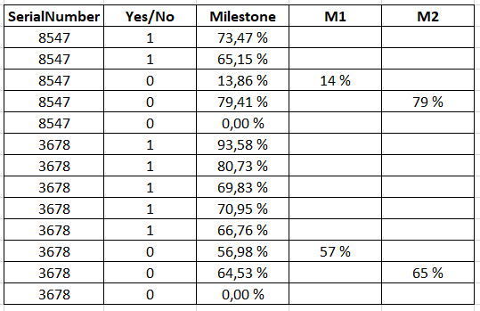
I have the following table :

I want to create a line chart using :
- X axis : column "Milestone"
- Y axis : Measure "Total Yes/No" (cumulative sum of column "Yes/No")
- Legend : column "SerialNumber"
- Slicer : column "SerialNumber"
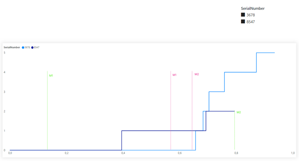
I want that my graph shows a vertical line for each milestone (M1, M2) for each SerialNumber.
I tried many solutions but nothing worked.
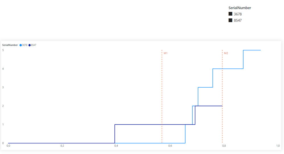
If I use the "X ais constant line" in the analytics pane, it works for one SerialNumber but if I select multiple values in the slicer (2 or more SerialNumbers), I don't get the result that I want.
Here is what I have now :

And this is the expected result :

I hope there is a way to make it work as expected.
Thank you.
Helpful resources

Microsoft Fabric Learn Together
Covering the world! 9:00-10:30 AM Sydney, 4:00-5:30 PM CET (Paris/Berlin), 7:00-8:30 PM Mexico City

Power BI Monthly Update - April 2024
Check out the April 2024 Power BI update to learn about new features.

| User | Count |
|---|---|
| 105 | |
| 102 | |
| 79 | |
| 72 | |
| 65 |
| User | Count |
|---|---|
| 141 | |
| 107 | |
| 100 | |
| 82 | |
| 74 |
