Jumpstart your career with the Fabric Career Hub
Find everything you need to get certified on Fabric—skills challenges, live sessions, exam prep, role guidance, and more.
Get started- Power BI forums
- Updates
- News & Announcements
- Get Help with Power BI
- Desktop
- Service
- Report Server
- Power Query
- Mobile Apps
- Developer
- DAX Commands and Tips
- Custom Visuals Development Discussion
- Health and Life Sciences
- Power BI Spanish forums
- Translated Spanish Desktop
- Power Platform Integration - Better Together!
- Power Platform Integrations (Read-only)
- Power Platform and Dynamics 365 Integrations (Read-only)
- Training and Consulting
- Instructor Led Training
- Dashboard in a Day for Women, by Women
- Galleries
- Community Connections & How-To Videos
- COVID-19 Data Stories Gallery
- Themes Gallery
- Data Stories Gallery
- R Script Showcase
- Webinars and Video Gallery
- Quick Measures Gallery
- 2021 MSBizAppsSummit Gallery
- 2020 MSBizAppsSummit Gallery
- 2019 MSBizAppsSummit Gallery
- Events
- Ideas
- Custom Visuals Ideas
- Issues
- Issues
- Events
- Upcoming Events
- Community Blog
- Power BI Community Blog
- Custom Visuals Community Blog
- Community Support
- Community Accounts & Registration
- Using the Community
- Community Feedback
Grow your Fabric skills and prepare for the DP-600 certification exam by completing the latest Microsoft Fabric challenge.
- Power BI forums
- Forums
- Get Help with Power BI
- Desktop
- Creating Trends as a Visual
- Subscribe to RSS Feed
- Mark Topic as New
- Mark Topic as Read
- Float this Topic for Current User
- Bookmark
- Subscribe
- Printer Friendly Page
- Mark as New
- Bookmark
- Subscribe
- Mute
- Subscribe to RSS Feed
- Permalink
- Report Inappropriate Content
Creating Trends as a Visual
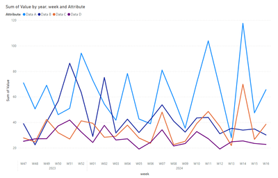
In a BI, I have generated a summary page, in which I show data, weekly and monthly of a time series, on that time series I calculate the 80th percentile. What I try to do is done automatically, in graphs, but I want to create somehow, that on that percentile select 8 data (the last 😎 and calculate a trend, indicate the trend, which in some cases, will be good or bad (sometimes positive and sometimes negative) marking 5%, 10%. The idea is to create it with two visual objects, one that shows the difference in % of the highest and lowest value of the series of 8 data and the other that shows an arrow with the characteristic of 5% orange, 10% red and if it improves more than 5% in green, as I say some values are good to decrease and others to increase.
Can you think of how to do it? It's giving me a lot of headaches.
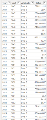
| year | week | given A | Data B | Data C | given D |
| 2023 | W47 | 70,92333333 | 38,96 | 27,84666667 | 25,18333333 |
| 2023 | W48 | 50,53333333 | 22,41666667 | 24,67333333 | 27,1 |
| 2023 | W49 | 69,05 | 40,31333333 | 42,28 | 27,21666667 |
| 2023 | W50 | 46,05333333 | 56,55 | 31,9 | 37,19 |
| 2023 | W51 | 50,99666667 | 86,31666667 | 26,95333333 | 41,81666667 |
| 2023 | W52 | 94,21666667 | 63,45 | 41,20666667 | 32,46666667 |
| 2024 | W01 | 72,98333333 | 28,98666667 | 39,3 | 24,26 |
| 2024 | W02 | 54,31 | 75,18333333 | 28,35 | 37,64666667 |
| 2024 | W03 | 41,71333333 | 31,68666667 | 29,08333333 | 26,2 |
| 2024 | W04 | 78,27 | 42,52333333 | 37,81666667 | 27,09333333 |
| 2024 | W05 | 42,63333333 | 32,01333333 | 27,74 | 19,08666667 |
| 2024 | W06 | 38,95333333 | 42,31333333 | 23,62 | 24,35666667 |
| 2024 | W07 | 80,97 | 53,76 | 48,02333333 | 34,18666667 |
| 2024 | W08 | 59,03333333 | 41,01666667 | 22,57666667 | 21,49 |
| 2024 | W09 | 35,45 | 32,39666667 | 25,17333333 | 23,4 |
| 2024 | W10 | 70,99333333 | 43,47 | 39,03666667 | 32,78333333 |
| 2024 | W11 | 103,91 | 43,89333333 | 48,54666667 | 27,20666667 |
| 2024 | W12 | 66,77 | 31,10666667 | 36,86333333 | 19,11666667 |
| 2024 | W13 | 28,02666667 | 35,32666667 | 21,86 | 24,75 |
| 2024 | W14 | 117,67 | 33,95 | 69,88666667 | 25,45 |
| 2024 | W15 | 47,46666667 | 34,82 | 26,68666667 | 23,47 |
| 2024 | W16 | 65,64333333 | 30,15333333 | 38,54 | 22,74333333 |
Thanks in advance.
- Mark as New
- Bookmark
- Subscribe
- Mute
- Subscribe to RSS Feed
- Permalink
- Report Inappropriate Content
Good afternoon, It would be something similar to this composition: The arrow would be the calculation of the hypothetical trend line with the values of the percentile (which BI calculates when filtering, of the P80, I have the raw data) positive or negative and the data would be the percentage of difference between those values.
Thank you
- Mark as New
- Bookmark
- Subscribe
- Mute
- Subscribe to RSS Feed
- Permalink
- Report Inappropriate Content
Helpful resources

New forum boards available in Real-Time Intelligence.
Ask questions in Eventhouse and KQL, Eventstream, and Reflex.

Power BI Monthly Update - May 2024
Check out the May 2024 Power BI update to learn about new features.

| User | Count |
|---|---|
| 89 | |
| 80 | |
| 60 | |
| 59 | |
| 58 |
| User | Count |
|---|---|
| 157 | |
| 118 | |
| 101 | |
| 76 | |
| 68 |


