- Power BI forums
- Updates
- News & Announcements
- Get Help with Power BI
- Desktop
- Service
- Report Server
- Power Query
- Mobile Apps
- Developer
- DAX Commands and Tips
- Custom Visuals Development Discussion
- Health and Life Sciences
- Power BI Spanish forums
- Translated Spanish Desktop
- Power Platform Integration - Better Together!
- Power Platform Integrations (Read-only)
- Power Platform and Dynamics 365 Integrations (Read-only)
- Training and Consulting
- Instructor Led Training
- Dashboard in a Day for Women, by Women
- Galleries
- Community Connections & How-To Videos
- COVID-19 Data Stories Gallery
- Themes Gallery
- Data Stories Gallery
- R Script Showcase
- Webinars and Video Gallery
- Quick Measures Gallery
- 2021 MSBizAppsSummit Gallery
- 2020 MSBizAppsSummit Gallery
- 2019 MSBizAppsSummit Gallery
- Events
- Ideas
- Custom Visuals Ideas
- Issues
- Issues
- Events
- Upcoming Events
- Community Blog
- Power BI Community Blog
- Custom Visuals Community Blog
- Community Support
- Community Accounts & Registration
- Using the Community
- Community Feedback
Register now to learn Fabric in free live sessions led by the best Microsoft experts. From Apr 16 to May 9, in English and Spanish.
- Power BI forums
- Forums
- Get Help with Power BI
- Desktop
- Comparison tool tip not dynamic with different dat...
- Subscribe to RSS Feed
- Mark Topic as New
- Mark Topic as Read
- Float this Topic for Current User
- Bookmark
- Subscribe
- Printer Friendly Page
- Mark as New
- Bookmark
- Subscribe
- Mute
- Subscribe to RSS Feed
- Permalink
- Report Inappropriate Content
Comparison tool tip not dynamic with different date range
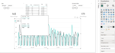
Hi all, I have 2 slicers that allows me to choose different date ranges to make comparison and I have superimposed them to start at the same point despite having different date ranges. However, I am facing some troubles with my tooltip. Only the left hand side's slicer's value is being updated and changing, whereas the right hand side's slicer's value is not changing on my tool tip. (Check the table above for the desired value & date)

When i use the default slicer, I get the correct values, but the dates are incorrect.

Any ideas how to fix this?
Another problem I face (but not as pressing) is that the end date of my graph follows the left hand side slicer. (ie. even though there are 171 days selected for the right side slicer, only 145 days are shown according to the left side slicer.
Would appreciate any help possible!
Here's my DAX code for the comparison line (ie the line generated by the right side slicer)
ComparisonLine =
 VAR __thisdate =   SELECTEDVALUE ( 'DATE TABLE 1'[Date] )
 VAR __minslicer1 =   CALCULATE ( MIN ( 'DATE TABLE 1'[Date] ), ALLSELECTED ( 'DATE TABLE 1'[Date] ) )
 VAR __daysin =   DATEDIFF ( __minslicer1, __thisdate, DAY ) + 0
 VAR __minslicer2 =   CALCULATE ( MIN ( 'Date Table (2)'[Date] ), ALLSELECTED ( 'Date Table (2)'[Date] ) )
 VAR __prevdate = __minslicer2 + __daysin

 RETURN   CALCULATE (   [Total],   'DATE TABLE 1'[Date] = __prevdate )
- Mark as New
- Bookmark
- Subscribe
- Mute
- Subscribe to RSS Feed
- Permalink
- Report Inappropriate Content
@milodinosaur , refer if this approach can help
Power BI Abstract Thesis: How to use two Date/Period slicers
Microsoft Power BI Learning Resources, 2023 !!
Learn Power BI - Full Course with Dec-2022, with Window, Index, Offset, 100+ Topics !!
Did I answer your question? Mark my post as a solution! Appreciate your Kudos !! Proud to be a Super User! !!
- Mark as New
- Bookmark
- Subscribe
- Mute
- Subscribe to RSS Feed
- Permalink
- Report Inappropriate Content
Hi @amitchandak !
Thank you for the wonderful video, however, I am trying to achieve slightly more than what is shown in the video, which is shifting the start date of the later date range, to make them start at the same point in my line chart. That I've succeeded, however, now the problem is with the tool tip not changing accordingly, since the x-axis of the graph is only using the first calendar table, and not the other.
Do you have any ideas how to fix it?
Helpful resources

Microsoft Fabric Learn Together
Covering the world! 9:00-10:30 AM Sydney, 4:00-5:30 PM CET (Paris/Berlin), 7:00-8:30 PM Mexico City

Power BI Monthly Update - April 2024
Check out the April 2024 Power BI update to learn about new features.

| User | Count |
|---|---|
| 104 | |
| 96 | |
| 79 | |
| 67 | |
| 62 |
| User | Count |
|---|---|
| 137 | |
| 106 | |
| 104 | |
| 81 | |
| 63 |
