- Power BI forums
- Updates
- News & Announcements
- Get Help with Power BI
- Desktop
- Service
- Report Server
- Power Query
- Mobile Apps
- Developer
- DAX Commands and Tips
- Custom Visuals Development Discussion
- Health and Life Sciences
- Power BI Spanish forums
- Translated Spanish Desktop
- Power Platform Integration - Better Together!
- Power Platform Integrations (Read-only)
- Power Platform and Dynamics 365 Integrations (Read-only)
- Training and Consulting
- Instructor Led Training
- Dashboard in a Day for Women, by Women
- Galleries
- Community Connections & How-To Videos
- COVID-19 Data Stories Gallery
- Themes Gallery
- Data Stories Gallery
- R Script Showcase
- Webinars and Video Gallery
- Quick Measures Gallery
- 2021 MSBizAppsSummit Gallery
- 2020 MSBizAppsSummit Gallery
- 2019 MSBizAppsSummit Gallery
- Events
- Ideas
- Custom Visuals Ideas
- Issues
- Issues
- Events
- Upcoming Events
- Community Blog
- Power BI Community Blog
- Custom Visuals Community Blog
- Community Support
- Community Accounts & Registration
- Using the Community
- Community Feedback
Earn a 50% discount on the DP-600 certification exam by completing the Fabric 30 Days to Learn It challenge.
- Power BI forums
- Galleries
- Data Stories Gallery
- Evaluating the performance of a creative team on F...
Evaluating the performance of a creative team on Facebook
03-05-2017 06:38 AM


- Mark as New
- Bookmark
- Subscribe
- Mute
- Subscribe to RSS Feed
- Permalink
- Report Inappropriate Content
Evaluating the performance of a creative team on Facebook
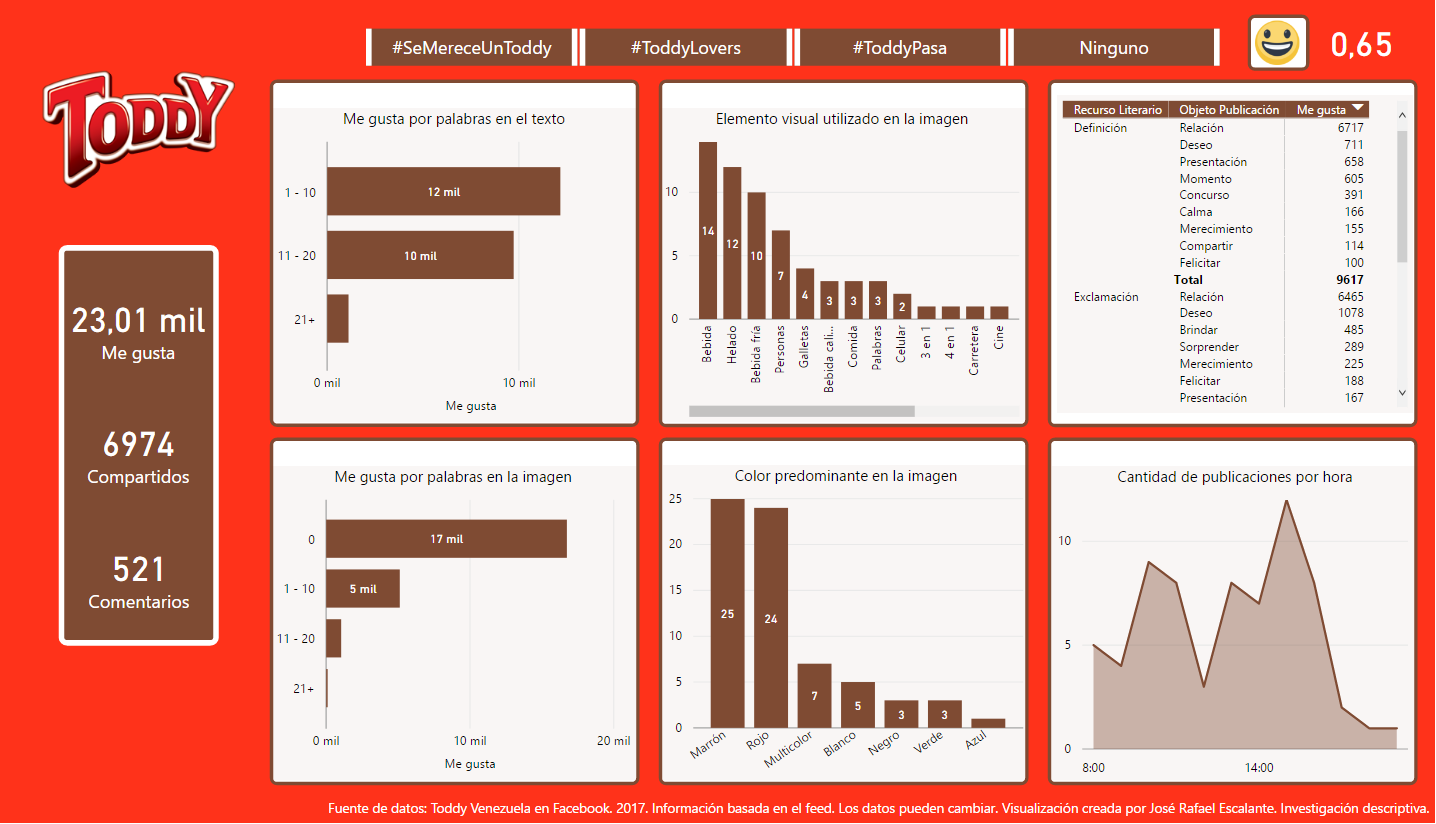
Hello everyone!
The next panel consists of an investigation that I am conducting based on a series of data that Facebook does not currently collect in its statistics. For example: the colors used, the number of words in the images as well as in the writing, the hashtags, the literary resource and the object of the publication. All data is public by scanning the brand feed. The purpose is to partially undress through the visualization of data, the creative process and compare it with the results obtained by interweaving all possible data. With this I want to present the importance of the measurement in the work environments using the storytelling with data.
I wanted to capture in the visualizations how attractive they should be for the viewer, trying to increase their interest in looking for the answers to their questions. Also keep the colors used regularly by the brand just like its youthful character. I have used different types of custom visuals to better focus the information: sparkline, sankey with labels, force-directed graph, pulse chart, among others. Finally I added a sentiment analysis using the Microsoft Azure Machine Learning - Text Analytics API to evaluate all users' comments. The dashboard is still under development, will continue to develop in the course of 2017.
I hope you like it! ![]()
José Rafael Escalante
¡Hola a todos!
El siguiente panel consiste en una investigación que estoy llevando a cabo en base a una serie de datos que actualmente Facebook no recopila en sus estadísticas. Por ejemplo: los colores usados, la cantidad de palabras tanto en las imágenes como en el escrito, los hashtags, el recurso literario y el objeto de la publicación. Todos los datos son de carácter público mediante la exploración del feed de la marca. La finalidad es desnudar parcialmente a través de la visualización de datos, el proceso creativo y compararlo con los resultados obtenidos entrelazando todos los datos posibles. Con ello quiero presentar la importancia de la medición en los ambientes de trabajo utilizando el storytelling con datos.
He querido plasmar en las visualizaciones lo atractivo que deben ser para el espectador, tratando de aumentar su interés en buscar las respuestas a sus preguntas. También mantener los colores utilizados regularmente por la marca al igual que su carácter juvenil. He utilizado distintos tipos de custom visuals para enfocar mejor la información: sparkline, sankey with labels, force-directed graph, pulse chart, entre otros. Por ultimo he agregado un análisis de sentimientos utilizando el API de Microsoft Azure Machine Learning – Text Analytics para evaluar todos los comentarios de los usuarios. El dashboard aún se encuentra en desarrollo, seguirá desarrollándose en el transcurso del año 2017.
¡Espero les guste! ![]()
José Rafael Escalante
eyJrIjoiNTY5NTNhNzUtMjdmYS00MjgyLTkyMWItYWFkYzNiYzhhOThhIiwidCI6ImMzOGEzOTY1LThkNjMtNDkyYi1iMjQyLWM5YWNhZGQ4YmQ1OSIsImMiOjR9