- Power BI forums
- Updates
- News & Announcements
- Get Help with Power BI
- Desktop
- Service
- Report Server
- Power Query
- Mobile Apps
- Developer
- DAX Commands and Tips
- Custom Visuals Development Discussion
- Health and Life Sciences
- Power BI Spanish forums
- Translated Spanish Desktop
- Power Platform Integration - Better Together!
- Power Platform Integrations (Read-only)
- Power Platform and Dynamics 365 Integrations (Read-only)
- Training and Consulting
- Instructor Led Training
- Dashboard in a Day for Women, by Women
- Galleries
- Community Connections & How-To Videos
- COVID-19 Data Stories Gallery
- Themes Gallery
- Data Stories Gallery
- R Script Showcase
- Webinars and Video Gallery
- Quick Measures Gallery
- 2021 MSBizAppsSummit Gallery
- 2020 MSBizAppsSummit Gallery
- 2019 MSBizAppsSummit Gallery
- Events
- Ideas
- Custom Visuals Ideas
- Issues
- Issues
- Events
- Upcoming Events
- Community Blog
- Power BI Community Blog
- Custom Visuals Community Blog
- Community Support
- Community Accounts & Registration
- Using the Community
- Community Feedback
Earn a 50% discount on the DP-600 certification exam by completing the Fabric 30 Days to Learn It challenge.
- Power BI forums
- Forums
- Get Help with Power BI
- Desktop
- Color legend for line and clustered column chart n...
- Subscribe to RSS Feed
- Mark Topic as New
- Mark Topic as Read
- Float this Topic for Current User
- Bookmark
- Subscribe
- Printer Friendly Page
- Mark as New
- Bookmark
- Subscribe
- Mute
- Subscribe to RSS Feed
- Permalink
- Report Inappropriate Content
Color legend for line and clustered column chart not changing
I set the default color (Monthly Sales) as a dark blue and the Running Total line as a yellow-orange. The graph displays the correct colors, but the legend shows Monthly Sales as being a slightly different yellow-orange color than the Running Total line.
How do I make the legend colors match the graph colors? It does this automatically on every other graph I've made.
- Mark as New
- Bookmark
- Subscribe
- Mute
- Subscribe to RSS Feed
- Permalink
- Report Inappropriate Content
Super old post, but I just ran into this same issue.
Seems like a glitch, but was able to fix by removing/re-adding the measure to Column y-axis.
- Mark as New
- Bookmark
- Subscribe
- Mute
- Subscribe to RSS Feed
- Permalink
- Report Inappropriate Content
I had the same issues and removing and re-adding the column measure fixed it for me! Thanks!
- Mark as New
- Bookmark
- Subscribe
- Mute
- Subscribe to RSS Feed
- Permalink
- Report Inappropriate Content
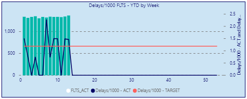
Any update? I am experiencing the exact same issue (see screenshot). Legend colors are correctly displayed for the line values, however for the colomn value the legend is displayed as white.
- Mark as New
- Bookmark
- Subscribe
- Mute
- Subscribe to RSS Feed
- Permalink
- Report Inappropriate Content
Hi @Anonymous
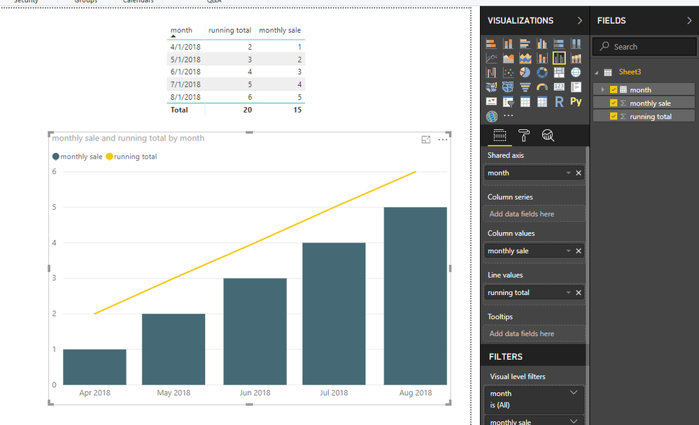
Test with this table and add columns to a "line and clustered column chart" as below
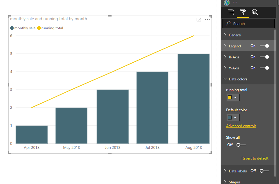
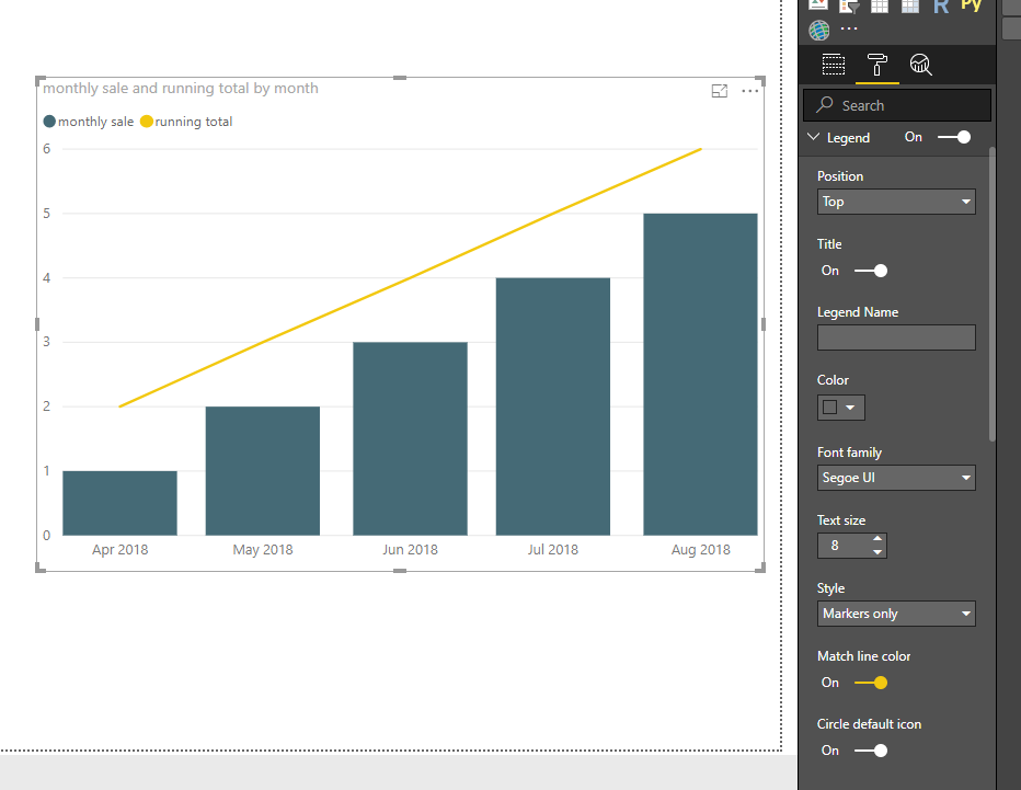
Please check your settings for this visual comparing with mine.
Additionally, do you use the lastest version of Power BI, please update to the lastest version.
https://docs.microsoft.com/en-us/power-bi/desktop-latest-update
Best Regards
Maggie
Helpful resources
| User | Count |
|---|---|
| 106 | |
| 88 | |
| 81 | |
| 76 | |
| 73 |
| User | Count |
|---|---|
| 112 | |
| 103 | |
| 96 | |
| 74 | |
| 67 |


