Jumpstart your career with the Fabric Career Hub
Find everything you need to get certified on Fabric—skills challenges, live sessions, exam prep, role guidance, and more.
Get started- Power BI forums
- Updates
- News & Announcements
- Get Help with Power BI
- Desktop
- Service
- Report Server
- Power Query
- Mobile Apps
- Developer
- DAX Commands and Tips
- Custom Visuals Development Discussion
- Health and Life Sciences
- Power BI Spanish forums
- Translated Spanish Desktop
- Power Platform Integration - Better Together!
- Power Platform Integrations (Read-only)
- Power Platform and Dynamics 365 Integrations (Read-only)
- Training and Consulting
- Instructor Led Training
- Dashboard in a Day for Women, by Women
- Galleries
- Community Connections & How-To Videos
- COVID-19 Data Stories Gallery
- Themes Gallery
- Data Stories Gallery
- R Script Showcase
- Webinars and Video Gallery
- Quick Measures Gallery
- 2021 MSBizAppsSummit Gallery
- 2020 MSBizAppsSummit Gallery
- 2019 MSBizAppsSummit Gallery
- Events
- Ideas
- Custom Visuals Ideas
- Issues
- Issues
- Events
- Upcoming Events
- Community Blog
- Power BI Community Blog
- Custom Visuals Community Blog
- Community Support
- Community Accounts & Registration
- Using the Community
- Community Feedback
Grow your Fabric skills and prepare for the DP-600 certification exam by completing the latest Microsoft Fabric challenge.
- Power BI forums
- Forums
- Get Help with Power BI
- Desktop
- Re: Can someone please explain why I arbitrarily c...
- Subscribe to RSS Feed
- Mark Topic as New
- Mark Topic as Read
- Float this Topic for Current User
- Bookmark
- Subscribe
- Printer Friendly Page
- Mark as New
- Bookmark
- Subscribe
- Mute
- Subscribe to RSS Feed
- Permalink
- Report Inappropriate Content
Can someone please explain why I arbitrarily can't add fields to charts?
Hi guys
I've had this problem now with several charts, where I attempt to drag & drop a field with valid data in to a chart, and nothing happens - I can't believe there is no kind of error message telling me what I am doing wrong, I don't even get a "Computer says no" - it just gives me no feedback whasoever on why it's unable to do such a simple thing.
Regardless of my moaning, I do actually want to learn why this is, so here's the context.
I have a blank line chart. I'm building this off a 'ComparisonTable' which is a summary of my 'Database' table.
ComparisonTable =
SUMMARIZE(
    Database,
    Database[Type],
    Database[Cost Heading],
    Database[Cost Group],
    Database[Asset],
    "MinRate", MIN(Database[Rate]),
    "MaxRate", MAX(Database[Rate])
)
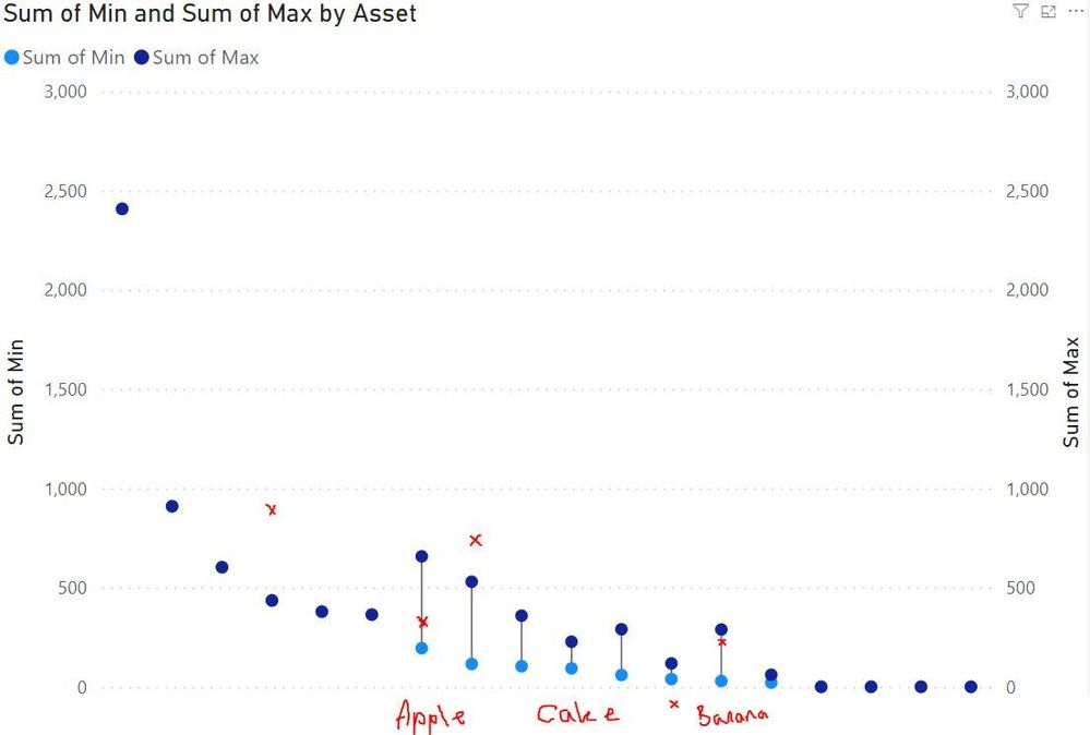
So I'm simply looking to get one line per Asset, with the minimum cost rate and the maximum cost rate. Example:
Apple | £0.80 | £1.00
Etc.
So I create a line chart, drag Asset onto the X, then I wish to have two Y-axis series - one for the minimum cost, and one for the maximum. I drag the MinRate into the Y-axis field 1 and nothing happens.
BUT
If I then create an excel table, and summarise the data in *EXACTLY* the same way as the 'ComparisonTable', then link that to a new PowerBI project I can create the table exactly as I need, example below.
Yes, I'm doing a bodge to get a dumbbell chart in.
My overall intention for this dashboard is to have the user import a CSV of products with the quoted price, and have the quoted prices appear on the relevant X-axis against the minimum & the maximum, and in that way the user can measure the quoted price of products against the database of costs.
But for now..
HOW DO I GET THE LINE CHART TO WORK WITH CALCULATED COLUMNS/TABLES, OR AT THE VERY LEAST, HOW DO I GET POWER BI TO TELL ME WHY THIS ISN'T POSSIBLE FOR THIS DATA FIELD?!
Thank you!
- Mark as New
- Bookmark
- Subscribe
- Mute
- Subscribe to RSS Feed
- Permalink
- Report Inappropriate Content
So I actually solved this and it's a genuine bug.
Microsoft added something in for Calculated groups that turn off Enable Implicit Measures.
I did not have at any points any calculated groups. Ever.
I learned that this kills the ability to sum columns etc. Fun, so what I ended up having to do was to go into PowerBI settings, turning on the beta setting to enable calculated groups, and then turning on the Implicit Measures switch. And hey-presto, now columns can be used in graphs.
Absolutely insane. I had to enable a beta feature to turn on a setting that had been turned off, with no ability to re-enable it unless you opted in to a beta setting.
Helpful resources

Europe’s largest Microsoft Fabric Community Conference
Join the community in Stockholm for expert Microsoft Fabric learning including a very exciting keynote from Arun Ulag, Corporate Vice President, Azure Data.

New forum boards available in Real-Time Intelligence.
Ask questions in Eventhouse and KQL, Eventstream, and Reflex.

| User | Count |
|---|---|
| 86 | |
| 82 | |
| 64 | |
| 63 | |
| 56 |
| User | Count |
|---|---|
| 171 | |
| 113 | |
| 110 | |
| 73 | |
| 73 |

