- Power BI forums
- Updates
- News & Announcements
- Get Help with Power BI
- Desktop
- Service
- Report Server
- Power Query
- Mobile Apps
- Developer
- DAX Commands and Tips
- Custom Visuals Development Discussion
- Health and Life Sciences
- Power BI Spanish forums
- Translated Spanish Desktop
- Power Platform Integration - Better Together!
- Power Platform Integrations (Read-only)
- Power Platform and Dynamics 365 Integrations (Read-only)
- Training and Consulting
- Instructor Led Training
- Dashboard in a Day for Women, by Women
- Galleries
- Community Connections & How-To Videos
- COVID-19 Data Stories Gallery
- Themes Gallery
- Data Stories Gallery
- R Script Showcase
- Webinars and Video Gallery
- Quick Measures Gallery
- 2021 MSBizAppsSummit Gallery
- 2020 MSBizAppsSummit Gallery
- 2019 MSBizAppsSummit Gallery
- Events
- Ideas
- Custom Visuals Ideas
- Issues
- Issues
- Events
- Upcoming Events
- Community Blog
- Power BI Community Blog
- Custom Visuals Community Blog
- Community Support
- Community Accounts & Registration
- Using the Community
- Community Feedback
Earn a 50% discount on the DP-600 certification exam by completing the Fabric 30 Days to Learn It challenge.
- Power BI forums
- Community Blog
- Power BI Community Blog
- An Alternate Reality: Measure Totals Sum Rows
- Subscribe to RSS Feed
- Mark as New
- Mark as Read
- Bookmark
- Subscribe
- Printer Friendly Page
- Report Inappropriate Content
- Subscribe to RSS Feed
- Mark as New
- Mark as Read
- Bookmark
- Subscribe
- Printer Friendly Page
- Report Inappropriate Content
Preamble
What if when Power BI was released all those years ago that it defaulted to table and matrix totals simply summing the rows? Let's explore this alternate reality and how you would handle displaying an alternate summary of information in a table or matrix.
Introduction
As we all know, the total row for table and matrix visuals in Power BI displays a sum of the rows. Obviously, for 95%+ of the world's population this is entirely expected behavior. After all, the definition of the word total is "a product of addition: sum" and this is what we have come to expect since this is how totals work in every spreadsheet, reporting and business intelligence tool ever created. Even before software, accountants and other business users who displayed totals for tables on paper, the total row always summed the rows of the table. In fact, a total summing the rows of a table is so ingrained into the human psyche that it honestly feels a little weird explaining and justifying this behavior.
But, Power BI provides the powerful formula language, DAX and DAX is so powerful that it provides alternate ways of thinking about what we might display in a summary line for a table or matrix. This article explores an example of one of those edge cases where we might not want to display the sum of the rows in a table but rather do something a little different.
Scenario
Suppose we have the following set of example data:
This table simply lists a unique customer identifier, Customer, along with the products they have purchased, Product. If we create a simple measure for counting the distinct customers like so:
Distinct Count = DISTINCTCOUNT('Table'[Customer])And we place this meaure into a table visual along with the Product column, we get the following:
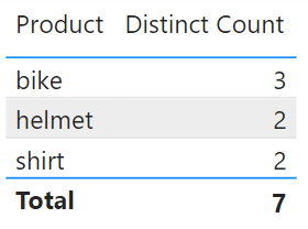
Here we can clearly see that the Total line displays the number 7, which is the sum of the individual rows in the table, 3 + 2 + 2 = 7. And it is important to note here that all Power BI visuals calculate totals this way such as the stacked column chart, stacked bar chart, and stacked area chart. Clearly, it would be ridiculous and confusing for end users if Power BI calculated totals differently depending upon which visual was used.
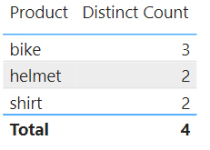
However, in this case, the report author wants to display a summary of the distinct count of all customers within the data. Since different customers bought the same products, they are distinct within the context of each product but there is some double counting going on within the Total row from the perspective of the overall count of distinct customers. From this perspective, the summary row of the table should display a distinct count of 4.
Never fear! There is an easy and straight-forward way of displaying the desired value without any additional DAX code!! This approach is super simple and only involves a bit of configuration and the creation of 1 or 2 additional visuals. Let's get started!
- Create a Card visual and place your Distinct Count measure into this Card visual in the Fields field well
- Format the Callout value to be the same font and size as the table, for example, Segoe UI Bold, 10
- Resize and position this Card value over top of the number returned by the table visual in the Total row
That's it! With three simple steps, we now have this:
Now, obviously the word "Total" being in the summary row is a potential problem since it is going to be super confusing for end users to have a Total that is not the sum of the rows. Therefore, to avoid such obvious confusion, an improvement to this techique is to do the following:
- Turn off the Total row for the table
- Create a new measure that is simply: Summary = "All"
- Place this new measure into the Fields well of a new Card visual
- Resize and reposition this Card visual in relation to the table
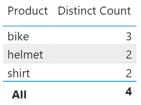
With this four additional steps we get the following:
Performing these additional steps will prevent user confusion and improve the natural readability and understanding of the report.
Now, is this technique fool proof? No. In self-service visualization and other scenarios, the rows in the table and matrix may change and this can mess up the positioning of the visuals relative to one another. In these scenarios, I often find it preferrable to turn off the Total row for the table or matrix and use a single card visual above the table or elsewhere on the page like below:
This technique is perhaps even better considering that even with proper labeling, end users are still going to be initially confused when they see a number in the summary row of a table that is not the sum of the rows.
Conclusion
DAX is a powerful formula language that can shift one's perspective about what report authors might want to provide as summary information for a table or matrix. However, care must be taken when providing a summary that is not the sum of the rows as this can create massive confusion for end users. And certainly, NEVER, leave the "Total" label present in the visual if you are providing an alternate summary that is not an actual total.
If you would like Microsoft to provide a toggle that allows the default behavior of summing the rows or an "all", then vote for this idea. I am 100% certain that, without fail, Microsoft will provide such an alternative in the next 7 years or so...
You must be a registered user to add a comment. If you've already registered, sign in. Otherwise, register and sign in.
- When to Use Heatmaps and How to Implement Row-Leve...
- Use a Python script to annotate special points on ...
- How to compare data in different date ranges
- Split a column and store values into corresponding...
- [PowerBi] Measure Killer - external tool to clean ...
- Design Mobile and Browser Layout view within Power...
- Dynamic rollback of the previous N weeks of data
- Supercharge Your Visuals: Easy Conditional Formatt...
- The using of Cartesian products in many-to-many re...
- How to Filter similar Columns Based on Specific Co...
-
 Brunner_BI
on:
[PowerBi] Measure Killer - external tool to clean ...
-
 Fowmy
on:
Supercharge Your Visuals: Easy Conditional Formatt...
-
marcoselias
 on:
Power BI Dynamic Date Filters: Automatically Updat...
- joseftantawi on: How to customize open-sourced custom visual.
- kalpeshdangar on: Creating Custom Calendars for Accurate Working Day...
- gwayne on: Embracing TMDL Functionalities in Power BI and Pre...
- jian123 on: Sharing Power Query tables
-
 Martin_D
on:
From the Desk of An Experienced Power BI Analyst
-
 ibarrau
on:
[PowerQuery] Catch errors in a request http
- Aditya07 on: How to import customised themes in Power BI - usin...
-
How To
577 -
Tips & Tricks
532 -
Support insights
121 -
Events
107 -
DAX
66 -
Power BI
65 -
Opinion
64 -
Power Query
62 -
Power BI Desktop
40 -
Power BI Dev Camp
36 -
Roundup
31 -
Power BI Embedded
20 -
Time Intelligence
19 -
Tips&Tricks
18 -
PowerBI REST API
12 -
Power BI Service
8 -
Power Query Tips & Tricks
8 -
finance
8 -
Direct Query
7 -
Power BI REST API
6 -
Auto ML
6 -
financial reporting
6 -
Data Analysis
6 -
Power Automate
6 -
Data Visualization
6 -
Python
6 -
Income Statement
5 -
powerbi
5 -
service
5 -
Power BI PowerShell
5 -
Machine Learning
5 -
Featured User Group Leader
5 -
Dax studio
5 -
External tool
4 -
Paginated Reports
4 -
Power BI Goals
4 -
PowerShell
4 -
Desktop
4 -
Bookmarks
4 -
Group By
4 -
Line chart
4 -
community
4 -
RLS
4 -
M language
4 -
Visuals
3 -
R script
3 -
Aggregation
3 -
Dataflow
3 -
calendar
3 -
Gateways
3 -
R
3 -
M Query
3 -
R visual
3 -
Webinar
3 -
CALCULATE
3 -
Reports
3 -
PowerApps
3 -
Data Science
3 -
Azure
3 -
Data model
3 -
Conditional Formatting
3 -
Visualisation
3 -
Administration
3 -
M code
3 -
SQL Server 2017 Express Edition
3 -
PUG
2 -
Custom Measures
2 -
Filtering
2 -
Row and column conversion
2 -
Python script
2 -
Nulls
2 -
DVW Analytics
2 -
Industrial App Store
2 -
Week
2 -
Date duration
2 -
parameter
2 -
Weekday Calendar
2 -
Support insights.
2 -
construct list
2 -
Formatting
2 -
Power Platform
2 -
Workday
2 -
external tools
2 -
slicers
2 -
SAP
2 -
index
2 -
RANKX
2 -
Integer
2 -
PBI Desktop
2 -
Date Dimension
2 -
Power BI Challenge
2 -
Query Parameter
2 -
Visualization
2 -
Tabular Editor
2 -
Date
2 -
SharePoint
2 -
Power BI Installation and Updates
2 -
How Things Work
2 -
troubleshooting
2 -
Date DIFF
2 -
Transform data
2 -
rank
2 -
ladataweb
2 -
Tips and Tricks
2 -
Incremental Refresh
2 -
Query Plans
2 -
Power BI & Power Apps
2 -
Random numbers
2 -
Day of the Week
2 -
Number Ranges
2 -
M
2 -
hierarchies
2 -
Power BI Anniversary
2 -
Language M
2 -
Custom Visual
2 -
VLOOKUP
2 -
pivot
2 -
calculated column
2 -
Power BI Premium Per user
2 -
inexact
2 -
Date Comparison
2 -
Split
2 -
Forecasting
2 -
REST API
2 -
Editor
2 -
Working with Non Standatd Periods
2 -
powerbi.tips
2 -
Custom function
2 -
Reverse
2 -
measure
2 -
Microsoft-flow
2 -
Paginated Report Builder
2 -
Power Pivot
1 -
Quick Tips
1 -
data
1 -
PBIRS
1 -
Usage Metrics in Power BI
1 -
HR Analytics
1 -
keepfilters
1 -
Connect Data
1 -
Financial Year
1 -
Schneider
1 -
dynamically delete records
1 -
Copy Measures
1 -
Friday
1 -
Table
1 -
Natural Query Language
1 -
Infographic
1 -
automation
1 -
Prediction
1 -
newworkspacepowerbi
1 -
Performance KPIs
1 -
Active Employee
1 -
Custom Date Range on Date Slicer
1 -
refresh error
1 -
PAS
1 -
certain duration
1 -
DA-100
1 -
bulk renaming of columns
1 -
Single Date Picker
1 -
Monday
1 -
PCS
1 -
Saturday
1 -
Q&A
1 -
Event
1 -
Custom Visuals
1 -
Free vs Pro
1 -
Format
1 -
Current Employees
1 -
date hierarchy
1 -
relationship
1 -
SIEMENS
1 -
Multiple Currency
1 -
Power BI Premium
1 -
On-premises data gateway
1 -
Binary
1 -
Power BI Connector for SAP
1 -
Sunday
1 -
update
1 -
Slicer
1 -
Visual
1 -
forecast
1 -
Regression
1 -
CICD
1 -
sport statistics
1 -
Intelligent Plant
1 -
Circular dependency
1 -
GE
1 -
Exchange rate
1 -
Dendrogram
1 -
range of values
1 -
activity log
1 -
Decimal
1 -
Charticulator Challenge
1 -
Field parameters
1 -
Training
1 -
Announcement
1 -
Features
1 -
domain
1 -
pbiviz
1 -
Color Map
1 -
Industrial
1 -
Weekday
1 -
Working Date
1 -
Space Issue
1 -
Emerson
1 -
Date Table
1 -
Cluster Analysis
1 -
Stacked Area Chart
1 -
union tables
1 -
Number
1 -
Start of Week
1 -
Tips& Tricks
1 -
deployment
1 -
ssrs traffic light indicators
1 -
SQL
1 -
trick
1 -
Scripts
1 -
Extract
1 -
Topper Color On Map
1 -
Historians
1 -
context transition
1 -
Custom textbox
1 -
OPC
1 -
Zabbix
1 -
Label: DAX
1 -
Business Analysis
1 -
Supporting Insight
1 -
rank value
1 -
Synapse
1 -
End of Week
1 -
Tips&Trick
1 -
Workspace
1 -
Theme Colours
1 -
Text
1 -
Flow
1 -
Publish to Web
1 -
patch
1 -
Top Category Color
1 -
A&E data
1 -
Previous Order
1 -
Substring
1 -
Wonderware
1 -
Power M
1 -
Format DAX
1 -
Custom functions
1 -
accumulative
1 -
DAX&Power Query
1 -
Premium Per User
1 -
GENERATESERIES
1 -
Showcase
1 -
custom connector
1 -
Waterfall Chart
1 -
Power BI On-Premise Data Gateway
1 -
step by step
1 -
Top Brand Color on Map
1 -
Tutorial
1 -
Previous Date
1 -
XMLA End point
1 -
color reference
1 -
Date Time
1 -
Marker
1 -
Lineage
1 -
CSV file
1 -
conditional accumulative
1 -
Matrix Subtotal
1 -
Check
1 -
null value
1 -
Report Server
1 -
Audit Logs
1 -
analytics pane
1 -
mahak
1 -
pandas
1 -
Networkdays
1 -
Button
1 -
Dataset list
1 -
Keyboard Shortcuts
1 -
Fill Function
1 -
LOOKUPVALUE()
1 -
Tips &Tricks
1 -
Plotly package
1 -
refresh M language Python script Support Insights
1 -
Excel
1 -
Cumulative Totals
1 -
Report Theme
1 -
Bookmarking
1 -
oracle
1 -
Canvas Apps
1 -
total
1 -
Filter context
1 -
Difference between two dates
1 -
get data
1 -
OSI
1 -
Query format convert
1 -
ETL
1 -
Json files
1 -
Merge Rows
1 -
CONCATENATEX()
1 -
take over Datasets;
1 -
Networkdays.Intl
1 -
Get row and column totals
1 -
Sameperiodlastyear
1 -
Office Theme
1 -
matrix
1 -
bar chart
1 -
Measures
1 -
powerbi argentina
1 -
Model Driven Apps
1 -
REMOVEFILTERS
1 -
XMLA endpoint
1 -
translations
1 -
OSI pi
1 -
Parquet
1 -
Change rows to columns
1 -
remove spaces
1 -
Azure AAD
1 -
Governance
1 -
Fun
1 -
Power BI gateway
1 -
gateway
1 -
Elementary
1 -
Custom filters
1 -
Vertipaq Analyzer
1 -
powerbi cordoba
1 -
DIisconnected Tables
1 -
Sandbox
1 -
Honeywell
1 -
Combine queries
1 -
X axis at different granularity
1 -
ADLS
1 -
Primary Key
1 -
Microsoft 365 usage analytics data
1 -
Randomly filter
1 -
Week of the Day
1 -
Get latest sign-in data for each user
1 -
Retail
1 -
Power BI Report Server
1 -
School
1 -
Cost-Benefit Analysis
1 -
ISV
1 -
Ties
1 -
unpivot
1 -
Practice Model
1 -
Continuous streak
1 -
ProcessVue
1 -
Create function
1 -
Table.Schema
1 -
Acknowledging
1 -
Postman
1 -
Text.ContainsAny
1 -
Power BI Show
1 -
query
1 -
Dynamic Visuals
1 -
KPI
1 -
Intro
1 -
Icons
1 -
Issues
1 -
function
1 -
stacked column chart
1 -
ho
1 -
ABB
1 -
KNN algorithm
1 -
List.Zip
1 -
optimization
1 -
Artificial Intelligence
1 -
Map Visual
1 -
Text.ContainsAll
1 -
Tuesday
1 -
API
1 -
Kingsley
1 -
Merge
1 -
variable
1 -
financial reporting hierarchies RLS
1 -
Featured Data Stories
1 -
MQTT
1 -
Custom Periods
1 -
Partial group
1 -
Reduce Size
1 -
FBL3N
1 -
Wednesday
1 -
help
1 -
group
1 -
Scorecard
1 -
Json
1 -
Tops
1 -
Multivalued column
1 -
pipeline
1 -
Path
1 -
Yokogawa
1 -
Dynamic calculation
1 -
Data Wrangling
1 -
native folded query
1 -
transform table
1 -
UX
1 -
Cell content
1 -
General Ledger
1 -
Thursday
1


