- Power BI forums
- Updates
- News & Announcements
- Get Help with Power BI
- Desktop
- Service
- Report Server
- Power Query
- Mobile Apps
- Developer
- DAX Commands and Tips
- Custom Visuals Development Discussion
- Health and Life Sciences
- Power BI Spanish forums
- Translated Spanish Desktop
- Power Platform Integration - Better Together!
- Power Platform Integrations (Read-only)
- Power Platform and Dynamics 365 Integrations (Read-only)
- Training and Consulting
- Instructor Led Training
- Dashboard in a Day for Women, by Women
- Galleries
- Community Connections & How-To Videos
- COVID-19 Data Stories Gallery
- Themes Gallery
- Data Stories Gallery
- R Script Showcase
- Webinars and Video Gallery
- Quick Measures Gallery
- 2021 MSBizAppsSummit Gallery
- 2020 MSBizAppsSummit Gallery
- 2019 MSBizAppsSummit Gallery
- Events
- Ideas
- Custom Visuals Ideas
- Issues
- Issues
- Events
- Upcoming Events
- Community Blog
- Power BI Community Blog
- Custom Visuals Community Blog
- Community Support
- Community Accounts & Registration
- Using the Community
- Community Feedback
Register now to learn Fabric in free live sessions led by the best Microsoft experts. From Apr 16 to May 9, in English and Spanish.
- Power BI forums
- Forums
- Get Help with Power BI
- Service
- real time streaming data set issue
- Subscribe to RSS Feed
- Mark Topic as New
- Mark Topic as Read
- Float this Topic for Current User
- Bookmark
- Subscribe
- Printer Friendly Page
- Mark as New
- Bookmark
- Subscribe
- Mute
- Subscribe to RSS Feed
- Permalink
- Report Inappropriate Content
real time streaming data set issue
Hi ,

- Mark as New
- Bookmark
- Subscribe
- Mute
- Subscribe to RSS Feed
- Permalink
- Report Inappropriate Content
Hi @gowrishankar65,
I think this issue should more related to your data, it seems like you push multiple records at same time with both actual and alarm label. Then your chart analysis/display these history records as two lines.
Regards,
Xiaoxin Sheng
If this post helps, please consider accept as solution to help other members find it more quickly.
- Mark as New
- Bookmark
- Subscribe
- Mute
- Subscribe to RSS Feed
- Permalink
- Report Inappropriate Content
Hi @v-shex-msft,
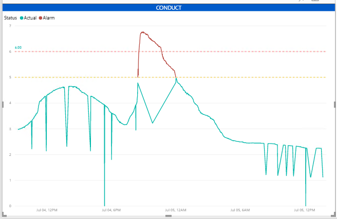
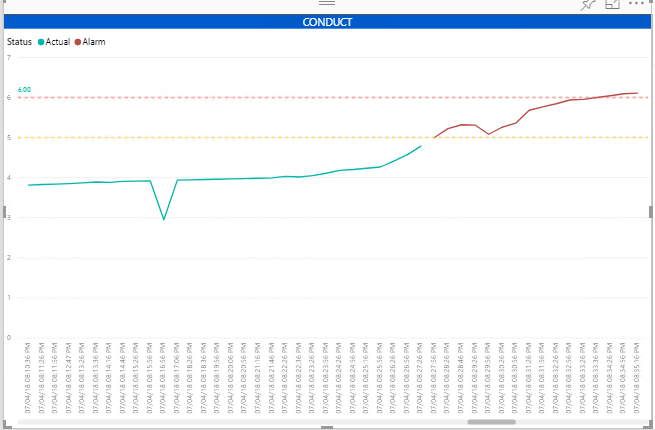
Thanks for your reply 🙂 As I said earlier, the red line is showing data for different timestamp and green is showing for different timestamp. The issue I figure out is due to x-axis type as continuous. By changing the X-axis type to categorical below is the output for green and red lines.
This approach will not work since I am getting real time data for every 30 seconds. For x-axis = continous, I want to see green and red for different time range window.
Regards,
Gowrishankar
- Mark as New
- Bookmark
- Subscribe
- Mute
- Subscribe to RSS Feed
- Permalink
- Report Inappropriate Content
Hi @gowrishankar65,
Maybe you can consider to use history data to create visual, it support more visual types than live stream tiles.
BTW, current power bi desktop support to connect power bi service datasets, you can do some custom on them and publish them to power bi service.
Regards,
Xiaoxin Sheng
If this post helps, please consider accept as solution to help other members find it more quickly.
- Mark as New
- Bookmark
- Subscribe
- Mute
- Subscribe to RSS Feed
- Permalink
- Report Inappropriate Content
Hi @v-shex-msft,
Yes, we are using the hybrid dataset option by turning ON the historical data and also with support to Power BI service datasets, we are creating the Line chart and publishing them into the power BI service.
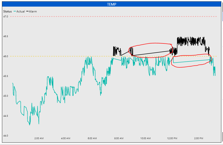
The problem lies with the Line chart X-Axis option where we are giving Type - Continuous. For every 30 seconds, we are aggregating the TEMP value. If you notice the circled area, the dots are getting connected to form the continous line and during that time nothing happened but it makes the user to think like both the black line and green line happened in same time duration but its not.
Can you help me on which other visual I can utilize for the same ?
- Mark as New
- Bookmark
- Subscribe
- Mute
- Subscribe to RSS Feed
- Permalink
- Report Inappropriate Content
HI @gowrishankar65,
Unfortunately, I also not found any option to prevent these lines which generated by continuous mode.
In this mode, it will auto link nearest points.(I also try to use measure to instead but failed)
Regards,
Xiaoxin Sheng
If this post helps, please consider accept as solution to help other members find it more quickly.
Helpful resources

Microsoft Fabric Learn Together
Covering the world! 9:00-10:30 AM Sydney, 4:00-5:30 PM CET (Paris/Berlin), 7:00-8:30 PM Mexico City

Power BI Monthly Update - April 2024
Check out the April 2024 Power BI update to learn about new features.


