- Power BI forums
- Updates
- News & Announcements
- Get Help with Power BI
- Desktop
- Service
- Report Server
- Power Query
- Mobile Apps
- Developer
- DAX Commands and Tips
- Custom Visuals Development Discussion
- Health and Life Sciences
- Power BI Spanish forums
- Translated Spanish Desktop
- Power Platform Integration - Better Together!
- Power Platform Integrations (Read-only)
- Power Platform and Dynamics 365 Integrations (Read-only)
- Training and Consulting
- Instructor Led Training
- Dashboard in a Day for Women, by Women
- Galleries
- Community Connections & How-To Videos
- COVID-19 Data Stories Gallery
- Themes Gallery
- Data Stories Gallery
- R Script Showcase
- Webinars and Video Gallery
- Quick Measures Gallery
- 2021 MSBizAppsSummit Gallery
- 2020 MSBizAppsSummit Gallery
- 2019 MSBizAppsSummit Gallery
- Events
- Ideas
- Custom Visuals Ideas
- Issues
- Issues
- Events
- Upcoming Events
- Community Blog
- Power BI Community Blog
- Custom Visuals Community Blog
- Community Support
- Community Accounts & Registration
- Using the Community
- Community Feedback
Register now to learn Fabric in free live sessions led by the best Microsoft experts. From Apr 16 to May 9, in English and Spanish.
- Power BI forums
- Forums
- Get Help with Power BI
- Service
- Re: Visualization Graphs/Average and Labels
- Subscribe to RSS Feed
- Mark Topic as New
- Mark Topic as Read
- Float this Topic for Current User
- Bookmark
- Subscribe
- Printer Friendly Page
- Mark as New
- Bookmark
- Subscribe
- Mute
- Subscribe to RSS Feed
- Permalink
- Report Inappropriate Content
Visualization Graphs/Average and Labels
Good day Community,
I have prbably simple question. I have data which looks like that. Data comes from similar Excel files from different assessments:
ITEM 1 ITEM 2 ITEM 2
Manager GOOD BAD NOT ASSESSED
Operator NOT ASSESSED VERY GOOD BAD
Assistant GOOD AVERAGE NOT ASSESSED
In a background of Excel, I have chaged asessemnt crtieria to NUMBERS to allow better visualization for AREA CHARTS etc... Text can only be presented by PIE CHARTS in %.
GOOD is 5
AVERAGE is 3
NOT ASSESED is 0
Question #1: In need average mark for every item, how to exclude 0 mark from average. I do not want to hide 0 as I want to know how many times "NOT ASSESSED" was used.
Question#2: On are chart, It will preferlty show what I need if I use numbers - Can I change legend and labels in Power Bi to customize numbers back to TEXT for better understanding of reader?
Thnaks
Aleks
Solved! Go to Solution.
- Mark as New
- Bookmark
- Subscribe
- Mute
- Subscribe to RSS Feed
- Permalink
- Report Inappropriate Content
@AleksandrMe
For Q2, you may create another column as the labels, something like:
Column 2 = SWITCH(TRUE(),[Measure]<3,"Don't Meet Standard",[Measure]>=3,"Meet Standard")
Paul Zheng _ Community Support Team
If this post helps, then please consider Accept it as the solution to help the other members find it more quickly.
- Mark as New
- Bookmark
- Subscribe
- Mute
- Subscribe to RSS Feed
- Permalink
- Report Inappropriate Content
@AleksandrMe - I would unpivot those last three columns (ITEM1, ITEM2, ITEM3) in Power Query. You could get the average of no 0's by doing something like:
You could create a column then like this:
Column = SWITCH([Value],"GOOD",5,"AVERAGE",3,"NOT ASSESSED",0)
Then a measure like this:
Measure = AVERAGEX(FILTER('Table',[Column]<>0),[Column])
@ me in replies or I'll lose your thread!!!
Instead of a Kudo, please vote for this idea
Become an expert!: Enterprise DNA
External Tools: MSHGQM
YouTube Channel!: Microsoft Hates Greg
Latest book!: The Definitive Guide to Power Query (M)
DAX is easy, CALCULATE makes DAX hard...
- Mark as New
- Bookmark
- Subscribe
- Mute
- Subscribe to RSS Feed
- Permalink
- Report Inappropriate Content
@Greg_Deckler - Thanks Greg.
I figured out how to deal with average exlusion of ) values. However still not able to figure out if my another idea is possible at all.
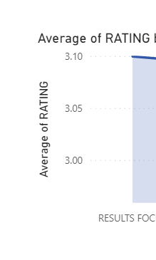
Please see screen - TO have this graph I need Numbers but Not Text. I woul like to keep this type of graph by I woul like to use text for labels - this is where I struggle. Reader needs to undertand what 3.0 means, this for example "Meet Standard" etc...
- Mark as New
- Bookmark
- Subscribe
- Mute
- Subscribe to RSS Feed
- Permalink
- Report Inappropriate Content
@AleksandrMe
For Q2, you may create another column as the labels, something like:
Column 2 = SWITCH(TRUE(),[Measure]<3,"Don't Meet Standard",[Measure]>=3,"Meet Standard")
Paul Zheng _ Community Support Team
If this post helps, then please consider Accept it as the solution to help the other members find it more quickly.
Helpful resources

Microsoft Fabric Learn Together
Covering the world! 9:00-10:30 AM Sydney, 4:00-5:30 PM CET (Paris/Berlin), 7:00-8:30 PM Mexico City

Power BI Monthly Update - April 2024
Check out the April 2024 Power BI update to learn about new features.


