@nirvana_moksh
Summarized data only exports aggregated data points that you see in the visual while Underlying data exports additional data that are not displayed but are relevant for the visual.
Here is the link where MS explains the difference: https://docs.microsoft.com/en-us/power-bi/visuals/power-bi-visualization-export-data
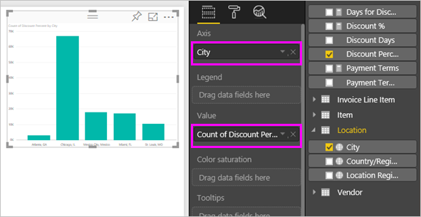
Based on below chart.
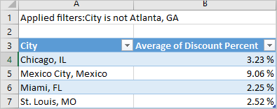
Summarized data: select this option if you want to export data for what you see in that visual. This type of export shows you only the data (columns and measures) that you chose to create the visual. If the visual has an aggregate, you'll export aggregated data. For example, if you have a bar chart showing 4 bars, you will get 4 rows of data. Summarized data is available as .xlsx and .csv.
In this example, our Excel export shows one total for each city. Since we filtered out Atlanta, it is not included in the results. The first row of our spreadsheet shows the filters that were used when extracting the data from Power BI.
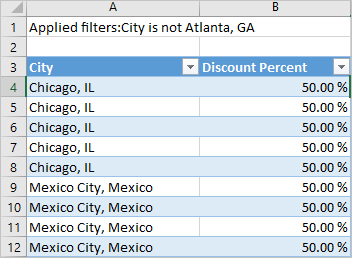
Underlying data: select this option if you want to see the data in the visual and additional data from the model (see chart below for details). If your visualization has an aggregate, selecting Underlying data removes the aggregate. When you select Export, the data is exported to an .xlsx file and your browser prompts you to save the file. Once saved, open the file in Excel.
In this example, our Excel export shows one row for every single City row in our dataset, and the discount percent for that single entry. In other words, the data is flattened and not aggregated. The first row of our spreadsheet shows the filters that were used when extracting the data from Power BI.