- Power BI forums
- Updates
- News & Announcements
- Get Help with Power BI
- Desktop
- Service
- Report Server
- Power Query
- Mobile Apps
- Developer
- DAX Commands and Tips
- Custom Visuals Development Discussion
- Health and Life Sciences
- Power BI Spanish forums
- Translated Spanish Desktop
- Power Platform Integration - Better Together!
- Power Platform Integrations (Read-only)
- Power Platform and Dynamics 365 Integrations (Read-only)
- Training and Consulting
- Instructor Led Training
- Dashboard in a Day for Women, by Women
- Galleries
- Community Connections & How-To Videos
- COVID-19 Data Stories Gallery
- Themes Gallery
- Data Stories Gallery
- R Script Showcase
- Webinars and Video Gallery
- Quick Measures Gallery
- 2021 MSBizAppsSummit Gallery
- 2020 MSBizAppsSummit Gallery
- 2019 MSBizAppsSummit Gallery
- Events
- Ideas
- Custom Visuals Ideas
- Issues
- Issues
- Events
- Upcoming Events
- Community Blog
- Power BI Community Blog
- Custom Visuals Community Blog
- Community Support
- Community Accounts & Registration
- Using the Community
- Community Feedback
Register now to learn Fabric in free live sessions led by the best Microsoft experts. From Apr 16 to May 9, in English and Spanish.
- Power BI forums
- Forums
- Get Help with Power BI
- Service
- Report doesnt show the same timeperiod as in Dash ...
- Subscribe to RSS Feed
- Mark Topic as New
- Mark Topic as Read
- Float this Topic for Current User
- Bookmark
- Subscribe
- Printer Friendly Page
- Mark as New
- Bookmark
- Subscribe
- Mute
- Subscribe to RSS Feed
- Permalink
- Report Inappropriate Content
Report doesnt show the same timeperiod as in Dash Board
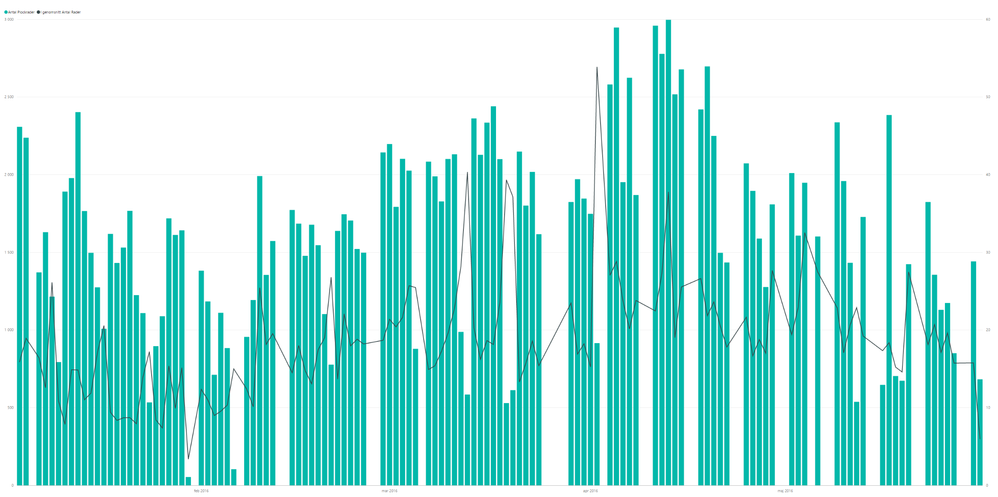
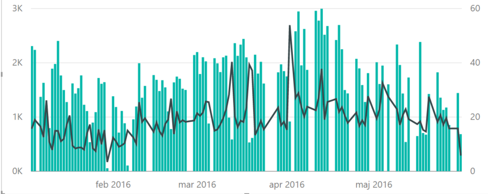
I have created an "Line and stack column chart" to show number of picked lines and an average of the no. of lined in an order.
It is created in the desktop and looks good.
Then i publize it to the service as ar areport it will only show a smaller timeframe
If i "pin it" to an Dashboard it will show the sam (correct) timeperiod as in the Desktop.
(please se scrrenshots)
I have tried to change filtering and design but are not able to find why it happen
Report Timeperiod
Dashboard Timeperiod
Desktop Period
So Any ideas??
Desktop timeperiod
Solved! Go to Solution.
- Mark as New
- Bookmark
- Subscribe
- Mute
- Subscribe to RSS Feed
- Permalink
- Report Inappropriate Content
Hi @stelllemark,
I have reproduced the issue like yours. The Line and Stacked Column chart will not display complete dataset records in Power BI Desktop, but in Power BI Service dashboard, the chart will display complete records. It should be a potential bug. I will report it internally and keep you updated once I get any updates.
Best Regards,
Qiuyun Yu
If this post helps, then please consider Accept it as the solution to help the other members find it more quickly.
- Mark as New
- Bookmark
- Subscribe
- Mute
- Subscribe to RSS Feed
- Permalink
- Report Inappropriate Content
Tested with the sanme dataset and as several persons have written an fix has been done and now it iis working
- Mark as New
- Bookmark
- Subscribe
- Mute
- Subscribe to RSS Feed
- Permalink
- Report Inappropriate Content
Hi @stelllemark,
You mentioned "Then i publize it to the service as ar areport it will only show a smaller timeframe", but from the screenshots, I havn't found any difference in timeframe. Would you please clarify the issue clearly?
Based om my test, if I create a Line and stack column chart in latest Power BI Desktop(version: 2.35.4399.381), then publish to Power BI Service as an report or pin to dashboard. The report are the same in those three scenarios, and chart will contains same number of columns and display same date values in X-axis. See:


If you have any question, please feel free to ask.
Best Regards,
Qiuyun Yu
If this post helps, then please consider Accept it as the solution to help the other members find it more quickly.
- Mark as New
- Bookmark
- Subscribe
- Mute
- Subscribe to RSS Feed
- Permalink
- Report Inappropriate Content
Sorry my fault.. Sent the same image twice 😞
Here you can se how it looks for me in the Report and as someone mentioned it seems it only uses 90Ishh rows from the dataset
I also have tried to changes size deletet and do everything that i could thinl off.
- Mark as New
- Bookmark
- Subscribe
- Mute
- Subscribe to RSS Feed
- Permalink
- Report Inappropriate Content
I also realiased a difference in ypu and mine testing.
Youa re using lees that 97-98 "rows" in the dataset and also ypu are using a hiearchy in the visual The first ine will do so everything works. It is then ou want to display an visual with moore than 100 rows that will trigger the behavior (se @Tishchenko video also)
- Mark as New
- Bookmark
- Subscribe
- Mute
- Subscribe to RSS Feed
- Permalink
- Report Inappropriate Content
Hi @stelllemark,
I have reproduced the issue like yours. The Line and Stacked Column chart will not display complete dataset records in Power BI Desktop, but in Power BI Service dashboard, the chart will display complete records. It should be a potential bug. I will report it internally and keep you updated once I get any updates.
Best Regards,
Qiuyun Yu
If this post helps, then please consider Accept it as the solution to help the other members find it more quickly.
- Mark as New
- Bookmark
- Subscribe
- Mute
- Subscribe to RSS Feed
- Permalink
- Report Inappropriate Content
Hi,
Apparently this has been now fixed? Had the similar issue but now it's ok again
- Mark as New
- Bookmark
- Subscribe
- Mute
- Subscribe to RSS Feed
- Permalink
- Report Inappropriate Content
@tuomash I'm not able to reproduce to now. I'm recorded this video (above this subject) on version 13.0.1100.658, now is 13.0.1100.682. Maybe this is the reason ))
- Mark as New
- Bookmark
- Subscribe
- Mute
- Subscribe to RSS Feed
- Permalink
- Report Inappropriate Content
Yes, apparently that has been fixed to the latest version 13.0.1100.682
- Mark as New
- Bookmark
- Subscribe
- Mute
- Subscribe to RSS Feed
- Permalink
- Report Inappropriate Content
Some visuals shown ONLY first 99 row from dataset
- Mark as New
- Bookmark
- Subscribe
- Mute
- Subscribe to RSS Feed
- Permalink
- Report Inappropriate Content
I had the feeling that it was showing only parts of the dataset but didnt start counting....
Helpful resources

Microsoft Fabric Learn Together
Covering the world! 9:00-10:30 AM Sydney, 4:00-5:30 PM CET (Paris/Berlin), 7:00-8:30 PM Mexico City

Power BI Monthly Update - April 2024
Check out the April 2024 Power BI update to learn about new features.


