- Power BI forums
- Updates
- News & Announcements
- Get Help with Power BI
- Desktop
- Service
- Report Server
- Power Query
- Mobile Apps
- Developer
- DAX Commands and Tips
- Custom Visuals Development Discussion
- Health and Life Sciences
- Power BI Spanish forums
- Translated Spanish Desktop
- Power Platform Integration - Better Together!
- Power Platform Integrations (Read-only)
- Power Platform and Dynamics 365 Integrations (Read-only)
- Training and Consulting
- Instructor Led Training
- Dashboard in a Day for Women, by Women
- Galleries
- Community Connections & How-To Videos
- COVID-19 Data Stories Gallery
- Themes Gallery
- Data Stories Gallery
- R Script Showcase
- Webinars and Video Gallery
- Quick Measures Gallery
- 2021 MSBizAppsSummit Gallery
- 2020 MSBizAppsSummit Gallery
- 2019 MSBizAppsSummit Gallery
- Events
- Ideas
- Custom Visuals Ideas
- Issues
- Issues
- Events
- Upcoming Events
- Community Blog
- Power BI Community Blog
- Custom Visuals Community Blog
- Community Support
- Community Accounts & Registration
- Using the Community
- Community Feedback
Register now to learn Fabric in free live sessions led by the best Microsoft experts. From Apr 16 to May 9, in English and Spanish.
- Power BI forums
- Forums
- Get Help with Power BI
- Service
- Power BI - Dynamic Report - Adhoc Table
- Subscribe to RSS Feed
- Mark Topic as New
- Mark Topic as Read
- Float this Topic for Current User
- Bookmark
- Subscribe
- Printer Friendly Page
- Mark as New
- Bookmark
- Subscribe
- Mute
- Subscribe to RSS Feed
- Permalink
- Report Inappropriate Content
Power BI - Dynamic Report - Adhoc Table
Hello all,
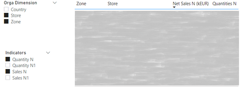
I'm looking for a technic to be able to create a fully dynamic table. I'm coming from Qlik and enjoying working with Power BI. I have some users that request (as they have in their old QlikView app) a table where they could themselves select the dimensions and measures.
To give more details, I want to give them a list of selectable dimensions and measures, and if they pick one or two dimensions and one or two measures, it automatically create a table with those fields and measures.
The trick is that if the user is not selecting a dimension, I do not want to have an empty column.
Is that even possible in Power BI ? In Qlik, there is conditionnal display rule that you can based on the selected values.
I know with the dataset within Excel, they can create their own crosstable, but saying to my client that to do the same thing that they were able to do in their old tool, they have to use Excel is hard to accept for them...
Thank you !
Solved! Go to Solution.
- Mark as New
- Bookmark
- Subscribe
- Mute
- Subscribe to RSS Feed
- Permalink
- Report Inappropriate Content
Hi @TeedoGz
There are many ways of achieving what you want.
You could use the Q&A visualisation, this will allow your users to ask questions like "sum <measurename> and <measurename> by <dimension> as a matrix".
see more on Q&A here ..Use Power BI Q&A to explore and create visuals - Power BI | Microsoft Docs
Or you could create a Matrix visual and then allow the users to personalize the visualisation, which will allow the users to pick other fields in the matrix, or select other dimensions and measures.
see more on personalisation here: Let users personalize visuals in a report - Power BI | Microsoft Docs
These are some of the main ways you can allow your users to create dynamic visualisations.
hope this helps
Stuart
- Mark as New
- Bookmark
- Subscribe
- Mute
- Subscribe to RSS Feed
- Permalink
- Report Inappropriate Content
Hello @Burningsuit,
Thank you for your quick reply, the solution by creating a perspective is perfect. I am sure my users will be happy with that.
Thanks again 😀
Helpful resources

Microsoft Fabric Learn Together
Covering the world! 9:00-10:30 AM Sydney, 4:00-5:30 PM CET (Paris/Berlin), 7:00-8:30 PM Mexico City

Power BI Monthly Update - April 2024
Check out the April 2024 Power BI update to learn about new features.


