- Power BI forums
- Updates
- News & Announcements
- Get Help with Power BI
- Desktop
- Service
- Report Server
- Power Query
- Mobile Apps
- Developer
- DAX Commands and Tips
- Custom Visuals Development Discussion
- Health and Life Sciences
- Power BI Spanish forums
- Translated Spanish Desktop
- Power Platform Integration - Better Together!
- Power Platform Integrations (Read-only)
- Power Platform and Dynamics 365 Integrations (Read-only)
- Training and Consulting
- Instructor Led Training
- Dashboard in a Day for Women, by Women
- Galleries
- Community Connections & How-To Videos
- COVID-19 Data Stories Gallery
- Themes Gallery
- Data Stories Gallery
- R Script Showcase
- Webinars and Video Gallery
- Quick Measures Gallery
- 2021 MSBizAppsSummit Gallery
- 2020 MSBizAppsSummit Gallery
- 2019 MSBizAppsSummit Gallery
- Events
- Ideas
- Custom Visuals Ideas
- Issues
- Issues
- Events
- Upcoming Events
- Community Blog
- Power BI Community Blog
- Custom Visuals Community Blog
- Community Support
- Community Accounts & Registration
- Using the Community
- Community Feedback
Register now to learn Fabric in free live sessions led by the best Microsoft experts. From Apr 16 to May 9, in English and Spanish.
- Power BI forums
- Forums
- Get Help with Power BI
- Service
- Re: Please Need help - Daily different Colors shou...
- Subscribe to RSS Feed
- Mark Topic as New
- Mark Topic as Read
- Float this Topic for Current User
- Bookmark
- Subscribe
- Printer Friendly Page
- Mark as New
- Bookmark
- Subscribe
- Mute
- Subscribe to RSS Feed
- Permalink
- Report Inappropriate Content
Please Need help - Daily different Colors should display Error Rate
Hi,
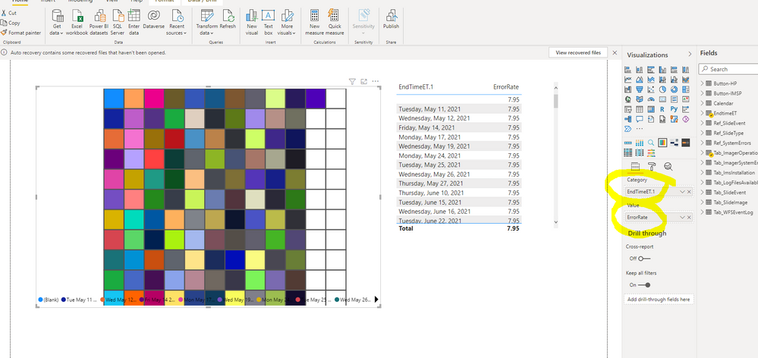
Please tell me how can I create a Brick chart which wull be display daily error rates. Requirement is color has to be differ depend on Error Rate for each day. but I could not do it, I highlited on screenshot that I can not move measure to category section. Please if you have any idea, or other visuatlions like that I can use for each day to display with different colors conditions with Error Rate. Lookinf forward to hearing.. Thank you
@v-yalanwu-msft,
@amitchandak,
- Mark as New
- Bookmark
- Subscribe
- Mute
- Subscribe to RSS Feed
- Permalink
- Report Inappropriate Content
Hi, @theybasar ;
Maybe matrix and then conditional formatting would do the trick.
https://docs.microsoft.com/en-us/power-bi/create-reports/desktop-conditional-table-formatting
Best Regards,
Community Support Team_ Yalan Wu
If this post helps, then please consider Accept it as the solution to help the other members find it more quickly.
- Mark as New
- Bookmark
- Subscribe
- Mute
- Subscribe to RSS Feed
- Permalink
- Report Inappropriate Content
Hi, @theybasar ;
As far as I know, measure usually can't be put in category, it's usually put in value.
Second, you can create a column or a table as a category and then create measures for each category.
And I'm not familiar with the visual objects in your diagram. What do you want the output to look like? Treemap you can try whether it meets your needs?
If none of the above methods meet your expectations, can you share a simple file after removing sensitive information and the output what you want?
Best Regards,
Community Support Team_ Yalan Wu
If this post helps, then please consider Accept it as the solution to help the other members find it more quickly.
- Mark as New
- Bookmark
- Subscribe
- Mute
- Subscribe to RSS Feed
- Permalink
- Report Inappropriate Content
Good Morning @v-yalanwu-msft ,
To be honest, the requirement is to create an Error Date Visualization with days. (Error Rates 0-5 Green, 5-20 Yellow, 20-50 orange and 50-100 Red colors ). Each day will be displayed different color (error rates). I thougt Brick Chart could be a good idea but not really. Attached is the sample data. Looking forward to hearing from you.
Please feel free to share your idea and smaple power bi doc.
Thank you,
Yavuz
Helpful resources

Microsoft Fabric Learn Together
Covering the world! 9:00-10:30 AM Sydney, 4:00-5:30 PM CET (Paris/Berlin), 7:00-8:30 PM Mexico City

Power BI Monthly Update - April 2024
Check out the April 2024 Power BI update to learn about new features.


