- Power BI forums
- Updates
- News & Announcements
- Get Help with Power BI
- Desktop
- Service
- Report Server
- Power Query
- Mobile Apps
- Developer
- DAX Commands and Tips
- Custom Visuals Development Discussion
- Health and Life Sciences
- Power BI Spanish forums
- Translated Spanish Desktop
- Power Platform Integration - Better Together!
- Power Platform Integrations (Read-only)
- Power Platform and Dynamics 365 Integrations (Read-only)
- Training and Consulting
- Instructor Led Training
- Dashboard in a Day for Women, by Women
- Galleries
- Community Connections & How-To Videos
- COVID-19 Data Stories Gallery
- Themes Gallery
- Data Stories Gallery
- R Script Showcase
- Webinars and Video Gallery
- Quick Measures Gallery
- 2021 MSBizAppsSummit Gallery
- 2020 MSBizAppsSummit Gallery
- 2019 MSBizAppsSummit Gallery
- Events
- Ideas
- Custom Visuals Ideas
- Issues
- Issues
- Events
- Upcoming Events
- Community Blog
- Power BI Community Blog
- Custom Visuals Community Blog
- Community Support
- Community Accounts & Registration
- Using the Community
- Community Feedback
Register now to learn Fabric in free live sessions led by the best Microsoft experts. From Apr 16 to May 9, in English and Spanish.
- Power BI forums
- Forums
- Get Help with Power BI
- Service
- Re: Pie Chart Colours Keep Changing
- Subscribe to RSS Feed
- Mark Topic as New
- Mark Topic as Read
- Float this Topic for Current User
- Bookmark
- Subscribe
- Printer Friendly Page
- Mark as New
- Bookmark
- Subscribe
- Mute
- Subscribe to RSS Feed
- Permalink
- Report Inappropriate Content
Pie Chart Colours Keep Changing
We have created a number of dashboards and have pinned live pages for each of the tab from the report. When you first open Power BI, each pie chart is formatted with the standard colour palette. However, when you switch to another dashboard, each of the pie charts on the next dashboard show with a different colour palette so it's a bit lollipop. If you refresh the page for this dashboard, then the pie charts all revert to the standard colour palette.
- Mark as New
- Bookmark
- Subscribe
- Mute
- Subscribe to RSS Feed
- Permalink
- Report Inappropriate Content
This is not working anymore
- Mark as New
- Bookmark
- Subscribe
- Mute
- Subscribe to RSS Feed
- Permalink
- Report Inappropriate Content
Actually what you can do is colouring the piechart or any chart with FX.
My task was quite similar today, I had to give fix colours to Currencies. I have created a measure based on the existing currencies in the dataset:
ColourPalette =

SWITCH(true(),
Table1[Currency] = "USD", "#e044a7",
Table1[Currency] = "GBP", "#118dff",
Table1[Currency] = "EUR", "#12239e",
Table1[Currency] = "SEK", "#6b007b",
Table1[Currency] = "NOK", "#e66c37"
)
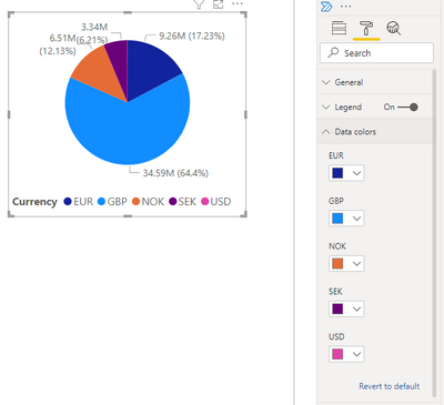
Once I've done this one, created a pie chart, but as you can see in the screenshot, there is no option for FX colouring:
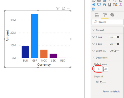
So, I just changed the chart to a bar chart, and there was an FX option.
Clicking on the FX option, I set the Format Style ->Field Value, and selected the ColourPalette measure, I have created. Once I saved the colour of the bar chart changed based on the ColourPalette. After that I just changed back the Bar chart to a pie chart, and the colours are staying as well. Also in PowerBI service, because there is an FX format in the background somewhere 😄
Please mark as Solution if it worked for you 🙂
- Mark as New
- Bookmark
- Subscribe
- Mute
- Subscribe to RSS Feed
- Permalink
- Report Inappropriate Content
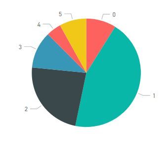
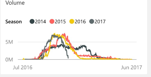
Power BI keeps changing the color that was originally red back to red when I reopen the saved file, which is...not good. It's happened on basically all of my charts in which I have done this, in different .pbix files. ![]()
- Mark as New
- Bookmark
- Subscribe
- Mute
- Subscribe to RSS Feed
- Permalink
- Report Inappropriate Content
Hi @jason_hill,
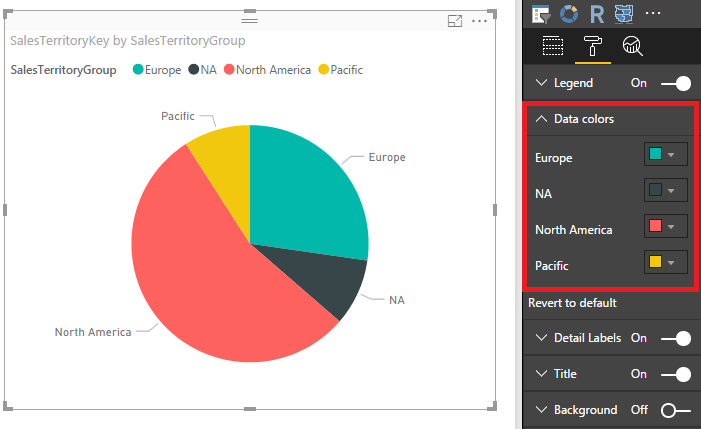
Based on my test, after we create the pie chart, the data colors are specified based on below properties.
And both report and dashboard will display the pie chart in the same color in my workspace or my team mate's workspace after shared with her. So each slice's color shouldn't change automatically.
In your scenario, where did you create the report? Create it on Power BI Service directly, or on Power BI Desktop then publish to service? If in desktop, please share desktop version. It would be best if you could share more information for us to reproduce it.
Best Regards,
Qiuyun Yu
If this post helps, then please consider Accept it as the solution to help the other members find it more quickly.
- Mark as New
- Bookmark
- Subscribe
- Mute
- Subscribe to RSS Feed
- Permalink
- Report Inappropriate Content
Hi,
The report was created in BI desktop. The first dashboard you view in the BI online service displays fine, but when you switch to a different dashboard from the left nav, then the colours go screwy in the next dashboard. If you refresh the page though, then the colours correct.
The information in our dashboards is commercially sensitive so I can't post you examples here but can send them privately of that helps.
Regards,
Jason
- Mark as New
- Bookmark
- Subscribe
- Mute
- Subscribe to RSS Feed
- Permalink
- Report Inappropriate Content
Hi @jason_hill,
Please restart the computer and login Power BI Service in Edge, then publish the attached .PBIX file to Power BI Service and pin live page to different dashboards. In my environment, this file works fine in two dashboards with Edge browser.
Best Regards,
Qiuyun Yu
If this post helps, then please consider Accept it as the solution to help the other members find it more quickly.
- Mark as New
- Bookmark
- Subscribe
- Mute
- Subscribe to RSS Feed
- Permalink
- Report Inappropriate Content
Yes, that works fine.
I am not sure why our dashboards are behaving differently. We are using direct query to pull data from Azure SQL but other than that we are just talking about standard pie charts with default colours assigned to the segments. They are completely different pbix files published to different workspace groups in the service so not sure if that has any bearing.
- Mark as New
- Bookmark
- Subscribe
- Mute
- Subscribe to RSS Feed
- Permalink
- Report Inappropriate Content
Hi @jason_hill,
The attached .PBIX file is created in Power BI Desktop version 2.39.4526.362. Please update the desktop to this latest version then create pie chart use Azure SQL database to see if issue persists.
Best Regards,
Qiuyun Yu
If this post helps, then please consider Accept it as the solution to help the other members find it more quickly.
- Mark as New
- Bookmark
- Subscribe
- Mute
- Subscribe to RSS Feed
- Permalink
- Report Inappropriate Content
Here's the steps I performed:
- Updated to the latest BI desktop
- Created a completely new PBIX with a simple pie chart pulling data from Azure via DirectQuery
- Copied the PBIX and just changed the connection to a different Azure database
- Published those PBIX files to two different workspace groups within the BI service
- Pinned the live page for each report into new dashboards
- Open the BI service and opened the first new dashboard - the pie chart colours are fine
- Switched to the other new dashboard and the pie chart colours are a bit whack. Refreshed the page and the colours are fine.
So, yes the problem still occurs with the latest BI desktop and creating a new PBIX with a really simple pie chart.
- Mark as New
- Bookmark
- Subscribe
- Mute
- Subscribe to RSS Feed
- Permalink
- Report Inappropriate Content
Hi @jason_hill,
I notice you copy the .PBIX, please pin the live page for the original report to see if issue occurs.
Also can you open the original .PBIX file and save as different .PBIX file to duplicate the report? Then publish these reports to service and pin live page to see if color changes?
Best Regards,
Qiuyun Yu
If this post helps, then please consider Accept it as the solution to help the other members find it more quickly.
- Mark as New
- Bookmark
- Subscribe
- Mute
- Subscribe to RSS Feed
- Permalink
- Report Inappropriate Content
The colours are fine when pinning a live page from the same report to different dashboards.
I then used the save as method to duplicate the report and published those to the service and pinned live pages to different dashboards. The colours are fine for the first dashboard but after switching to the second dashboard, the colours go wrong again.
It deosn't matter which order you open the dashboards either...the first one displays OK but the colours go wrong with the second dashboard.
- Mark as New
- Bookmark
- Subscribe
- Mute
- Subscribe to RSS Feed
- Permalink
- Report Inappropriate Content
I have the same issue with colours. Have tried removing the pbix file and creating it again all to no avail.
Would be great if the colours match all the way through but at the moment I seem to have no ability to lock this down.
desktop
website
iphone
- Mark as New
- Bookmark
- Subscribe
- Mute
- Subscribe to RSS Feed
- Permalink
- Report Inappropriate Content
I am having the same issue
Below screenshots.
Service
Desktop
- Mark as New
- Bookmark
- Subscribe
- Mute
- Subscribe to RSS Feed
- Permalink
- Report Inappropriate Content
Does anybody have an idea on how to solve this?
Thanks!
- Mark as New
- Bookmark
- Subscribe
- Mute
- Subscribe to RSS Feed
- Permalink
- Report Inappropriate Content
A year later and still no solution?
I'm having the same problem with pie charts and bar graphs. I can't publish these for people to look at because the colors don't stay consistent on the same page, and it becomes very confusing.
Being able to set the color on a graph seems like a pretty basic function that should work for a program like this.
- Mark as New
- Bookmark
- Subscribe
- Mute
- Subscribe to RSS Feed
- Permalink
- Report Inappropriate Content
Playing with this some more it seems to be related to using colors outside of the selected theme. If you stick to the theme colors, it publishes correctly, but if you select a color outside of the theme, it may be changed after publication.
- Mark as New
- Bookmark
- Subscribe
- Mute
- Subscribe to RSS Feed
- Permalink
- Report Inappropriate Content
im not so sure about that @Anonymous I have been having the issues but have never installed a different theme. Is all just the default.
- Mark as New
- Bookmark
- Subscribe
- Mute
- Subscribe to RSS Feed
- Permalink
- Report Inappropriate Content
@jason_hill I've actually seen that posted few times by few other users. I would suggest you submit it as a bug here.
Helpful resources

Microsoft Fabric Learn Together
Covering the world! 9:00-10:30 AM Sydney, 4:00-5:30 PM CET (Paris/Berlin), 7:00-8:30 PM Mexico City

Power BI Monthly Update - April 2024
Check out the April 2024 Power BI update to learn about new features.

