- Power BI forums
- Updates
- News & Announcements
- Get Help with Power BI
- Desktop
- Service
- Report Server
- Power Query
- Mobile Apps
- Developer
- DAX Commands and Tips
- Custom Visuals Development Discussion
- Health and Life Sciences
- Power BI Spanish forums
- Translated Spanish Desktop
- Power Platform Integration - Better Together!
- Power Platform Integrations (Read-only)
- Power Platform and Dynamics 365 Integrations (Read-only)
- Training and Consulting
- Instructor Led Training
- Dashboard in a Day for Women, by Women
- Galleries
- Community Connections & How-To Videos
- COVID-19 Data Stories Gallery
- Themes Gallery
- Data Stories Gallery
- R Script Showcase
- Webinars and Video Gallery
- Quick Measures Gallery
- 2021 MSBizAppsSummit Gallery
- 2020 MSBizAppsSummit Gallery
- 2019 MSBizAppsSummit Gallery
- Events
- Ideas
- Custom Visuals Ideas
- Issues
- Issues
- Events
- Upcoming Events
- Community Blog
- Power BI Community Blog
- Custom Visuals Community Blog
- Community Support
- Community Accounts & Registration
- Using the Community
- Community Feedback
Register now to learn Fabric in free live sessions led by the best Microsoft experts. From Apr 16 to May 9, in English and Spanish.
- Power BI forums
- Forums
- Get Help with Power BI
- Service
- Re: Issues with bar & line chart
- Subscribe to RSS Feed
- Mark Topic as New
- Mark Topic as Read
- Float this Topic for Current User
- Bookmark
- Subscribe
- Printer Friendly Page
- Mark as New
- Bookmark
- Subscribe
- Mute
- Subscribe to RSS Feed
- Permalink
- Report Inappropriate Content
Issues with bar & line chart
Hi - I created a stacked bar/line chart to show two sets of data, the first column (bars) show dates when someone contacted me, and the second column (line) shows when an actual meeting was scheduled. The chart seems to be having problems when the contact and meeting happened in different months, e.g. if someone contacted me on 11/15/2018 and the meeting was scheduled on 12/5/2018, the chart is showing the contact in November, which is accurate, but it is showing that the meeting also happened in November, which is inaccurate. Any thoughts on how to solve this?
Thanks,
Paola
Solved! Go to Solution.
- Mark as New
- Bookmark
- Subscribe
- Mute
- Subscribe to RSS Feed
- Permalink
- Report Inappropriate Content
Hi @paopau86
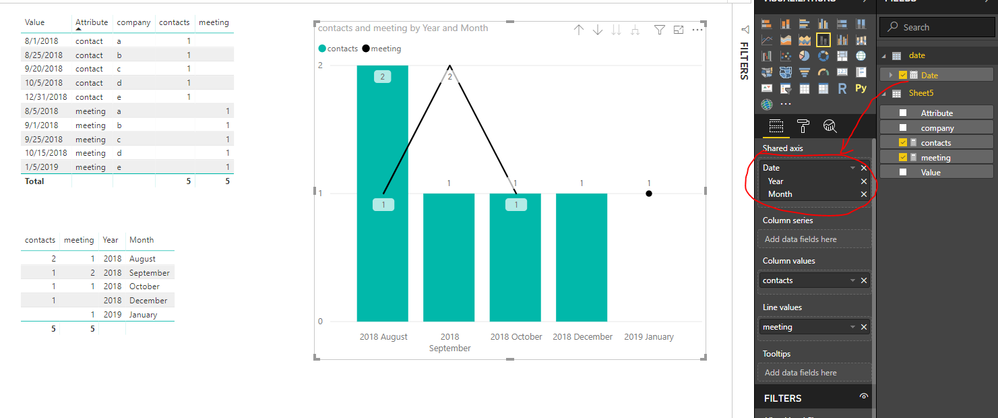
1. Open Edit queries
click on columns "contact" and "meeting", select "transform"->unpivot columns
then i get the following table
close &apply
2.
create a new table, enter the formula in the formula bar in"Home"->"new table"
date = CALENDARAUTO()
create a relationsip between this date table and my data table
3. create two measures
contacts = CALCULATE(DISTINCTCOUNT(Sheet5[company]),FILTER(Sheet5,Sheet5[Attribute]="contact"))

meeting = CALCULATE(DISTINCTCOUNT(Sheet5[company]),FILTER(Sheet5,Sheet5[Attribute]="meeting"))
Best Regards
Maggie
Community Support Team _ Maggie Li
If this post helps, then please consider Accept it as the solution to help the other members find it more quickly.
- Mark as New
- Bookmark
- Subscribe
- Mute
- Subscribe to RSS Feed
- Permalink
- Report Inappropriate Content
Hi @paopau86
Based on my experience, it seems you didn't use the chart correctly.
please share a simple dataset as an example and tell me what you need to see from the visual, so that i can reproduce your scenario and help you create the correct visual.
Best Regards
Maggie
- Mark as New
- Bookmark
- Subscribe
- Mute
- Subscribe to RSS Feed
- Permalink
- Report Inappropriate Content
Thank you so much for the responses - I am new user of Power BI and I am trying to learn as I go (planning on taking a course soon), I appreciate your assistance.
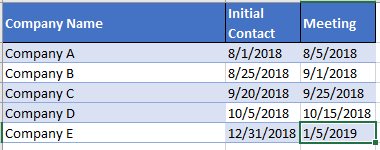
Below is a sample of the information I want to show in a chart. Basically, I would like to show in a bar how many people I contacted every month (e.g. August would have two contacts and in september 1) and then in a line show how many meetings occurred on the given month (one meeting in August, and two in september).
Thanks again!
Paola
- Mark as New
- Bookmark
- Subscribe
- Mute
- Subscribe to RSS Feed
- Permalink
- Report Inappropriate Content
Hi @paopau86
1. Open Edit queries
click on columns "contact" and "meeting", select "transform"->unpivot columns
then i get the following table
close &apply
2.
create a new table, enter the formula in the formula bar in"Home"->"new table"
date = CALENDARAUTO()
create a relationsip between this date table and my data table
3. create two measures
contacts = CALCULATE(DISTINCTCOUNT(Sheet5[company]),FILTER(Sheet5,Sheet5[Attribute]="contact"))

meeting = CALCULATE(DISTINCTCOUNT(Sheet5[company]),FILTER(Sheet5,Sheet5[Attribute]="meeting"))
Best Regards
Maggie
Community Support Team _ Maggie Li
If this post helps, then please consider Accept it as the solution to help the other members find it more quickly.
- Mark as New
- Bookmark
- Subscribe
- Mute
- Subscribe to RSS Feed
- Permalink
- Report Inappropriate Content
Very tough without example data and expected output. Please see this post regarding How to Get Your Question Answered Quickly: https://community.powerbi.com/t5/Community-Blog/How-to-Get-Your-Question-Answered-Quickly/ba-p/38490
That being said, see if these quick measures help:
https://community.powerbi.com/t5/Quick-Measures-Gallery/Periodic-Billing/m-p/409365
https://community.powerbi.com/t5/Quick-Measures-Gallery/Open-Tickets/m-p/409364
@ me in replies or I'll lose your thread!!!
Instead of a Kudo, please vote for this idea
Become an expert!: Enterprise DNA
External Tools: MSHGQM
YouTube Channel!: Microsoft Hates Greg
Latest book!: The Definitive Guide to Power Query (M)
DAX is easy, CALCULATE makes DAX hard...
Helpful resources

Microsoft Fabric Learn Together
Covering the world! 9:00-10:30 AM Sydney, 4:00-5:30 PM CET (Paris/Berlin), 7:00-8:30 PM Mexico City

Power BI Monthly Update - April 2024
Check out the April 2024 Power BI update to learn about new features.


