- Power BI forums
- Updates
- News & Announcements
- Get Help with Power BI
- Desktop
- Service
- Report Server
- Power Query
- Mobile Apps
- Developer
- DAX Commands and Tips
- Custom Visuals Development Discussion
- Health and Life Sciences
- Power BI Spanish forums
- Translated Spanish Desktop
- Power Platform Integration - Better Together!
- Power Platform Integrations (Read-only)
- Power Platform and Dynamics 365 Integrations (Read-only)
- Training and Consulting
- Instructor Led Training
- Dashboard in a Day for Women, by Women
- Galleries
- Community Connections & How-To Videos
- COVID-19 Data Stories Gallery
- Themes Gallery
- Data Stories Gallery
- R Script Showcase
- Webinars and Video Gallery
- Quick Measures Gallery
- 2021 MSBizAppsSummit Gallery
- 2020 MSBizAppsSummit Gallery
- 2019 MSBizAppsSummit Gallery
- Events
- Ideas
- Custom Visuals Ideas
- Issues
- Issues
- Events
- Upcoming Events
- Community Blog
- Power BI Community Blog
- Custom Visuals Community Blog
- Community Support
- Community Accounts & Registration
- Using the Community
- Community Feedback
Register now to learn Fabric in free live sessions led by the best Microsoft experts. From Apr 16 to May 9, in English and Spanish.
- Power BI forums
- Forums
- Get Help with Power BI
- Service
- Re: How do I improve render speed?
- Subscribe to RSS Feed
- Mark Topic as New
- Mark Topic as Read
- Float this Topic for Current User
- Bookmark
- Subscribe
- Printer Friendly Page
- Mark as New
- Bookmark
- Subscribe
- Mute
- Subscribe to RSS Feed
- Permalink
- Report Inappropriate Content
How do I improve render speed?
I have a report with 7 "Infographic Designer" visualisations, 3 "Tachometer" visualisations, and 9 "Card" visualisations. It takes 22 seconds to render.
When I make a copy of the report and replace all the "Infographic Designer" and "Tachometer" visualisations with "Table" visualisations it renders in under a second.
Obviously I'd like to present the prettier version of the report.
What can I do to improve the performance?
- Mark as New
- Bookmark
- Subscribe
- Mute
- Subscribe to RSS Feed
- Permalink
- Report Inappropriate Content
Some things to keep in mind here. With 22 separate visualisations, your report is likely having to make 22 separate sets of calculations. When you brought them all into a singular table, you allowed Power BI to optimise how many calculations it needed to make.
So really you have 2 options:
- You can either optimise how you display the data by reducing the number of visuals
- You can optimise the Measures these visualisations rely upon.
As a quick pointer toward something to optimise. Have a look at your measures and see if, within that same measure, you refer to a set of data more than once. If that is the case, you can front load calculations into a variable and use that result throughout that measure. An example of this:
ExampleA = IF(Sum[Column] < 5, 5, Sum[Column])
Could be optimised to:
ExampleB =
VAR Result = Sum[Column]
RETURN
IF(Result < 5, 5, Result)
- Mark as New
- Bookmark
- Subscribe
- Mute
- Subscribe to RSS Feed
- Permalink
- Report Inappropriate Content
Recognizing that none of the values to be displayed were reliant on filters or sliders I had already moved them all to columns. If I understand correctly, they should all be computed when the dataset is imported and not at render time.
That leaves me at option 1 - reduce the number of visualisations by spreading them out across multiple pages.
- Mark as New
- Bookmark
- Subscribe
- Mute
- Subscribe to RSS Feed
- Permalink
- Report Inappropriate Content
Quite a few of my reports have 10 to 12 visuals on them and all render fairly fast. The only exception is when i'm displaying graphs that have to calculation on many millions of rows of data. Without knowing your dataset I'm now quite curious what sort of data you are using and what visualisations you are creating using only calculated columns and still getting poor performance. I would have to imagine you either have a tonne of sizable tables with lots of complex relationships? Can you optimise your dataset in anyway instead?
General best practise is that if you have a choice between a calculated column and a measure, the measure should be your first choice. I would be concerned if you feel you need to shy away from them.
- Mark as New
- Bookmark
- Subscribe
- Mute
- Subscribe to RSS Feed
- Permalink
- Report Inappropriate Content
The report is more of an infographic, with big number showing aggregates (revenue this week or month) and aggregates of aggregates (best week in the past 3 months, in terms of revenue). There are no visualistions that provide filering or drill down.
I have 2 versions of the report: measures, and columns.
For the columns report I again have 2 versions: fancy visualisations, and simple tables.
The columns-tables version is rendering in a second or so, but that's not the task. The task is to provide fancy visualisation that are just as effective on mobile as desktop. To that end I think I'm using a rather heavy visualisation (Infographic Designer) to put numbers and text inside shapes because the Card visualisation is too simple.
- Mark as New
- Bookmark
- Subscribe
- Mute
- Subscribe to RSS Feed
- Permalink
- Report Inappropriate Content
I'm not curious how you are calculating some of these figures, specificly the ones like "Best week in past 3 months" without using a measure? This would be a perfect calculation for dax to complete quickly.
Is your data model fairly sizable with lots of tables and columns? Could we leverage power query or a tabular model in the data source to create some mini tables to pre-calculate things like Weekly Revenue?
- Mark as New
- Bookmark
- Subscribe
- Mute
- Subscribe to RSS Feed
- Permalink
- Report Inappropriate Content
Maybe I'm using some of the wrong terminology, and I apologise.
I originally created the calculations as measures using DAX within the Reports View of Power BI Desktop.
I recreated them as summary tables in the Data View. This is Power Query, right? This is what I've been refering to as "columns" since they are both precomputed.
I don't know what the definition of large is, but I'm still concerned about the speed difference between presenting the summary table as a grids (near instant) vs displaying it with a tachomoters (22sec).
- Mark as New
- Bookmark
- Subscribe
- Mute
- Subscribe to RSS Feed
- Permalink
- Report Inappropriate Content
Ahh got you.
Edit Queries section is definately the Power Query area. So yes, anything you did in here is pre-calculated.
Measures are calculated at run-time, whenever the visual that references is loaded or has its context changed. Your measures should have a little calculator icon next to their name in the field listing
Calculated columns are your inbetween, they are done after Power Query, when your data is loaded. They are the slowest but are still an excellent tool when used correctly. Calculated columns will have an icon that looks like a little window with a 'fx' symbol.
To help you start off, go to the screen that deals with your table relationships and take a screenshot of it. That might give me an idea of how complex your data is.
Next, give me an idea of the number of rows each of your tables have. That should give me an idea of how large your data is.
Lastly, have a look at your measures, and see how often they refer to the same data in one expression. Use my example in the earlier post to see what i mean. See if there are any options to convert some of the data references to variables so that you minimise the number of times DAX needs to go and get a result.
- Mark as New
- Bookmark
- Subscribe
- Mute
- Subscribe to RSS Feed
- Permalink
- Report Inappropriate Content
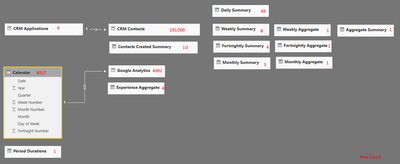
The table relationships and number of rows are shown in the following image. There are no measures or computed columns. There are lots of summary and aggregate tables - some of them could probably be merged, but that can wait.
Given that everything is pre calculated during the import, I don't yet believe that the issue is related to the schema.
- Mark as New
- Bookmark
- Subscribe
- Mute
- Subscribe to RSS Feed
- Permalink
- Report Inappropriate Content
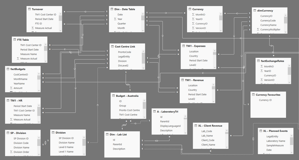
Its quite a small dataset, so i'm really quite surprised you are having performance issues. I was expecting something much much larger. Most of mine load within 5 seconds and are much larger. They probably have half the number of visual elements but are making much more complex run-time calculations. Here is an example of some of mine (a lot of the tables have 500,000 to 1,500,000 records):

What happens if you build a page with the same information you display now, but with simplier visuals? Try to get the same number of visuals, displaying the same information, but using a much simplier visual. Don't be afraid to let them overlap for testing. The purpose here will be to force Power BI to make the same calculations, but test whether the visuals themselves (mainly tachometer and infographic designer) are just slow to draw.
- Mark as New
- Bookmark
- Subscribe
- Mute
- Subscribe to RSS Feed
- Permalink
- Report Inappropriate Content
If I can refer you to my original post,
With all the visuals turned on it takes 22 seconds.
When I replace each visual with a simple table or card it's done almost instantly.
I love the schema you've got there - it really puts my task into perspective. It also emphasises just how powerful the Power BI engine really is.
- Mark as New
- Bookmark
- Subscribe
- Mute
- Subscribe to RSS Feed
- Permalink
- Report Inappropriate Content
Thanks for clarifying, i'd read your original post as if you had replaced all visuals with 1 or 2 tables.
Try again, this time don't replace the Tacho's. Do they add much to the render speed?
My gut feeling is that one of the visuals is slow to draw in the browser. I've used Tachos and they seem ok, so i'm wondering if its your other custom visual.
- Mark as New
- Bookmark
- Subscribe
- Mute
- Subscribe to RSS Feed
- Permalink
- Report Inappropriate Content
Under 2 seconds with Tachos. It definitely looks like an issue with the Infographic Designer.
I have now checked the report with both Edge and Chrome with the same results.
- Mark as New
- Bookmark
- Subscribe
- Mute
- Subscribe to RSS Feed
- Permalink
- Report Inappropriate Content
Great! So now you know where the problem is. You might be able to gain back some performance if you can convert and some of those Infographic designer to other visuals. I'd like to imagine its a compounding problem. Let us know how you go! I'm super curious.
Helpful resources

Microsoft Fabric Learn Together
Covering the world! 9:00-10:30 AM Sydney, 4:00-5:30 PM CET (Paris/Berlin), 7:00-8:30 PM Mexico City

Power BI Monthly Update - April 2024
Check out the April 2024 Power BI update to learn about new features.


