- Power BI forums
- Updates
- News & Announcements
- Get Help with Power BI
- Desktop
- Service
- Report Server
- Power Query
- Mobile Apps
- Developer
- DAX Commands and Tips
- Custom Visuals Development Discussion
- Health and Life Sciences
- Power BI Spanish forums
- Translated Spanish Desktop
- Power Platform Integration - Better Together!
- Power Platform Integrations (Read-only)
- Power Platform and Dynamics 365 Integrations (Read-only)
- Training and Consulting
- Instructor Led Training
- Dashboard in a Day for Women, by Women
- Galleries
- Community Connections & How-To Videos
- COVID-19 Data Stories Gallery
- Themes Gallery
- Data Stories Gallery
- R Script Showcase
- Webinars and Video Gallery
- Quick Measures Gallery
- 2021 MSBizAppsSummit Gallery
- 2020 MSBizAppsSummit Gallery
- 2019 MSBizAppsSummit Gallery
- Events
- Ideas
- Custom Visuals Ideas
- Issues
- Issues
- Events
- Upcoming Events
- Community Blog
- Power BI Community Blog
- Custom Visuals Community Blog
- Community Support
- Community Accounts & Registration
- Using the Community
- Community Feedback
Register now to learn Fabric in free live sessions led by the best Microsoft experts. From Apr 16 to May 9, in English and Spanish.
- Power BI forums
- Forums
- Get Help with Power BI
- Service
- Re: Getting Item Detail Behind Insights
- Subscribe to RSS Feed
- Mark Topic as New
- Mark Topic as Read
- Float this Topic for Current User
- Bookmark
- Subscribe
- Printer Friendly Page
- Mark as New
- Bookmark
- Subscribe
- Mute
- Subscribe to RSS Feed
- Permalink
- Report Inappropriate Content
Getting Item Detail Behind Insights
I just started a free trial for the Power BI service and am trying to figure out something basic with the Get Insights from the Dataset.
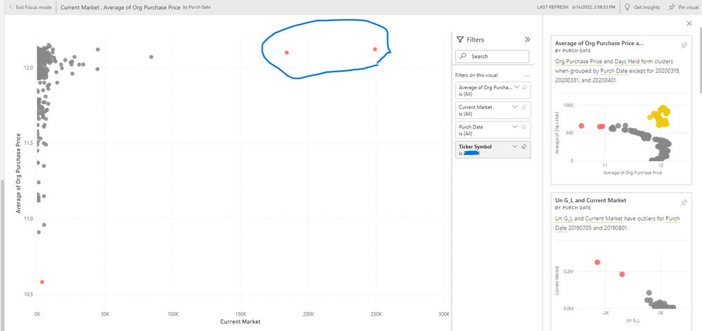
I have the dataset in my workspace and run the View Instights. It loads up some interesting visualizations. I find one interesting and click on it to make it the Focus Mode. I run the Get Insights on that visualization now.
That brings up new visualizations along the right. There are several that indicate outliers. (In my case stock purchases.)
I click on one of them to make the focus. I wind up with the situation below. I have outliers that I wish to drill down to or somehow see the details of those items. I can pin it to a dashboard but I don't think that's the solution because I fumbled around with that a little.
I'm very new to the Power BI service so I'm very clueless at the moment. Thanks for any help
Solved! Go to Solution.
- Mark as New
- Bookmark
- Subscribe
- Mute
- Subscribe to RSS Feed
- Permalink
- Report Inappropriate Content
HI @TimCPA ,
My suggestion is that you recreate that specific visual in the desktop. And then, add your own tooltips or other items as you see fit. At first glance, that appears to me to be the Scatter Chart.
Did I answer your question? Mark my post as a solution!
Proud to be a Datanaut!
Private message me for consulting or training needs.
- Mark as New
- Bookmark
- Subscribe
- Mute
- Subscribe to RSS Feed
- Permalink
- Report Inappropriate Content
- Mark as New
- Bookmark
- Subscribe
- Mute
- Subscribe to RSS Feed
- Permalink
- Report Inappropriate Content
Hey @TimCPA ,
So, when you hover over this dot, doesn't it give you hover help? If you are looking to add more detail and do more things with this visual, you can take a look at the type and the fields and then recreate it as a new visual in the servicer and/or add it to your Desktop file. That way you can add drill down or hover help or other functionality.
Is that what you are looking for?
Did I answer your question? Mark my post as a solution!
Proud to be a Datanaut!
Private message me for consulting or training needs.
- Mark as New
- Bookmark
- Subscribe
- Mute
- Subscribe to RSS Feed
- Permalink
- Report Inappropriate Content
It doesn't do anything when I hover over it or even right click it.
I was hoping there was a way similar to if it were in the Desktop either to right click and Show Data Point as Table or use that visualization as a filter and use it to limit a new table visualization showing then only the outliers I highlighted.
- Mark as New
- Bookmark
- Subscribe
- Mute
- Subscribe to RSS Feed
- Permalink
- Report Inappropriate Content
HI @TimCPA ,
My suggestion is that you recreate that specific visual in the desktop. And then, add your own tooltips or other items as you see fit. At first glance, that appears to me to be the Scatter Chart.
Did I answer your question? Mark my post as a solution!
Proud to be a Datanaut!
Private message me for consulting or training needs.
- Mark as New
- Bookmark
- Subscribe
- Mute
- Subscribe to RSS Feed
- Permalink
- Report Inappropriate Content
Thanks, I will do that.
Helpful resources

Microsoft Fabric Learn Together
Covering the world! 9:00-10:30 AM Sydney, 4:00-5:30 PM CET (Paris/Berlin), 7:00-8:30 PM Mexico City

Power BI Monthly Update - April 2024
Check out the April 2024 Power BI update to learn about new features.


