- Power BI forums
- Updates
- News & Announcements
- Get Help with Power BI
- Desktop
- Service
- Report Server
- Power Query
- Mobile Apps
- Developer
- DAX Commands and Tips
- Custom Visuals Development Discussion
- Health and Life Sciences
- Power BI Spanish forums
- Translated Spanish Desktop
- Power Platform Integration - Better Together!
- Power Platform Integrations (Read-only)
- Power Platform and Dynamics 365 Integrations (Read-only)
- Training and Consulting
- Instructor Led Training
- Dashboard in a Day for Women, by Women
- Galleries
- Community Connections & How-To Videos
- COVID-19 Data Stories Gallery
- Themes Gallery
- Data Stories Gallery
- R Script Showcase
- Webinars and Video Gallery
- Quick Measures Gallery
- 2021 MSBizAppsSummit Gallery
- 2020 MSBizAppsSummit Gallery
- 2019 MSBizAppsSummit Gallery
- Events
- Ideas
- Custom Visuals Ideas
- Issues
- Issues
- Events
- Upcoming Events
- Community Blog
- Power BI Community Blog
- Custom Visuals Community Blog
- Community Support
- Community Accounts & Registration
- Using the Community
- Community Feedback
Register now to learn Fabric in free live sessions led by the best Microsoft experts. From Apr 16 to May 9, in English and Spanish.
- Power BI forums
- Forums
- Get Help with Power BI
- Service
- Re: Equipment Running or shutdown
- Subscribe to RSS Feed
- Mark Topic as New
- Mark Topic as Read
- Float this Topic for Current User
- Bookmark
- Subscribe
- Printer Friendly Page
- Mark as New
- Bookmark
- Subscribe
- Mute
- Subscribe to RSS Feed
- Permalink
- Report Inappropriate Content
Equipment Running or shutdown
Hii,
I would like to use a visual to show if a chosen pump is running or not based on 0 and 1 at a given time.
0 = shutdown
1= running
It can either be a colored square or a "Running/Shutdown" text
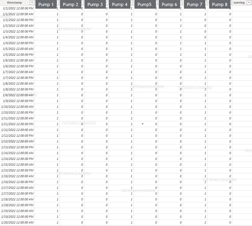
This is how my query looks like
Solved! Go to Solution.
- Mark as New
- Bookmark
- Subscribe
- Mute
- Subscribe to RSS Feed
- Permalink
- Report Inappropriate Content
Hi @Fati99
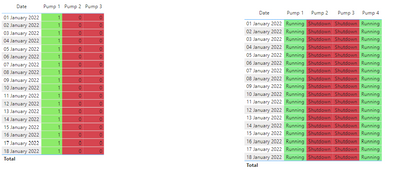
As your data has a single value you can either replace the value in the query editor to Running/shut down and use the colour formatting. Attaching the sample file for your reference.
Thanks,
Ankit Kukreja
www.linkedin.com/in/ankit-kukreja1904
- Mark as New
- Bookmark
- Subscribe
- Mute
- Subscribe to RSS Feed
- Permalink
- Report Inappropriate Content
So the only visual I can use would be the table visual?
I wanted to use a nicer visual to show if the pump is running or not in a certain time.
- Mark as New
- Bookmark
- Subscribe
- Mute
- Subscribe to RSS Feed
- Permalink
- Report Inappropriate Content
You can try with other visuals but a table/matrix would give you the best result showcasing date and pump data as well. I have worked on Alexis Olson's advice and I did unpivot this data and have used conditional formatting. Please see if this helps.
Thanks,
Ankit Kukreja
www.linkedin.com/in/ankit-kukreja1904
- Mark as New
- Bookmark
- Subscribe
- Mute
- Subscribe to RSS Feed
- Permalink
- Report Inappropriate Content
Hi @Fati99 ,
I guess the best and simplest way to represent would be through table visualization with conditional formatting.
To make it visually better, you can apply same conditional formatting for font color and background color and then provide a legend somewhere indicating what green and red would mean.
 |
Give a Thumbs Up if this post helped you in any way and Mark This Post as Solution if it solved your query !!! Proud To Be a Super User !!! |
- Mark as New
- Bookmark
- Subscribe
- Mute
- Subscribe to RSS Feed
- Permalink
- Report Inappropriate Content
I'd recommend unpivoting the pump columns before loading your data. It should be easier to work with that way.
https://learn.microsoft.com/en-us/power-query/unpivot-column
Helpful resources

Microsoft Fabric Learn Together
Covering the world! 9:00-10:30 AM Sydney, 4:00-5:30 PM CET (Paris/Berlin), 7:00-8:30 PM Mexico City

Power BI Monthly Update - April 2024
Check out the April 2024 Power BI update to learn about new features.


