- Power BI forums
- Updates
- News & Announcements
- Get Help with Power BI
- Desktop
- Service
- Report Server
- Power Query
- Mobile Apps
- Developer
- DAX Commands and Tips
- Custom Visuals Development Discussion
- Health and Life Sciences
- Power BI Spanish forums
- Translated Spanish Desktop
- Power Platform Integration - Better Together!
- Power Platform Integrations (Read-only)
- Power Platform and Dynamics 365 Integrations (Read-only)
- Training and Consulting
- Instructor Led Training
- Dashboard in a Day for Women, by Women
- Galleries
- Community Connections & How-To Videos
- COVID-19 Data Stories Gallery
- Themes Gallery
- Data Stories Gallery
- R Script Showcase
- Webinars and Video Gallery
- Quick Measures Gallery
- 2021 MSBizAppsSummit Gallery
- 2020 MSBizAppsSummit Gallery
- 2019 MSBizAppsSummit Gallery
- Events
- Ideas
- Custom Visuals Ideas
- Issues
- Issues
- Events
- Upcoming Events
- Community Blog
- Power BI Community Blog
- Custom Visuals Community Blog
- Community Support
- Community Accounts & Registration
- Using the Community
- Community Feedback
Register now to learn Fabric in free live sessions led by the best Microsoft experts. From Apr 16 to May 9, in English and Spanish.
- Power BI forums
- Forums
- Get Help with Power BI
- Service
- Displaying full Months Name on the X-axis in line-...
- Subscribe to RSS Feed
- Mark Topic as New
- Mark Topic as Read
- Float this Topic for Current User
- Bookmark
- Subscribe
- Printer Friendly Page
- Mark as New
- Bookmark
- Subscribe
- Mute
- Subscribe to RSS Feed
- Permalink
- Report Inappropriate Content
Displaying full Months Name on the X-axis in line-Clustered Column chart
Hi,
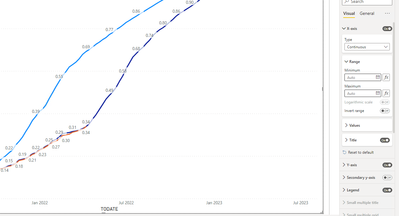
I have a case when X-axis Type is Continuous it will show month Jan-Jul; However; I want to all month to be displayed.
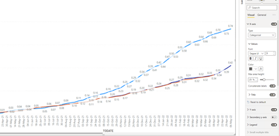
If I select select Categorical Type it will show weekly.
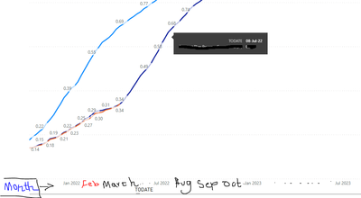
I need to show all months in parallel with displaying weekly in the graph.
Data:
Regards,
- Mark as New
- Bookmark
- Subscribe
- Mute
- Subscribe to RSS Feed
- Permalink
- Report Inappropriate Content
Use a date dimension table and create a hierarchy, but weeks don't work well within months because some weeks overlap two months.
- https://exceleratorbi.com.au/build-reusable-calendar-table-power-query/
1. How to get your question answered quickly - good questions get good answers!
2. Learning how to fish > being spoon-fed without active thinking.
3. Please accept as a solution posts that resolve your questions.
------------------------------------------------
BI Blog: Datamarts | RLS/OLS | Dev Tools | Languages | Aggregations | XMLA/APIs | Field Parameters | Custom Visuals
- Mark as New
- Bookmark
- Subscribe
- Mute
- Subscribe to RSS Feed
- Permalink
- Report Inappropriate Content
@BP2022
Ive often solved the this behavior by simply re sizing the visual. Ive seen it at times making the visual larger will make all the months display as desired. When there is limited space PBI seems to 'skip display months' . This often rsults in me needing to change the BI Narrative as I didnt have room to make it bigger. I solved that by moving the visual to its own page with a drill thru / bookmark to navigate to it.
Alternative, I have also used the Categorical Type but had to alter the visual. To get the month name to show I used a date dimension for the Month Name only (no hierarchy). This should achieve you desired layout with no 'skip months'. Then to get the weekly details I created a duplicate chart but used week instead of month. I then layer these visuals ontop of each other with a button bookmark to allow the users to toggle between monthly or weekly view.
Hope it helps, mark it as a solution if it does.
- Mark as New
- Bookmark
- Subscribe
- Mute
- Subscribe to RSS Feed
- Permalink
- Report Inappropriate Content
Thank you for your respone.
The first solution you share it will not work becasue I have to minmize the graph. The second solution, we have user using the graph by filting and exporting data this solution will not help.
Regards,
Helpful resources

Microsoft Fabric Learn Together
Covering the world! 9:00-10:30 AM Sydney, 4:00-5:30 PM CET (Paris/Berlin), 7:00-8:30 PM Mexico City

Power BI Monthly Update - April 2024
Check out the April 2024 Power BI update to learn about new features.


