- Power BI forums
- Updates
- News & Announcements
- Get Help with Power BI
- Desktop
- Service
- Report Server
- Power Query
- Mobile Apps
- Developer
- DAX Commands and Tips
- Custom Visuals Development Discussion
- Health and Life Sciences
- Power BI Spanish forums
- Translated Spanish Desktop
- Power Platform Integration - Better Together!
- Power Platform Integrations (Read-only)
- Power Platform and Dynamics 365 Integrations (Read-only)
- Training and Consulting
- Instructor Led Training
- Dashboard in a Day for Women, by Women
- Galleries
- Community Connections & How-To Videos
- COVID-19 Data Stories Gallery
- Themes Gallery
- Data Stories Gallery
- R Script Showcase
- Webinars and Video Gallery
- Quick Measures Gallery
- 2021 MSBizAppsSummit Gallery
- 2020 MSBizAppsSummit Gallery
- 2019 MSBizAppsSummit Gallery
- Events
- Ideas
- Custom Visuals Ideas
- Issues
- Issues
- Events
- Upcoming Events
- Community Blog
- Power BI Community Blog
- Custom Visuals Community Blog
- Community Support
- Community Accounts & Registration
- Using the Community
- Community Feedback
Register now to learn Fabric in free live sessions led by the best Microsoft experts. From Apr 16 to May 9, in English and Spanish.
- Power BI forums
- Forums
- Get Help with Power BI
- Service
- Display line in line chart instead of zero
- Subscribe to RSS Feed
- Mark Topic as New
- Mark Topic as Read
- Float this Topic for Current User
- Bookmark
- Subscribe
- Printer Friendly Page
- Mark as New
- Bookmark
- Subscribe
- Mute
- Subscribe to RSS Feed
- Permalink
- Report Inappropriate Content
Display line in line chart instead of zero
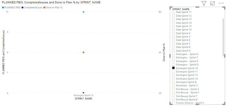
Hi - I have a Sprint name slicer and a line graph. When I select a Particular sprint name in the slicer, the line graph changes from a line to a dot and displays particular sprint data.
The line graph consists of axis-=sprint name, values=planed pbis, completed issues, secondary values= done to plan %.
I want the line to display the particular sprint name I select in the slicer. so here it is displaying a dot instead of line
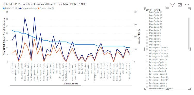
If no sprint name is selected in the slicer, it is showing for all sprint names in a line chart. I want to display a line for the particular sprint name I select in slicer.
So here I am attaching the pics when I am not selecting any sprint name in the slicer it is showing a line for all sprint names when I am selecting a name it is showing a dot. so I need to display a line for the name I select in the slicer.
Solved! Go to Solution.
- Mark as New
- Bookmark
- Subscribe
- Mute
- Subscribe to RSS Feed
- Permalink
- Report Inappropriate Content
Hi, @Anonymous
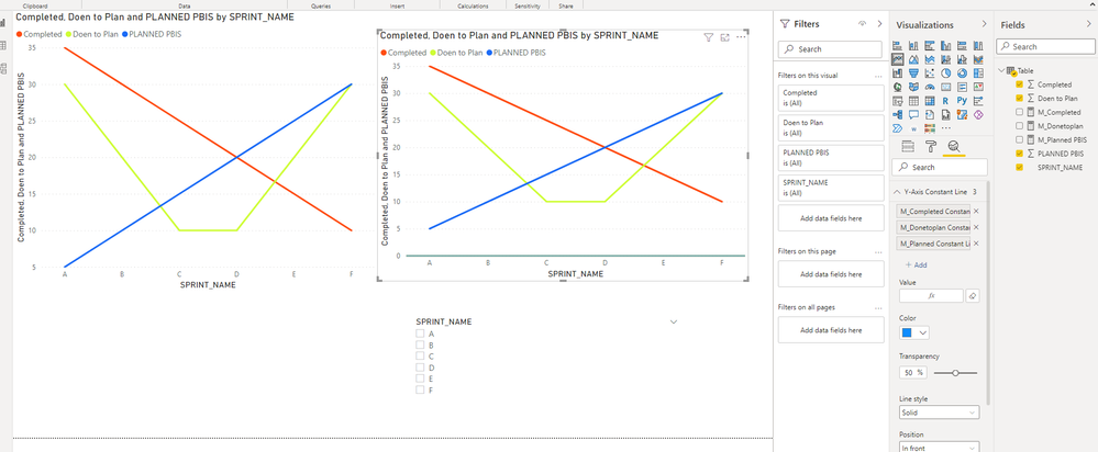
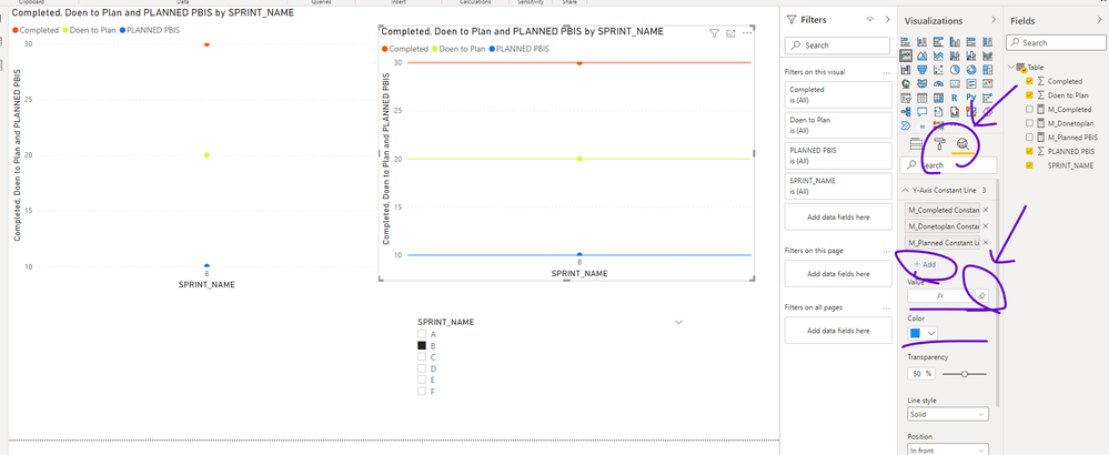
As a workaround, you may consider adding three auxiliary lines to the Analytics pane of line chart .
something like:
M_Completed = IF(HASONEVALUE('Table'[SPRINT_NAME]),AVERAGE('Table'[Completed]),BLANK())
// AVERAGE('Table'[Doen to Plan])can be replaced by any measure your need
M_Donetoplan = IF(HASONEVALUE('Table'[SPRINT_NAME]), AVERAGE('Table'[Doen to Plan]) ,BLANK())M_Planned PBIS = IF(HASONEVALUE('Table'[SPRINT_NAME]),AVERAGE('Table'[PLANNED PBIS]),BLANK())The result will show as below:
Please check my sample file for more details.
Best Regards,
Community Support Team _ Eason
- Mark as New
- Bookmark
- Subscribe
- Mute
- Subscribe to RSS Feed
- Permalink
- Report Inappropriate Content
Hi, @v-easonf-msft
This issue has been resolved by your solution. Thank you for your valuable time and support. It means a lot having such great support! Hoping for this support when again needed.
- Mark as New
- Bookmark
- Subscribe
- Mute
- Subscribe to RSS Feed
- Permalink
- Report Inappropriate Content
Please consider using a different visual type for this data. A line chart should only be used for temporal continuity data.
Helpful resources

Microsoft Fabric Learn Together
Covering the world! 9:00-10:30 AM Sydney, 4:00-5:30 PM CET (Paris/Berlin), 7:00-8:30 PM Mexico City

Power BI Monthly Update - April 2024
Check out the April 2024 Power BI update to learn about new features.


