- Power BI forums
- Updates
- News & Announcements
- Get Help with Power BI
- Desktop
- Service
- Report Server
- Power Query
- Mobile Apps
- Developer
- DAX Commands and Tips
- Custom Visuals Development Discussion
- Health and Life Sciences
- Power BI Spanish forums
- Translated Spanish Desktop
- Power Platform Integration - Better Together!
- Power Platform Integrations (Read-only)
- Power Platform and Dynamics 365 Integrations (Read-only)
- Training and Consulting
- Instructor Led Training
- Dashboard in a Day for Women, by Women
- Galleries
- Community Connections & How-To Videos
- COVID-19 Data Stories Gallery
- Themes Gallery
- Data Stories Gallery
- R Script Showcase
- Webinars and Video Gallery
- Quick Measures Gallery
- 2021 MSBizAppsSummit Gallery
- 2020 MSBizAppsSummit Gallery
- 2019 MSBizAppsSummit Gallery
- Events
- Ideas
- Custom Visuals Ideas
- Issues
- Issues
- Events
- Upcoming Events
- Community Blog
- Power BI Community Blog
- Custom Visuals Community Blog
- Community Support
- Community Accounts & Registration
- Using the Community
- Community Feedback
Register now to learn Fabric in free live sessions led by the best Microsoft experts. From Apr 16 to May 9, in English and Spanish.
- Power BI forums
- Forums
- Get Help with Power BI
- Service
- Custom Report Size to Dashboard
- Subscribe to RSS Feed
- Mark Topic as New
- Mark Topic as Read
- Float this Topic for Current User
- Bookmark
- Subscribe
- Printer Friendly Page
- Mark as New
- Bookmark
- Subscribe
- Mute
- Subscribe to RSS Feed
- Permalink
- Report Inappropriate Content
Custom Report Size to Dashboard
Hi All,
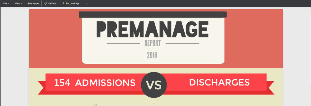
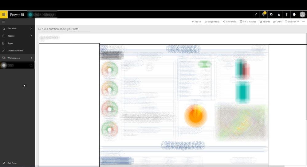
I got this neat idea to build an infographic report with interactive charts. For the report I am using a custom size of 1350 x 2000. The report looks just fine in report view in both the desktop and web app [Image 1] but once I pin the report to a live page [Image 2] I get this scaled down version of my report. This is causing the charts to be extremely small. You can see in the second image that there is a ton of unused white space... No matter how big I make the tile block, the report still stays the same size. Can someone help me get the report scaled to a bigger size or has any recommendations on what I can do?
Solved! Go to Solution.
- Mark as New
- Bookmark
- Subscribe
- Mute
- Subscribe to RSS Feed
- Permalink
- Report Inappropriate Content
@BrianPDX I would just create a quick "pointer" element on the dashboard so the user has to click it to be taken to the report. For example. this could be as simple as creating a text box with "Premanage Report" - pin that to the dashboard, and delete it from the report page. The pinned visual on the dashboard will still take you to the report page.
Or, you could get fancy and do the same with an image or snapshot of the report or an element.
Either way, rather than fight the behavior of dashboard tiles, my suggestion is to just get people to navigate to the actual report as efficiently as possible.
Looking for more Power BI tips, tricks & tools? Check out PowerBI.tips the site I co-own with Mike Carlo. Also, if you are near SE WI? Join our PUG Milwaukee Brew City PUG
- Mark as New
- Bookmark
- Subscribe
- Mute
- Subscribe to RSS Feed
- Permalink
- Report Inappropriate Content
@BrianPDX I just re-tested this. Place the visual, pin it, save the report.
Re-open report, delete the visual - the tile will still be there.
Looking for more Power BI tips, tricks & tools? Check out PowerBI.tips the site I co-own with Mike Carlo. Also, if you are near SE WI? Join our PUG Milwaukee Brew City PUG
- Mark as New
- Bookmark
- Subscribe
- Mute
- Subscribe to RSS Feed
- Permalink
- Report Inappropriate Content
@BrianPDX I would just create a quick "pointer" element on the dashboard so the user has to click it to be taken to the report. For example. this could be as simple as creating a text box with "Premanage Report" - pin that to the dashboard, and delete it from the report page. The pinned visual on the dashboard will still take you to the report page.
Or, you could get fancy and do the same with an image or snapshot of the report or an element.
Either way, rather than fight the behavior of dashboard tiles, my suggestion is to just get people to navigate to the actual report as efficiently as possible.
Looking for more Power BI tips, tricks & tools? Check out PowerBI.tips the site I co-own with Mike Carlo. Also, if you are near SE WI? Join our PUG Milwaukee Brew City PUG
- Mark as New
- Bookmark
- Subscribe
- Mute
- Subscribe to RSS Feed
- Permalink
- Report Inappropriate Content
Hey Eno, thanks for the suggestion. I just tried that but once I delete the textbox from the report it asks me if I want to save. If yes then the textbox dissapears from the dashboard. If no then obviously the visual stays both in the report and the dashboard.
- Mark as New
- Bookmark
- Subscribe
- Mute
- Subscribe to RSS Feed
- Permalink
- Report Inappropriate Content
@BrianPDX I just re-tested this. Place the visual, pin it, save the report.
Re-open report, delete the visual - the tile will still be there.
Looking for more Power BI tips, tricks & tools? Check out PowerBI.tips the site I co-own with Mike Carlo. Also, if you are near SE WI? Join our PUG Milwaukee Brew City PUG
- Mark as New
- Bookmark
- Subscribe
- Mute
- Subscribe to RSS Feed
- Permalink
- Report Inappropriate Content
You're right it worked.
For some reason when I create a textbox visual via the web app and delete it, the tile gets deleted. When I made the visual via the desktop, your work around worked just fine.
I'll go ahead and mark this as "solved" but if anyone has another other suggestions, I'd like to hear them. I'm just trying to make the process as easy as possible for end users (upper management) as they are not tech savvy at all.
- Mark as New
- Bookmark
- Subscribe
- Mute
- Subscribe to RSS Feed
- Permalink
- Report Inappropriate Content
Hi Brain,
you got the solution .. ?
am unable to get the point.
could please help me on this.
Thanks & Regards,
vinod
- Mark as New
- Bookmark
- Subscribe
- Mute
- Subscribe to RSS Feed
- Permalink
- Report Inappropriate Content
Hi,
This is still an issue. I created a report with two sheets (resolution 1920 x 1080) with a slicer on each sheet (which refers to the same field). The customer wants to use the slicer once, so I put sheet2 under sheet 1, creating a page with a resolution of 1920 x 2160. Now the slicer affects the entire report, letting the customer use it once and scroll through the entire report. When publishing this report, all seems well, untill a pin it as a live page to a dashboard, which results in a page with a white border on both sides:
It looks like Power BI is (in this case) auto-adjusting the width when i pin the page on a dashboard, which seems like a unintentional action to me. Any thoughts on this? The suggested pointer is not really a solution, but rather a workaround.
- Mark as New
- Bookmark
- Subscribe
- Mute
- Subscribe to RSS Feed
- Permalink
- Report Inappropriate Content
Hi,
Is there a solution for this?
Thanks,
Dan
- Mark as New
- Bookmark
- Subscribe
- Mute
- Subscribe to RSS Feed
- Permalink
- Report Inappropriate Content
I am seeing this as well, it is weird because the dashboard (I created a new one) seems to be the right size, but all of the charts get squeezed down into a little, centered area.
@ me in replies or I'll lose your thread!!!
Instead of a Kudo, please vote for this idea
Become an expert!: Enterprise DNA
External Tools: MSHGQM
YouTube Channel!: Microsoft Hates Greg
Latest book!: The Definitive Guide to Power Query (M)
DAX is easy, CALCULATE makes DAX hard...
Helpful resources

Microsoft Fabric Learn Together
Covering the world! 9:00-10:30 AM Sydney, 4:00-5:30 PM CET (Paris/Berlin), 7:00-8:30 PM Mexico City

Power BI Monthly Update - April 2024
Check out the April 2024 Power BI update to learn about new features.


