- Power BI forums
- Updates
- News & Announcements
- Get Help with Power BI
- Desktop
- Service
- Report Server
- Power Query
- Mobile Apps
- Developer
- DAX Commands and Tips
- Custom Visuals Development Discussion
- Health and Life Sciences
- Power BI Spanish forums
- Translated Spanish Desktop
- Power Platform Integration - Better Together!
- Power Platform Integrations (Read-only)
- Power Platform and Dynamics 365 Integrations (Read-only)
- Training and Consulting
- Instructor Led Training
- Dashboard in a Day for Women, by Women
- Galleries
- Community Connections & How-To Videos
- COVID-19 Data Stories Gallery
- Themes Gallery
- Data Stories Gallery
- R Script Showcase
- Webinars and Video Gallery
- Quick Measures Gallery
- 2021 MSBizAppsSummit Gallery
- 2020 MSBizAppsSummit Gallery
- 2019 MSBizAppsSummit Gallery
- Events
- Ideas
- Custom Visuals Ideas
- Issues
- Issues
- Events
- Upcoming Events
- Community Blog
- Power BI Community Blog
- Custom Visuals Community Blog
- Community Support
- Community Accounts & Registration
- Using the Community
- Community Feedback
Register now to learn Fabric in free live sessions led by the best Microsoft experts. From Apr 16 to May 9, in English and Spanish.
- Power BI forums
- Forums
- Get Help with Power BI
- Service
- Re: Abacus Chart
- Subscribe to RSS Feed
- Mark Topic as New
- Mark Topic as Read
- Float this Topic for Current User
- Bookmark
- Subscribe
- Printer Friendly Page
- Mark as New
- Bookmark
- Subscribe
- Mute
- Subscribe to RSS Feed
- Permalink
- Report Inappropriate Content
Abacus Chart
Hi All,
I'm new to PowerBI.🙂
I got a requirement to create the below chart. Based on the values (%) circle size should show accordingly. How to achieve this in PowerBI. Any help highly appreciated.
Solved! Go to Solution.
- Mark as New
- Bookmark
- Subscribe
- Mute
- Subscribe to RSS Feed
- Permalink
- Report Inappropriate Content
Hi @Anonymous ,
I've found a way, but it doesn't fulfill all of your requirements. With scatter chart you can display your value by size of point.
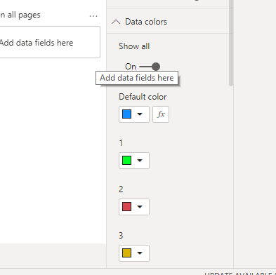
But you can't set conditional background color by threshold , you can set color by data color:
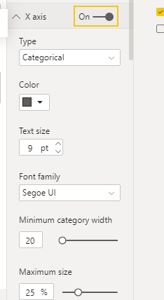
set type of x-axis to categorical:
For more detail,please refer to the pbix file: https://qiuyunus-my.sharepoint.com/:u:/g/personal/pbipro_qiuyunus_onmicrosoft_com/ESsW63YEzgBCriB9elCiOBMBDODwSQ4VewpIkxDabqKVhQ?e=2BflFO
If this post helps, then please consider Accept it as the solution to help the other members find it more quickly.
Best Regards,
Dedmon Dai
- Mark as New
- Bookmark
- Subscribe
- Mute
- Subscribe to RSS Feed
- Permalink
- Report Inappropriate Content
Hi @Anonymous ,
It sounds like you need something like bubble chart in Power BI. Please refer to https://docs.microsoft.com/en-us/power-bi/visuals/power-bi-visualization-scatter#create-a-bubble-chart
If this post helps, then please consider Accept it as the solution to help the other members find it more quickly.
Best Regards,
Dedmon Dai
- Mark as New
- Bookmark
- Subscribe
- Mute
- Subscribe to RSS Feed
- Permalink
- Report Inappropriate Content
Hi,
Thanks for you response, I am looking for only bubble Point size should change based on the values not on the possition of the bubble ikons.
Any help appreciated. Thanks!
- Mark as New
- Bookmark
- Subscribe
- Mute
- Subscribe to RSS Feed
- Permalink
- Report Inappropriate Content
Hi @Anonymous ,
I didn't find any custom visual to show value by the size of circle. As a workaround you can use bar chart to show them. Or you can show us more details about your requirements.I try to find a better workaround.
If this post helps, then please consider Accept it as the solution to help the other members find it more quickly.
Best Regards,
Dedmon Dai
- Mark as New
- Bookmark
- Subscribe
- Mute
- Subscribe to RSS Feed
- Permalink
- Report Inappropriate Content
Hi,
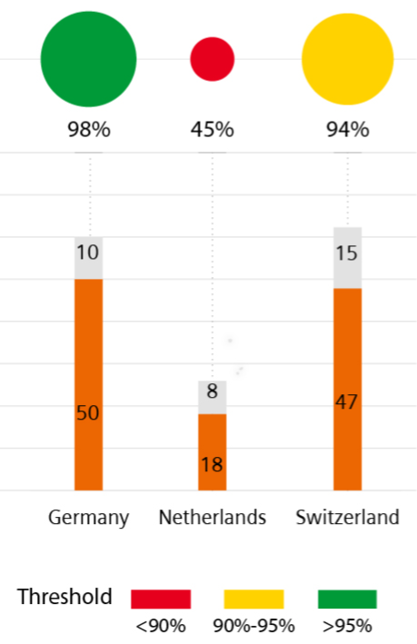
Here is my actual requirement to be show. I could not find this anywhere. any help on this would be much appreciated. Thanks!
- Mark as New
- Bookmark
- Subscribe
- Mute
- Subscribe to RSS Feed
- Permalink
- Report Inappropriate Content
Hi @Anonymous ,
I've found a way, but it doesn't fulfill all of your requirements. With scatter chart you can display your value by size of point.
But you can't set conditional background color by threshold , you can set color by data color:
set type of x-axis to categorical:
For more detail,please refer to the pbix file: https://qiuyunus-my.sharepoint.com/:u:/g/personal/pbipro_qiuyunus_onmicrosoft_com/ESsW63YEzgBCriB9elCiOBMBDODwSQ4VewpIkxDabqKVhQ?e=2BflFO
If this post helps, then please consider Accept it as the solution to help the other members find it more quickly.
Best Regards,
Dedmon Dai
Helpful resources

Microsoft Fabric Learn Together
Covering the world! 9:00-10:30 AM Sydney, 4:00-5:30 PM CET (Paris/Berlin), 7:00-8:30 PM Mexico City

Power BI Monthly Update - April 2024
Check out the April 2024 Power BI update to learn about new features.


