- Power BI forums
- Updates
- News & Announcements
- Get Help with Power BI
- Desktop
- Service
- Report Server
- Power Query
- Mobile Apps
- Developer
- DAX Commands and Tips
- Custom Visuals Development Discussion
- Health and Life Sciences
- Power BI Spanish forums
- Translated Spanish Desktop
- Power Platform Integration - Better Together!
- Power Platform Integrations (Read-only)
- Power Platform and Dynamics 365 Integrations (Read-only)
- Training and Consulting
- Instructor Led Training
- Dashboard in a Day for Women, by Women
- Galleries
- Community Connections & How-To Videos
- COVID-19 Data Stories Gallery
- Themes Gallery
- Data Stories Gallery
- R Script Showcase
- Webinars and Video Gallery
- Quick Measures Gallery
- 2021 MSBizAppsSummit Gallery
- 2020 MSBizAppsSummit Gallery
- 2019 MSBizAppsSummit Gallery
- Events
- Ideas
- Custom Visuals Ideas
- Issues
- Issues
- Events
- Upcoming Events
- Community Blog
- Power BI Community Blog
- Custom Visuals Community Blog
- Community Support
- Community Accounts & Registration
- Using the Community
- Community Feedback
Register now to learn Fabric in free live sessions led by the best Microsoft experts. From Apr 16 to May 9, in English and Spanish.
- Power BI forums
- Forums
- Get Help with Power BI
- Report Server
- Stacked Column Chart to show %
- Subscribe to RSS Feed
- Mark Topic as New
- Mark Topic as Read
- Float this Topic for Current User
- Bookmark
- Subscribe
- Printer Friendly Page
- Mark as New
- Bookmark
- Subscribe
- Mute
- Subscribe to RSS Feed
- Permalink
- Report Inappropriate Content
Stacked Column Chart to show %
Hi All,
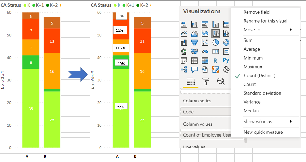
Seeking for help. I would like to convert the Count (Distinct) of Employee User ID as column values (staked bar chart on the left) to percentage as staked bar chart on the right.
Thanks in advance.
Solved! Go to Solution.
- Mark as New
- Bookmark
- Subscribe
- Mute
- Subscribe to RSS Feed
- Permalink
- Report Inappropriate Content
Hi @alicelpn ,
Unfortunately, there's no options for it now. But you can create a measure like:
Measure = COUNT(Table[Employee User ID])/CALCULTAE(COUNT(Table[Employee User ID]),ALLEXCEPT(Table,Table[Employee code]))
And put it in tooltips, it will show in tooltips when you hover on the stacked bar chart. Please refer to the similar post: https://community.powerbi.com/t5/Desktop/Display-percentage-in-stacked-column-chart/td-p/560354
If this post helps, then please consider Accept it as the solution to help the other members find it more quickly.
Best Regards,
Dedmon Dai
- Mark as New
- Bookmark
- Subscribe
- Mute
- Subscribe to RSS Feed
- Permalink
- Report Inappropriate Content
Hi @alicelpn !
You will need to create another measure to get [% of Employee Count] in that group;
To get % of Employee Count, you can do it like, [Employee Count] / [Total Employee Per Category]
Then you can place this new measure in normal stacked column chart in [Values] section.
Regards,
Hasham
- Mark as New
- Bookmark
- Subscribe
- Mute
- Subscribe to RSS Feed
- Permalink
- Report Inappropriate Content
Thank you Hasham.
I would be very grateful if you can provide me the full DAX as suggested;
[Employee Count] / [Total Employee Per Category]
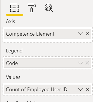
This is the visualisation pane and I want to maintain the Employee Count at Y-axis and Competence Element at X-axis. The % is to show the no. of Staff for each category of Code within the Competence Element.
- Mark as New
- Bookmark
- Subscribe
- Mute
- Subscribe to RSS Feed
- Permalink
- Report Inappropriate Content
Hi @alicelpn ,
Unfortunately, there's no options for it now. But you can create a measure like:
Measure = COUNT(Table[Employee User ID])/CALCULTAE(COUNT(Table[Employee User ID]),ALLEXCEPT(Table,Table[Employee code]))
And put it in tooltips, it will show in tooltips when you hover on the stacked bar chart. Please refer to the similar post: https://community.powerbi.com/t5/Desktop/Display-percentage-in-stacked-column-chart/td-p/560354
If this post helps, then please consider Accept it as the solution to help the other members find it more quickly.
Best Regards,
Dedmon Dai
- Mark as New
- Bookmark
- Subscribe
- Mute
- Subscribe to RSS Feed
- Permalink
- Report Inappropriate Content
@alicelpn
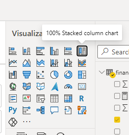
You can use the 100% Stacked Column Chart
⭕ Subscribe and learn Power BI from these videos
⚪ Website ⚪ LinkedIn ⚪ PBI User Group
- Mark as New
- Bookmark
- Subscribe
- Mute
- Subscribe to RSS Feed
- Permalink
- Report Inappropriate Content
Hi Fowmy,
Thank you for your suggestion. Tried it out and the 100% stacked bar chart shows similar height for all the columns which does not meet the requirement. I want a regular stacked bar chart that displays % of each bar, split between the different columns I have in each bar.
- Mark as New
- Bookmark
- Subscribe
- Mute
- Subscribe to RSS Feed
- Permalink
- Report Inappropriate Content
If you put any type of value in Y-Axis, it will always be created based on that. Since you are showing percentages on the y-axis therefore all values will sum up to 100% and your graph will always be a 100% stack chart.
Unfortunately, as of now, you don't have any feature yet to replace Data Labels as another field in default graphs.
Did I answer your question? Mark my post as a solution! Appreciate your Kudos!!
Proud to be a Super User!
Helpful resources

Microsoft Fabric Learn Together
Covering the world! 9:00-10:30 AM Sydney, 4:00-5:30 PM CET (Paris/Berlin), 7:00-8:30 PM Mexico City

Power BI Monthly Update - April 2024
Check out the April 2024 Power BI update to learn about new features.

| User | Count |
|---|---|
| 12 | |
| 7 | |
| 4 | |
| 3 | |
| 2 |
| User | Count |
|---|---|
| 15 | |
| 11 | |
| 5 | |
| 5 | |
| 2 |


