- Power BI forums
- Updates
- News & Announcements
- Get Help with Power BI
- Desktop
- Service
- Report Server
- Power Query
- Mobile Apps
- Developer
- DAX Commands and Tips
- Custom Visuals Development Discussion
- Health and Life Sciences
- Power BI Spanish forums
- Translated Spanish Desktop
- Power Platform Integration - Better Together!
- Power Platform Integrations (Read-only)
- Power Platform and Dynamics 365 Integrations (Read-only)
- Training and Consulting
- Instructor Led Training
- Dashboard in a Day for Women, by Women
- Galleries
- Community Connections & How-To Videos
- COVID-19 Data Stories Gallery
- Themes Gallery
- Data Stories Gallery
- R Script Showcase
- Webinars and Video Gallery
- Quick Measures Gallery
- 2021 MSBizAppsSummit Gallery
- 2020 MSBizAppsSummit Gallery
- 2019 MSBizAppsSummit Gallery
- Events
- Ideas
- Custom Visuals Ideas
- Issues
- Issues
- Events
- Upcoming Events
- Community Blog
- Power BI Community Blog
- Custom Visuals Community Blog
- Community Support
- Community Accounts & Registration
- Using the Community
- Community Feedback
Register now to learn Fabric in free live sessions led by the best Microsoft experts. From Apr 16 to May 9, in English and Spanish.
- Power BI forums
- Forums
- Get Help with Power BI
- Report Server
- Issue with datas without "no resume" option
- Subscribe to RSS Feed
- Mark Topic as New
- Mark Topic as Read
- Float this Topic for Current User
- Bookmark
- Subscribe
- Printer Friendly Page
- Mark as New
- Bookmark
- Subscribe
- Mute
- Subscribe to RSS Feed
- Permalink
- Report Inappropriate Content
Issue with datas without "no resume" option
Hello,
First of all, I would like to apology if my explanations are not truely clear in this message but I will do my best to be understood.
I am French and I am discovering Power Bi in Spain with Spanish version and I will write in English so that can explain that I am not using the best vocabulary.
I have just left from my Power Bi training a week ago and I am trying to practice. I do not have any computing skills so I am trying to be a bit basic in my using.
I am creating a report in Power BI about a production follow-up on our product characteristics. We have a measuring device that give me a data evey 20 seconds at least of my product width. That means I can collect such a huge amount of datas quickly.
To avoid to make a big start, I started with a 2 months set of datas to be able to play with.
I did not have too much dificulies to prepare my datas tables ( I am sure it is not well optimized for memory consumption but step by step). I took care to classify all type of datas and I have done all connections of my datas base. For now, it seems to work because I can calculate the number of product and filters by products type or date so far so good...
My problem is when I would like to focus on my width characteristic, I cannot monitore it individually. I check by adding a table that I can have acces to all datas but I cannot grafic it. Each time, I would like to make a curve to have an overview per product (for exemple), I can monitore the average, the max, the variance... but I do not have access to individual value.
I tryed to change by decimal or general for the data type but without success. I am pretty sure it is a configuration parameters I forgot but I do not have any clue. It is the same for the SPC Histogramm. I can get the individual value only in a table.
Do you have any piste of investigation I can check to help me.
Thank you the community for your advice.
- Mark as New
- Bookmark
- Subscribe
- Mute
- Subscribe to RSS Feed
- Permalink
- Report Inappropriate Content
Hi, @NicoBarate
What type of data source is and what connection method is used? If you can share some insensitive data samples and expected output? Then we can help you soon.
Best Regards
Janey Guo
- Mark as New
- Bookmark
- Subscribe
- Mute
- Subscribe to RSS Feed
- Permalink
- Report Inappropriate Content
Hello,
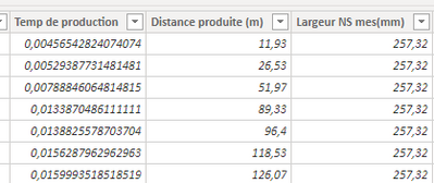
I have datas with decimal in table. the timeline is the secondes.
In the same table, we will find:
- Production time
- distance
- width in mm
I have also in the same table:
- Product code
- beginning of production
- time counter so I can compute an horodating.
First, that i would like to do basically, it is only to grafic my width evolution.
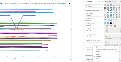
But it seems that in power bi, I cannot monitor datas lower than the day frequency so I cannot have acces to my width values without to resume it by an average per day.
I have no acces at the value without resuming...
When I put it in a table, it is working but not in a chart.
It is a bit sad because the fact to use average will filter a bit the signal of my width and it is not relfecting the reality.
For now, I do not have any connection issue because I am using datas form the same table. I would like juste to create a chart like in excel about my characteristic.
Regards,
Nicolas
- Mark as New
- Bookmark
- Subscribe
- Mute
- Subscribe to RSS Feed
- Permalink
- Report Inappropriate Content
- Mark as New
- Bookmark
- Subscribe
- Mute
- Subscribe to RSS Feed
- Permalink
- Report Inappropriate Content
Hello
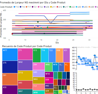
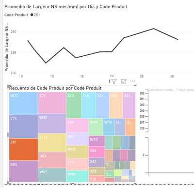
I tried with 2 differents ways:
1- A dinamic square chart:
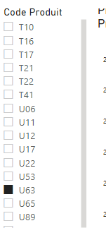
2) I use directly a slicer
But I cannot figure out what the selection type can impact the data resuming.
The issue is before the data selection filter. it is really when I would like to create the chart and put the data label in the value field.
Regards,
Nicolas
- Mark as New
- Bookmark
- Subscribe
- Mute
- Subscribe to RSS Feed
- Permalink
- Report Inappropriate Content
Hi, @NicoBarate
Sorry, What you share are all pictures. It is difficult for me to have a deep understanding. I can't even find out what you want to do in a large piece of information. Do you want to display data on the X axis with the time type instead of the date type? If you want to display the data label, just open it in the settings.
Did I answer your question ? Please mark my reply as solution. Thank you very much.
If not, please upload some insensitive data samples and expected output.
Best Regards
Janey Guo
Helpful resources

Microsoft Fabric Learn Together
Covering the world! 9:00-10:30 AM Sydney, 4:00-5:30 PM CET (Paris/Berlin), 7:00-8:30 PM Mexico City

Power BI Monthly Update - April 2024
Check out the April 2024 Power BI update to learn about new features.

| User | Count |
|---|---|
| 14 | |
| 4 | |
| 4 | |
| 3 | |
| 3 |
| User | Count |
|---|---|
| 14 | |
| 9 | |
| 6 | |
| 3 | |
| 3 |
