- Power BI forums
- Updates
- News & Announcements
- Get Help with Power BI
- Desktop
- Service
- Report Server
- Power Query
- Mobile Apps
- Developer
- DAX Commands and Tips
- Custom Visuals Development Discussion
- Health and Life Sciences
- Power BI Spanish forums
- Translated Spanish Desktop
- Power Platform Integration - Better Together!
- Power Platform Integrations (Read-only)
- Power Platform and Dynamics 365 Integrations (Read-only)
- Training and Consulting
- Instructor Led Training
- Dashboard in a Day for Women, by Women
- Galleries
- Community Connections & How-To Videos
- COVID-19 Data Stories Gallery
- Themes Gallery
- Data Stories Gallery
- R Script Showcase
- Webinars and Video Gallery
- Quick Measures Gallery
- 2021 MSBizAppsSummit Gallery
- 2020 MSBizAppsSummit Gallery
- 2019 MSBizAppsSummit Gallery
- Events
- Ideas
- Custom Visuals Ideas
- Issues
- Issues
- Events
- Upcoming Events
- Community Blog
- Power BI Community Blog
- Custom Visuals Community Blog
- Community Support
- Community Accounts & Registration
- Using the Community
- Community Feedback
Register now to learn Fabric in free live sessions led by the best Microsoft experts. From Apr 16 to May 9, in English and Spanish.
- Power BI forums
- Galleries
- Quick Measures Gallery
- Re: Stephen Few 'Red Dot'
- Mark as New
- Bookmark
- Subscribe
- Mute
- Subscribe to RSS Feed
- Permalink
- Report Inappropriate Content
Stephen Few 'Red Dot'
This quick measure shamelessly steals from Chris Webb's great work that gave us the Star Ratings Quick Measure
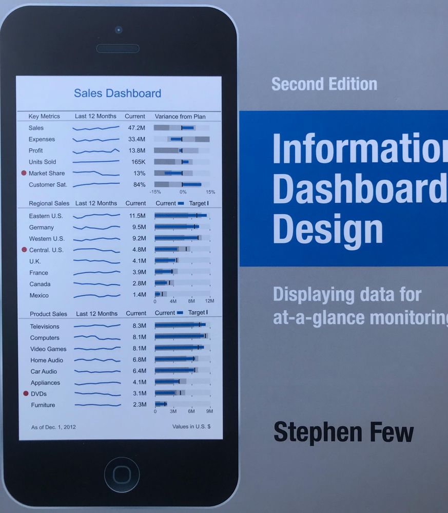
In his whitepaper on Dashboard Design Stephen Few recommends avoiding overuse of colour on dashboards.
The best use of colour, he suggests, is for making particular items stand out from the rest.
This quick measure allows you to create red highlighting dots.
First create a 'Flag' measure of your choice, for example:
Flag = if (sum(Sales[Sales])<[Target],1,0)
Then create the Quick Measure as follows:
Alert = REPT(UNICHAR(128308),[Flag])
eyJrIjoiNDkyZGNlNTItOGZhYy00N2M0LWIyYjEtYmYxNTJlYTBlOGI0IiwidCI6IjlkMzQ4NzUyLWI5YWMtNGI1OS1iY2YzLTgwMTQxMjZlMDExNyIsImMiOjh9
- Mark as New
- Bookmark
- Subscribe
- Mute
- Subscribe to RSS Feed
- Permalink
- Report Inappropriate Content
great !!!
Can you please elaborate regarding spark line
I wish to acheive something like the one below
- Mark as New
- Bookmark
- Subscribe
- Mute
- Subscribe to RSS Feed
- Permalink
- Report Inappropriate Content
Hi @nirrobi
I understand you're trying to create dashboards that look like Stephen Few's design. I'm trying to achieve this myself too
But didn't find an option to create spark lines or bullet charts in matrixes.
Have you made any progress?
Would you mind share some of your achievements?
Thanks a lot!
- Mark as New
- Bookmark
- Subscribe
- Mute
- Subscribe to RSS Feed
- Permalink
- Report Inappropriate Content
Hi,
You can do it by layering different visuals, it's just a bit fiddly to get things lined and spaced correctly but it is possible to get creative to accomplish something like what you want....
Cheers
Mark


