- Power BI forums
- Updates
- News & Announcements
- Get Help with Power BI
- Desktop
- Service
- Report Server
- Power Query
- Mobile Apps
- Developer
- DAX Commands and Tips
- Custom Visuals Development Discussion
- Health and Life Sciences
- Power BI Spanish forums
- Translated Spanish Desktop
- Power Platform Integration - Better Together!
- Power Platform Integrations (Read-only)
- Power Platform and Dynamics 365 Integrations (Read-only)
- Training and Consulting
- Instructor Led Training
- Dashboard in a Day for Women, by Women
- Galleries
- Community Connections & How-To Videos
- COVID-19 Data Stories Gallery
- Themes Gallery
- Data Stories Gallery
- R Script Showcase
- Webinars and Video Gallery
- Quick Measures Gallery
- 2021 MSBizAppsSummit Gallery
- 2020 MSBizAppsSummit Gallery
- 2019 MSBizAppsSummit Gallery
- Events
- Ideas
- Custom Visuals Ideas
- Issues
- Issues
- Events
- Upcoming Events
- Community Blog
- Power BI Community Blog
- Custom Visuals Community Blog
- Community Support
- Community Accounts & Registration
- Using the Community
- Community Feedback
Register now to learn Fabric in free live sessions led by the best Microsoft experts. From Apr 16 to May 9, in English and Spanish.
- Power BI forums
- Galleries
- Quick Measures Gallery
- SVG Sparklines - Line
SVG Sparklines - Line
08-10-2018 04:04 AM - last edited 08-13-2018 14:47 PM


- Mark as New
- Bookmark
- Subscribe
- Mute
- Subscribe to RSS Feed
- Permalink
- Report Inappropriate Content
SVG Sparklines - Line
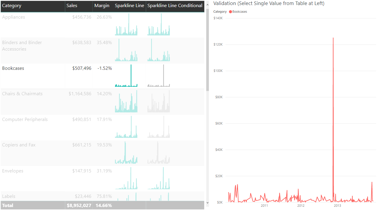
Power BI now allows the dynamic creation of Scalable Vector Graphics (SVG) images. Prior to the August 2018 version, it was possible to build SVG content into custom columns, but now it is possible to create measures that dynamically update to account for user selections and filters.
For additional detail on the method, please see this post on the DataVeld blog: Use SVG Images in Power BI: Part 3
Get the DAX: SVG Sparkline "Line" measure formula on GitHub
Substitute your own measure in place of [Measure Value], a date or numeric column for 'Table'[Date] for the X axis, and a column for 'Table'[Category] that will appear on the same table row as the sparkline.
The x axis is built by establishing the min and max values for each date and adjusting the range so that the min corresponds to 0 and max corresponds to 100.
The y axis is built by finding the min and max measure values and adjusting the range from 0 to 100 similar to the x axis. The measure value's position is based on ([Measure Value] - Min) / (Max - Min), a key calculation that I added awhile ago as another Quick Measure. In the case of the y axis though, SVG works from the top to the bottom (0 at top), so 100 - [Y] makes it render correctly. Otherwise, the chart would appear upside down.
After building a table of X and Y coordinates, CONCATENATEX is the magic function that puts the points together into a line.
IF(HASONEVALUE('Table'[Category])[...] helps hides the total in a Table or Matrix because the total renders as text and not an image.
Once the sparkline measure is ready, set the Data Category to Image URL and add the sparkline measure to a Table or Matrix visual.
In addition, change the LineColor variable from static to dynamic to create conditional color formatting. In this example, if the Margin % is not greater than 20%, the sparkline should be grey instead of green.
//Note: use %23 instead of # for Firefox compatibility
VAR LineColor = IF([Margin] > 0.20,"%2301B8AA","%23BBBBBB")
Create additional variables for stroke width or any applicable SVG property and subsitute new variables into the SVG text as needed.
Thanks to my BlueGranite colleague Meagan Longoria for providing a challenge that first made me investigate whether it was possible to dynamically build SVG content in Power BI. Thanks as well to Phil Seamark for suggesting optimizations to my original DAX.
eyJrIjoiOTExYmFjNTAtYzRkNy00YzU3LWJjOWUtY2M2YjM3YjI1MzkwIiwidCI6ImFjYzhhYWE1LWYxOTEtNDgyZi05MjFiLWNmNmMzM2E1ODgzMiIsImMiOjF9