- Power BI forums
- Updates
- News & Announcements
- Get Help with Power BI
- Desktop
- Service
- Report Server
- Power Query
- Mobile Apps
- Developer
- DAX Commands and Tips
- Custom Visuals Development Discussion
- Health and Life Sciences
- Power BI Spanish forums
- Translated Spanish Desktop
- Power Platform Integration - Better Together!
- Power Platform Integrations (Read-only)
- Power Platform and Dynamics 365 Integrations (Read-only)
- Training and Consulting
- Instructor Led Training
- Dashboard in a Day for Women, by Women
- Galleries
- Community Connections & How-To Videos
- COVID-19 Data Stories Gallery
- Themes Gallery
- Data Stories Gallery
- R Script Showcase
- Webinars and Video Gallery
- Quick Measures Gallery
- 2021 MSBizAppsSummit Gallery
- 2020 MSBizAppsSummit Gallery
- 2019 MSBizAppsSummit Gallery
- Events
- Ideas
- Custom Visuals Ideas
- Issues
- Issues
- Events
- Upcoming Events
- Community Blog
- Power BI Community Blog
- Custom Visuals Community Blog
- Community Support
- Community Accounts & Registration
- Using the Community
- Community Feedback
Register now to learn Fabric in free live sessions led by the best Microsoft experts. From Apr 16 to May 9, in English and Spanish.
- Power BI forums
- Galleries
- Quick Measures Gallery
- Re: Normalize Numeric Data


- Mark as New
- Bookmark
- Subscribe
- Mute
- Subscribe to RSS Feed
- Permalink
- Report Inappropriate Content
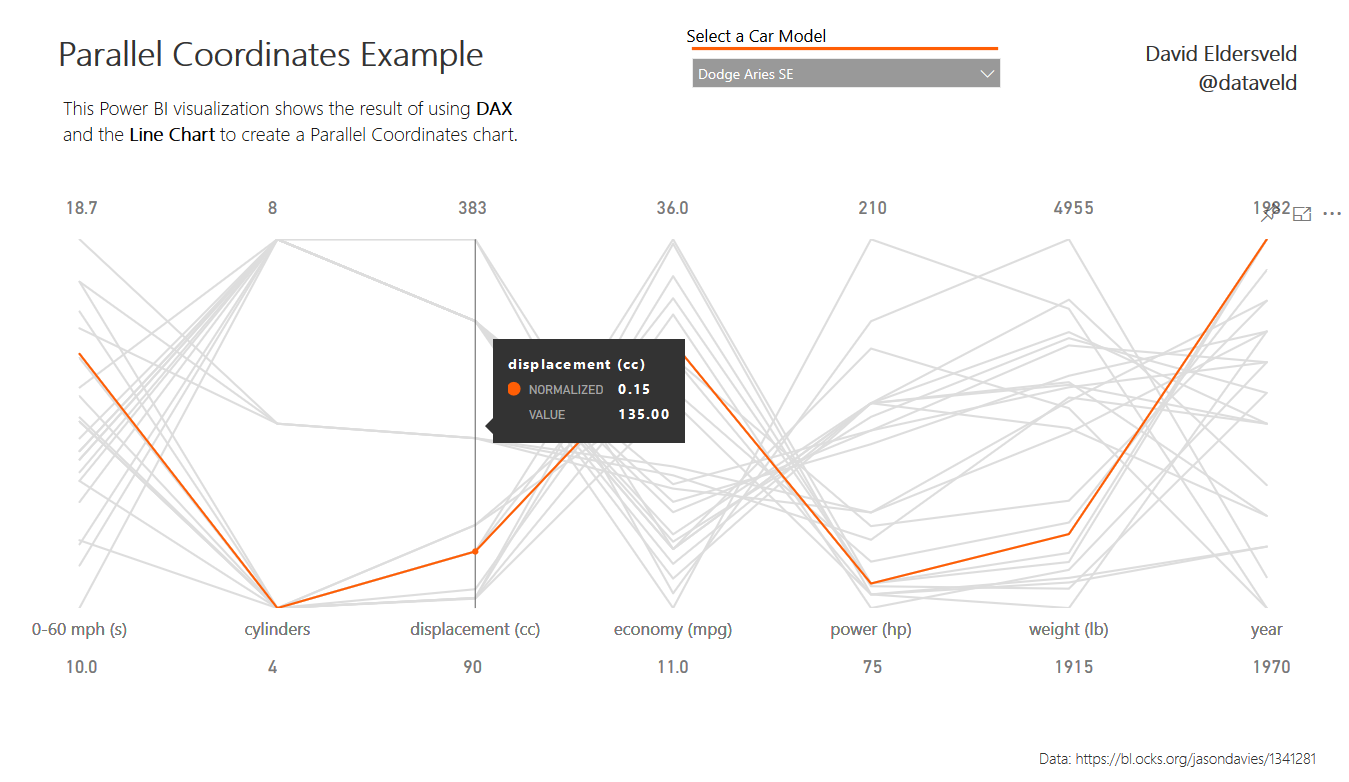
Normalize Numeric Data
Normalize numeric data from several independent ranges to a uniform scale ranging from 0 to 1. This can be used as a precursor for clustering, creating parallel coordinates plots, and more.
Follows formula:
(x-min(x))/(max(x)-min(x))Using the DAX measure:
Normalized Value =
VAR MinOfGroup = CALCULATE(MIN('Table'[Value]),ALLEXCEPT('Table','Table'[GroupAttribute]))
VAR MaxOfGroup = CALCULATE(MAX('Table'[Value]),ALLEXCEPT('Table','Table'[GroupAttribute]))
VAR DetailValue = MAX('Table'[Value])
RETURN DIVIDE(DetailValue - MinOfGroup,MaxOfGroup - MinOfGroup,0)
eyJrIjoiNGM5NTJjMmQtZjZlOS00YjZjLWIwOGItZTlkNTJiMDM2YzNlIiwidCI6ImFjYzhhYWE1LWYxOTEtNDgyZi05MjFiLWNmNmMzM2E1ODgzMiIsImMiOjF9
- Mark as New
- Bookmark
- Subscribe
- Mute
- Subscribe to RSS Feed
- Permalink
- Report Inappropriate Content
Hi, Thanks for the article.
I have one question. Why did you use MAX(Table[Value]) for each data point? Wouldnt it return the max value for the whole "value" column, while w need the current cell value here.
VAR DetailValue = MAX('Table'[Value])
- Mark as New
- Bookmark
- Subscribe
- Mute
- Subscribe to RSS Feed
- Permalink
- Report Inappropriate Content
How did you create the image of all the lines for the cars that were not selected in the background?
- Mark as New
- Bookmark
- Subscribe
- Mute
- Subscribe to RSS Feed
- Permalink
- Report Inappropriate Content
check this for excluding a filter:
- Mark as New
- Bookmark
- Subscribe
- Mute
- Subscribe to RSS Feed
- Permalink
- Report Inappropriate Content
There are two line charts overlaid one on the other. The background one has consistent color for all lines, and the visual interactions are set so that car slicer will only filter the top line chart and not the background one.
I wrote a bit about the technique deep into this blog post: https://dataveld.com/2017/05/06/throwing-a-curve-at-the-power-bi-line-chart/
"If you would like to add other visuals to the report, crossfiltering will be an issue since the line chart does not allow highlighting. In this case, an overlay can be beneficial. This technique works for any line chart by the way, not just this curved one. By disabling the visual interaction for the “underlay” and setting a static Y Axis range for the overlay but keeping the default interaction set to filter, you can get a highlighting effect."