- Power BI forums
- Updates
- News & Announcements
- Get Help with Power BI
- Desktop
- Service
- Report Server
- Power Query
- Mobile Apps
- Developer
- DAX Commands and Tips
- Custom Visuals Development Discussion
- Health and Life Sciences
- Power BI Spanish forums
- Translated Spanish Desktop
- Power Platform Integration - Better Together!
- Power Platform Integrations (Read-only)
- Power Platform and Dynamics 365 Integrations (Read-only)
- Training and Consulting
- Instructor Led Training
- Dashboard in a Day for Women, by Women
- Galleries
- Community Connections & How-To Videos
- COVID-19 Data Stories Gallery
- Themes Gallery
- Data Stories Gallery
- R Script Showcase
- Webinars and Video Gallery
- Quick Measures Gallery
- 2021 MSBizAppsSummit Gallery
- 2020 MSBizAppsSummit Gallery
- 2019 MSBizAppsSummit Gallery
- Events
- Ideas
- Custom Visuals Ideas
- Issues
- Issues
- Events
- Upcoming Events
- Community Blog
- Power BI Community Blog
- Custom Visuals Community Blog
- Community Support
- Community Accounts & Registration
- Using the Community
- Community Feedback
Register now to learn Fabric in free live sessions led by the best Microsoft experts. From Apr 16 to May 9, in English and Spanish.
- Power BI forums
- Forums
- Get Help with Power BI
- Power Query
- How can I add dynamic currency prefix in sales fie...
- Subscribe to RSS Feed
- Mark Topic as New
- Mark Topic as Read
- Float this Topic for Current User
- Bookmark
- Subscribe
- Printer Friendly Page
- Mark as New
- Bookmark
- Subscribe
- Mute
- Subscribe to RSS Feed
- Permalink
- Report Inappropriate Content
How can I add dynamic currency prefix in sales field to show it in a bar chart ?
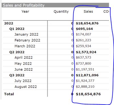
I created a measure that adds a currency prefix to Revenue and this works perfectly for a table but it turns of the data lables for a bar chart, I read on blogs that the format statement in my dax formula is return a text value. How do i work around this?
Solved! Go to Solution.
- Mark as New
- Bookmark
- Subscribe
- Mute
- Subscribe to RSS Feed
- Permalink
- Report Inappropriate Content
Hi @Femcold ,
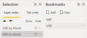
As a workaroud, you can use bookmark instead of slicer, here's the detailed steps:
1.Create measures for the result, and set each measure a seperate currency format.
USD = MAX('Table'[Sales])GBP = MAX('Table'[Sales])2.Create two charts with two measures seperately, and put them overlapping. Then create bookmarks with only one chart show and others hided. Now you can directly switch the bookmark to display charts with diffrent currency.
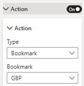
3.You can still create buttons, turn on the Action option and select corresponding bookmark.
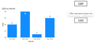
Now, you can change the data label by Ctrl+click the corresponding button.
Reference:Create report bookmarks in Power BI to share insights and build stories - Power BI | Microsoft Learn
Create buttons in Power BI reports - Power BI | Microsoft Learn
I attach my sample below for your reference.
Best Regards,
Community Support Team _ kalyj
If this post helps, then please consider Accept it as the solution to help the other members find it more quickly.
- Mark as New
- Bookmark
- Subscribe
- Mute
- Subscribe to RSS Feed
- Permalink
- Report Inappropriate Content
Hi @Femcold ,
Does my solution work for you? If so, would you mind accept it as solution? Then we are able to close the thread. More people who have the same requirment will find the solution quickly and benefit here, thank you!
Best Regards,
Community Support Team _ kalyj
- Mark as New
- Bookmark
- Subscribe
- Mute
- Subscribe to RSS Feed
- Permalink
- Report Inappropriate Content
Hi @Femcold ,
I think it's because the function FORMAT will return a text data, which cannot be displayed in the Y-axis of bar chart. The Y-axis of bar chart represent the size of value, it should be a number.
Best Regards,
Community Support Team _ kalyj
If this post helps, then please consider Accept it as the solution to help the other members find it more quickly.
- Mark as New
- Bookmark
- Subscribe
- Mute
- Subscribe to RSS Feed
- Permalink
- Report Inappropriate Content
- Mark as New
- Bookmark
- Subscribe
- Mute
- Subscribe to RSS Feed
- Permalink
- Report Inappropriate Content
Hi @Femcold ,
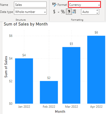
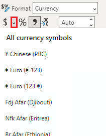
I think you can directly change the data format to Currency.
You can also click the drop-down option besides the $ symbol, there're all currency symbols in it.
Best Regards,
Community Support Team _ kalyj
If this post helps, then please consider Accept it as the solution to help the other members find it more quickly.
- Mark as New
- Bookmark
- Subscribe
- Mute
- Subscribe to RSS Feed
- Permalink
- Report Inappropriate Content
hi @v-yanjiang-msft, thanks for your reply but i have three currencies that i am switching based on a slicer,
FORMAT(_sales,
SWITCH(
SELECTEDVALUE('Currency'[Currency Format],"USD"),
"USD","$#,##0.##",
"GBP","£#,##0.##",
"Euro","€#,##0.##"
)
)
The format automatically turns the Measure to a text and i cant use it in a chart
- Mark as New
- Bookmark
- Subscribe
- Mute
- Subscribe to RSS Feed
- Permalink
- Report Inappropriate Content
Hi @Femcold ,
As a workaroud, you can use bookmark instead of slicer, here's the detailed steps:
1.Create measures for the result, and set each measure a seperate currency format.
USD = MAX('Table'[Sales])GBP = MAX('Table'[Sales])2.Create two charts with two measures seperately, and put them overlapping. Then create bookmarks with only one chart show and others hided. Now you can directly switch the bookmark to display charts with diffrent currency.
3.You can still create buttons, turn on the Action option and select corresponding bookmark.
Now, you can change the data label by Ctrl+click the corresponding button.
Reference:Create report bookmarks in Power BI to share insights and build stories - Power BI | Microsoft Learn
Create buttons in Power BI reports - Power BI | Microsoft Learn
I attach my sample below for your reference.
Best Regards,
Community Support Team _ kalyj
If this post helps, then please consider Accept it as the solution to help the other members find it more quickly.
- Mark as New
- Bookmark
- Subscribe
- Mute
- Subscribe to RSS Feed
- Permalink
- Report Inappropriate Content
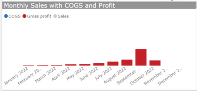
As you can see in the image the switch chnages the currency but removes the label on the chart
Helpful resources

Microsoft Fabric Learn Together
Covering the world! 9:00-10:30 AM Sydney, 4:00-5:30 PM CET (Paris/Berlin), 7:00-8:30 PM Mexico City

Power BI Monthly Update - April 2024
Check out the April 2024 Power BI update to learn about new features.

| User | Count |
|---|---|
| 102 | |
| 53 | |
| 21 | |
| 13 | |
| 11 |

