- Power BI forums
- Updates
- News & Announcements
- Get Help with Power BI
- Desktop
- Service
- Report Server
- Power Query
- Mobile Apps
- Developer
- DAX Commands and Tips
- Custom Visuals Development Discussion
- Health and Life Sciences
- Power BI Spanish forums
- Translated Spanish Desktop
- Power Platform Integration - Better Together!
- Power Platform Integrations (Read-only)
- Power Platform and Dynamics 365 Integrations (Read-only)
- Training and Consulting
- Instructor Led Training
- Dashboard in a Day for Women, by Women
- Galleries
- Community Connections & How-To Videos
- COVID-19 Data Stories Gallery
- Themes Gallery
- Data Stories Gallery
- R Script Showcase
- Webinars and Video Gallery
- Quick Measures Gallery
- 2021 MSBizAppsSummit Gallery
- 2020 MSBizAppsSummit Gallery
- 2019 MSBizAppsSummit Gallery
- Events
- Ideas
- Custom Visuals Ideas
- Issues
- Issues
- Events
- Upcoming Events
- Community Blog
- Power BI Community Blog
- Custom Visuals Community Blog
- Community Support
- Community Accounts & Registration
- Using the Community
- Community Feedback
Register now to learn Fabric in free live sessions led by the best Microsoft experts. From Apr 16 to May 9, in English and Spanish.
- Power BI forums
- Forums
- Get Help with Power BI
- Power Query
- Re: Display aggregated variable in a graph only if...
- Subscribe to RSS Feed
- Mark Topic as New
- Mark Topic as Read
- Float this Topic for Current User
- Bookmark
- Subscribe
- Printer Friendly Page
- Mark as New
- Bookmark
- Subscribe
- Mute
- Subscribe to RSS Feed
- Permalink
- Report Inappropriate Content
Display aggregated variable in a graph only if a certain filter selection is met
I have a table that contains forecast values per filial and the sum of the forecast for all filials is considered the group forecast (var forecast 1).
Then, I have another variable that contains another forecast, but it is aggregated, it is only a group (all filials) forecast (var forecast 2). This is in a excel and I am not sure how to merge into the first table.
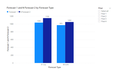
I would like to display both forecasts variables in a single graph in order to compare it. However, forecast 2 should would appear when all filters in the page are selected. Otherwise not, since this is an aggregated variable only.
Is there a way to do this? Can you please help me?
Table 1:
| Filial | Forecast Type | Forecast 1 |
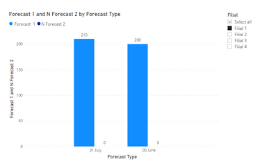
| Filial 1 | 00 June | 200 |
| Filial 1 | 01 July | 210 |
| Filial 2 | 00 June | 400 |
| Filial 2 | 01 July | 460 |
| Filial 3 | 00 June | 300 |
| Filial 3 | 01 July | 280 |
| Filial 4 | 00 June | 70 |
| Filial 4 | 01 July | 85 |
The sum is considered the group:
Group forecast 1 for 00 June is: 200+400+300+70 =970
Group forecast 1 for 01 June is: 210+460+280+85 = 1035
Excel - Table 2 (not sure how to merge to the existing table or if create a new table in Power Query for this):
| Forecast Type | Forecast 2 |
| 00 June | 1050 |
| 01 July | 1150 |
Filters available:
- Select all (Group)
- Filial 1
- Filial 2
- Filial 3
- Filial 4
Graph:
X axis: Forecast Type
Y axis: Forecast value in EUR (Forecast 1, Forecast 2)
Recap:
Forecast 1: can be filter by filial, showing individual forecasts. When select all" is chosen in the filter, it displays the sum of forecasts per filial, being considered the Group forecast 1.
Forecast 2: is the Group forecast 2. There is no information per filial. Therefore, it should only be displayed when "select all" is set in the slicer.
Thanks in advance for your help! I am new at Power BI and I am a bit lost...
Solved! Go to Solution.
- Mark as New
- Bookmark
- Subscribe
- Mute
- Subscribe to RSS Feed
- Permalink
- Report Inappropriate Content
OK. Understand!
Some updates:
1. Set relationship between Table 1 vs Table 2:
2. Create new Forcast 2 measure:
N Forecast 2 = if(ISBLANK(SELECTEDVALUE('Table 1'[Filial])),FIRSTNONBLANK('Table 2'[Forecast 2],1),0)
3. Add N Forecast 2 to your graph
- Mark as New
- Bookmark
- Subscribe
- Mute
- Subscribe to RSS Feed
- Permalink
- Report Inappropriate Content
You may just create a new Measure - Forecast 2
Forecast 2 = sum('Table'[Forecast 1])
and then put Forecast 2 in your graph. If you do not select any Filial, it shows all sumarized Forecast, if you select some Filial, it only shows selected Filial.
- Mark as New
- Bookmark
- Subscribe
- Mute
- Subscribe to RSS Feed
- Permalink
- Report Inappropriate Content
Hi @xzmiche. Thanks for the answer!
I think I did not explain my problem well.
Forecast 1 is a variable that contains one forecast type per filial, like using a model such as ARIMA.
Forecast 2 is a different variable, that contains another forecast type for the whole group (NOT per filial). So, it is an aggregated forecast performed with a different model.
Creating the suggested measure, only aggregates the Forecat 1. That I can do already.
I would like to know if it is possible display two different variables in a graph based in a certain condition. Like, when individual filials are selected in the slicer, then only variable Forecast 1 is displayed.
When "select all" is set in the slicer. Then I would like to see Forecast 1 and Forecast 2.
- Mark as New
- Bookmark
- Subscribe
- Mute
- Subscribe to RSS Feed
- Permalink
- Report Inappropriate Content
OK. Understand!
Some updates:
1. Set relationship between Table 1 vs Table 2:
2. Create new Forcast 2 measure:
N Forecast 2 = if(ISBLANK(SELECTEDVALUE('Table 1'[Filial])),FIRSTNONBLANK('Table 2'[Forecast 2],1),0)
3. Add N Forecast 2 to your graph
- Mark as New
- Bookmark
- Subscribe
- Mute
- Subscribe to RSS Feed
- Permalink
- Report Inappropriate Content
Thank you very much @xzmiche ! That's what I wanted. I really appreciate the help!
- Mark as New
- Bookmark
- Subscribe
- Mute
- Subscribe to RSS Feed
- Permalink
- Report Inappropriate Content
If you don't want to see 0 on graph, we may update measure formula with:
N Forecast 2 = if(ISBLANK(SELECTEDVALUE('Table 1'[Filial])),FIRSTNONBLANK('Table 2'[Forecast 2],1),"")
Helpful resources

Microsoft Fabric Learn Together
Covering the world! 9:00-10:30 AM Sydney, 4:00-5:30 PM CET (Paris/Berlin), 7:00-8:30 PM Mexico City

Power BI Monthly Update - April 2024
Check out the April 2024 Power BI update to learn about new features.

| User | Count |
|---|---|
| 100 | |
| 54 | |
| 21 | |
| 12 | |
| 11 |


