- Power BI forums
- Updates
- News & Announcements
- Get Help with Power BI
- Desktop
- Service
- Report Server
- Power Query
- Mobile Apps
- Developer
- DAX Commands and Tips
- Custom Visuals Development Discussion
- Health and Life Sciences
- Power BI Spanish forums
- Translated Spanish Desktop
- Power Platform Integration - Better Together!
- Power Platform Integrations (Read-only)
- Power Platform and Dynamics 365 Integrations (Read-only)
- Training and Consulting
- Instructor Led Training
- Dashboard in a Day for Women, by Women
- Galleries
- Community Connections & How-To Videos
- COVID-19 Data Stories Gallery
- Themes Gallery
- Data Stories Gallery
- R Script Showcase
- Webinars and Video Gallery
- Quick Measures Gallery
- 2021 MSBizAppsSummit Gallery
- 2020 MSBizAppsSummit Gallery
- 2019 MSBizAppsSummit Gallery
- Events
- Ideas
- Custom Visuals Ideas
- Issues
- Issues
- Events
- Upcoming Events
- Community Blog
- Power BI Community Blog
- Custom Visuals Community Blog
- Community Support
- Community Accounts & Registration
- Using the Community
- Community Feedback
Register now to learn Fabric in free live sessions led by the best Microsoft experts. From Apr 16 to May 9, in English and Spanish.
- Power BI forums
- Forums
- Get Help with Power BI
- Power Query
- DAX- A measure that count the cumulative percentag...
- Subscribe to RSS Feed
- Mark Topic as New
- Mark Topic as Read
- Float this Topic for Current User
- Bookmark
- Subscribe
- Printer Friendly Page
- Mark as New
- Bookmark
- Subscribe
- Mute
- Subscribe to RSS Feed
- Permalink
- Report Inappropriate Content
DAX- A measure that count the cumulative percentage (Pareto-Lorenz chart)
Drogi,
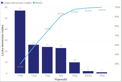
potrzebuję pomocy. Chcę utworzyć wykres słupkowy (sumujący wartości w tabeli) i wykres liniowy (miara skumulowanego procenta) Pracuję na zbiorze danych „reklamacje”. Moja miara wygląda tak:
Wykres jest poprawny, jeśli wartości na wykresie słupkowym nie powtarzają się.
I odwrotnie, jeśli wartości są takie same, wykres przedstawia błędną analizę.
Czego brakuje w mojej miarce?
Proszę o pomoc i z góry dziękuję za poświęcony czas.
Solved! Go to Solution.
- Mark as New
- Bookmark
- Subscribe
- Mute
- Subscribe to RSS Feed
- Permalink
- Report Inappropriate Content
Hi @ewelinag17 ,
You could try M code to create a new column
let
    Source = Table.FromRows(Json.Document(Binary.Decompress(Binary.FromText("i45WMrQ0UNJRMlSK1QGyjZHYyOIWCLaxAZK4kSl29TjMRNFrTAQbyRwkppEpDquQnWNMwJmxAA==", BinaryEncoding.Base64), Compression.Deflate)), let _t = ((type text) meta [Serialized.Text = true]) in type table [pojemnosc = _t, Indeks.2 = _t]),
    #"Changed Type" = Table.TransformColumnTypes(Source,{{"pojemnosc", Int64.Type}, {"Indeks.2", Int64.Type}}),
    #"Grouped Rows" = Table.Group(#"Changed Type", {"pojemnosc"}, {{"Count", each Table.RowCount(_), type number}, {"all", each _, type table [pojemnosc=number, Indeks.2=number]}}),
    #"Sorted Rows" = Table.Sort(#"Grouped Rows",{{"Count", Order.Ascending}}),
    #"Added Index" = Table.AddIndexColumn(#"Sorted Rows", "Index", 0, 1),
    #"Expanded all" = Table.ExpandTableColumn(#"Added Index", "all", {"pojemnosc", "Indeks.2"}, {"pojemnosc.1", "Indeks.2"}),
    #"Removed Columns" = Table.RemoveColumns(#"Expanded all",{"Count", "pojemnosc.1"})
in
    #"Removed Columns"
You could refer to my sample for details.
Best Regards,
Zoe Zhi
If this post helps, then please consider Accept it as the solution to help the other members find it more quickly.
- Mark as New
- Bookmark
- Subscribe
- Mute
- Subscribe to RSS Feed
- Permalink
- Report Inappropriate Content
Hi @ewelinag17 ,
It seems that you want to show distinct category in chart, right? If so and if possible could you please inform me more detailed information(such as your logic, expected output and your sample data )? Then I will help you more correctly.
Please do mask sensitive data before uploading.
Thanks for your understanding and support.
Best Regards,
Zoe Zhi
If this post helps, then please consider Accept it as the solution to help the other members find it more quickly.
- Mark as New
- Bookmark
- Subscribe
- Mute
- Subscribe to RSS Feed
- Permalink
- Report Inappropriate Content
An example data table is shown below.
I create a graph from the data.
I create a line chart with measure:
- Mark as New
- Bookmark
- Subscribe
- Mute
- Subscribe to RSS Feed
- Permalink
- Report Inappropriate Content
Hi @ewelinag17 ,
You could try M code to create a new column
let
    Source = Table.FromRows(Json.Document(Binary.Decompress(Binary.FromText("i45WMrQ0UNJRMlSK1QGyjZHYyOIWCLaxAZK4kSl29TjMRNFrTAQbyRwkppEpDquQnWNMwJmxAA==", BinaryEncoding.Base64), Compression.Deflate)), let _t = ((type text) meta [Serialized.Text = true]) in type table [pojemnosc = _t, Indeks.2 = _t]),
    #"Changed Type" = Table.TransformColumnTypes(Source,{{"pojemnosc", Int64.Type}, {"Indeks.2", Int64.Type}}),
    #"Grouped Rows" = Table.Group(#"Changed Type", {"pojemnosc"}, {{"Count", each Table.RowCount(_), type number}, {"all", each _, type table [pojemnosc=number, Indeks.2=number]}}),
    #"Sorted Rows" = Table.Sort(#"Grouped Rows",{{"Count", Order.Ascending}}),
    #"Added Index" = Table.AddIndexColumn(#"Sorted Rows", "Index", 0, 1),
    #"Expanded all" = Table.ExpandTableColumn(#"Added Index", "all", {"pojemnosc", "Indeks.2"}, {"pojemnosc.1", "Indeks.2"}),
    #"Removed Columns" = Table.RemoveColumns(#"Expanded all",{"Count", "pojemnosc.1"})
in
    #"Removed Columns"
You could refer to my sample for details.
Best Regards,
Zoe Zhi
If this post helps, then please consider Accept it as the solution to help the other members find it more quickly.
- Mark as New
- Bookmark
- Subscribe
- Mute
- Subscribe to RSS Feed
- Permalink
- Report Inappropriate Content
Great! But if I add a column and filter relative to the new column, the chart won't be stacked.
That's enough for now, but in the future this file will grow by a few columns. And then how to filter on new columns?
- Mark as New
- Bookmark
- Subscribe
- Mute
- Subscribe to RSS Feed
- Permalink
- Report Inappropriate Content
Hi @ewelinag17 ,
As I know, the slicer will affect on measure, it seem not affect on calculated column, so you need to use measure to achieve this goal.
Best Regards,
Zoe Zhi
If this post helps, then please consider Accept it as the solution to help the other members find it more quickly.
Helpful resources

Microsoft Fabric Learn Together
Covering the world! 9:00-10:30 AM Sydney, 4:00-5:30 PM CET (Paris/Berlin), 7:00-8:30 PM Mexico City

Power BI Monthly Update - April 2024
Check out the April 2024 Power BI update to learn about new features.


