- Power BI forums
- Updates
- News & Announcements
- Get Help with Power BI
- Desktop
- Service
- Report Server
- Power Query
- Mobile Apps
- Developer
- DAX Commands and Tips
- Custom Visuals Development Discussion
- Health and Life Sciences
- Power BI Spanish forums
- Translated Spanish Desktop
- Power Platform Integration - Better Together!
- Power Platform Integrations (Read-only)
- Power Platform and Dynamics 365 Integrations (Read-only)
- Training and Consulting
- Instructor Led Training
- Dashboard in a Day for Women, by Women
- Galleries
- Community Connections & How-To Videos
- COVID-19 Data Stories Gallery
- Themes Gallery
- Data Stories Gallery
- R Script Showcase
- Webinars and Video Gallery
- Quick Measures Gallery
- 2021 MSBizAppsSummit Gallery
- 2020 MSBizAppsSummit Gallery
- 2019 MSBizAppsSummit Gallery
- Events
- Ideas
- Custom Visuals Ideas
- Issues
- Issues
- Events
- Upcoming Events
- Community Blog
- Power BI Community Blog
- Custom Visuals Community Blog
- Community Support
- Community Accounts & Registration
- Using the Community
- Community Feedback
Register now to learn Fabric in free live sessions led by the best Microsoft experts. From Apr 16 to May 9, in English and Spanish.
- Power BI forums
- Forums
- Get Help with Power BI
- Mobile Apps
- Power BI Mobile KPI truncation
- Subscribe to RSS Feed
- Mark Topic as New
- Mark Topic as Read
- Float this Topic for Current User
- Bookmark
- Subscribe
- Printer Friendly Page
- Mark as New
- Bookmark
- Subscribe
- Mute
- Subscribe to RSS Feed
- Permalink
- Report Inappropriate Content
Power BI Mobile KPI truncation
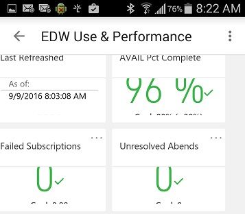
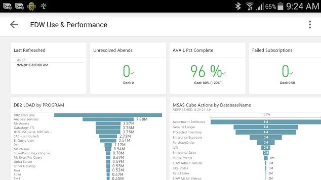
I have a Power BI dashboard displaying KPI's using the standard Pbi visualization (not a custom vis). I've created a Phone view of several KPI's from the dashboard - but when I view them in the most recent Android Power BI App - they're truncated.

Setting each item to its own "line" by widening it to the full width helps a bit, but the top item (the Last Refreshed" text box)was still truncated.
Using only a single KPI also saw it truncated.
I'd really like to limit the phone view to KPI's and use the screen space to best effect.
I've seen other postings related to formatting but none seem to have this specific issue.
Thanks 🙂
- Mark as New
- Bookmark
- Subscribe
- Mute
- Subscribe to RSS Feed
- Permalink
- Report Inappropriate Content
Thank you for reaching out, we are aware of this issue, in the meanwhile you can overcome this by allocating more space in your mobile dashboard for KPIs.
Stay tuned to the Power BI community and blogs for news about Power BI’s new features and enhancements.
- Mark as New
- Bookmark
- Subscribe
- Mute
- Subscribe to RSS Feed
- Permalink
- Report Inappropriate Content
Thanks for your quick reply - I'll do just that for now, spreading each one across the full Power BI mobile "page" corrects the truncation.
- Mark as New
- Bookmark
- Subscribe
- Mute
- Subscribe to RSS Feed
- Permalink
- Report Inappropriate Content
Just to be clear - this is a workaround for me - I really want to present smaller "KPI Like" objects on the phone and control the space they use on the screen. It's either that or move to the more specific mobile presentations available in a more targeted "Mobile Report Publisher" format. There's only so much screen real estate on the phone so I want to use it appropriately.
The ability to use a single underlying analytical presentation to serve multiple audiences is leading me to try these features (views over a Power BI dashboard / over a report / over a dataset that's refreshable). It could be a more efficient way to manage the set of graphical and text objects relating to a given business problem space. I'm showing a summary graphic to mobile devices, backed up by greater detail on other devices.
Yes, I could combine Mobile Report Published reports over datasets and relate them to underlying detailed SSRS reports in a more complex set of interrelated objects - but if I can create a single Power BI report to use in multiple presentations I could be way ahead of the game. 🙂
Helpful resources

Microsoft Fabric Learn Together
Covering the world! 9:00-10:30 AM Sydney, 4:00-5:30 PM CET (Paris/Berlin), 7:00-8:30 PM Mexico City

Power BI Monthly Update - April 2024
Check out the April 2024 Power BI update to learn about new features.


